One-way completely randomized design
Data
This example is taken from “Example 4.3” of the course material “Quantitative Methods in Biosciences (3402-420)” by Prof. Dr. Hans-Peter Piepho. It considers data published on p.52 of Mead, Curnow, and Hasted (2002) from a yield trial with melons. The trial had 4 melon varieties (variety). Each variety was tested on six field plots. The allocation of treatments (varieties) to experimental units (plots) was completely at random. Thus, the experiment was laid out as a completely randomized design (CRD).
Import
# data is available online:
path <- "https://raw.githubusercontent.com/SchmidtPaul/dsfair_quarto/master/data/Mead1993.csv"
dat <- read_csv(path) # use path from above
dat# A tibble: 24 × 4
variety yield row col
<chr> <dbl> <dbl> <dbl>
1 v1 25.1 4 2
2 v1 17.2 1 6
3 v1 26.4 4 1
4 v1 16.1 1 4
5 v1 22.2 1 2
6 v1 15.9 2 4
7 v2 40.2 4 4
8 v2 35.2 3 1
9 v2 32.0 4 6
10 v2 36.5 2 1
# ℹ 14 more rowsFormat
Before anything, the column variety should be encoded as a factor, since R by default encoded it as a character variable. There are multiple ways to do this - here are two:
Explore
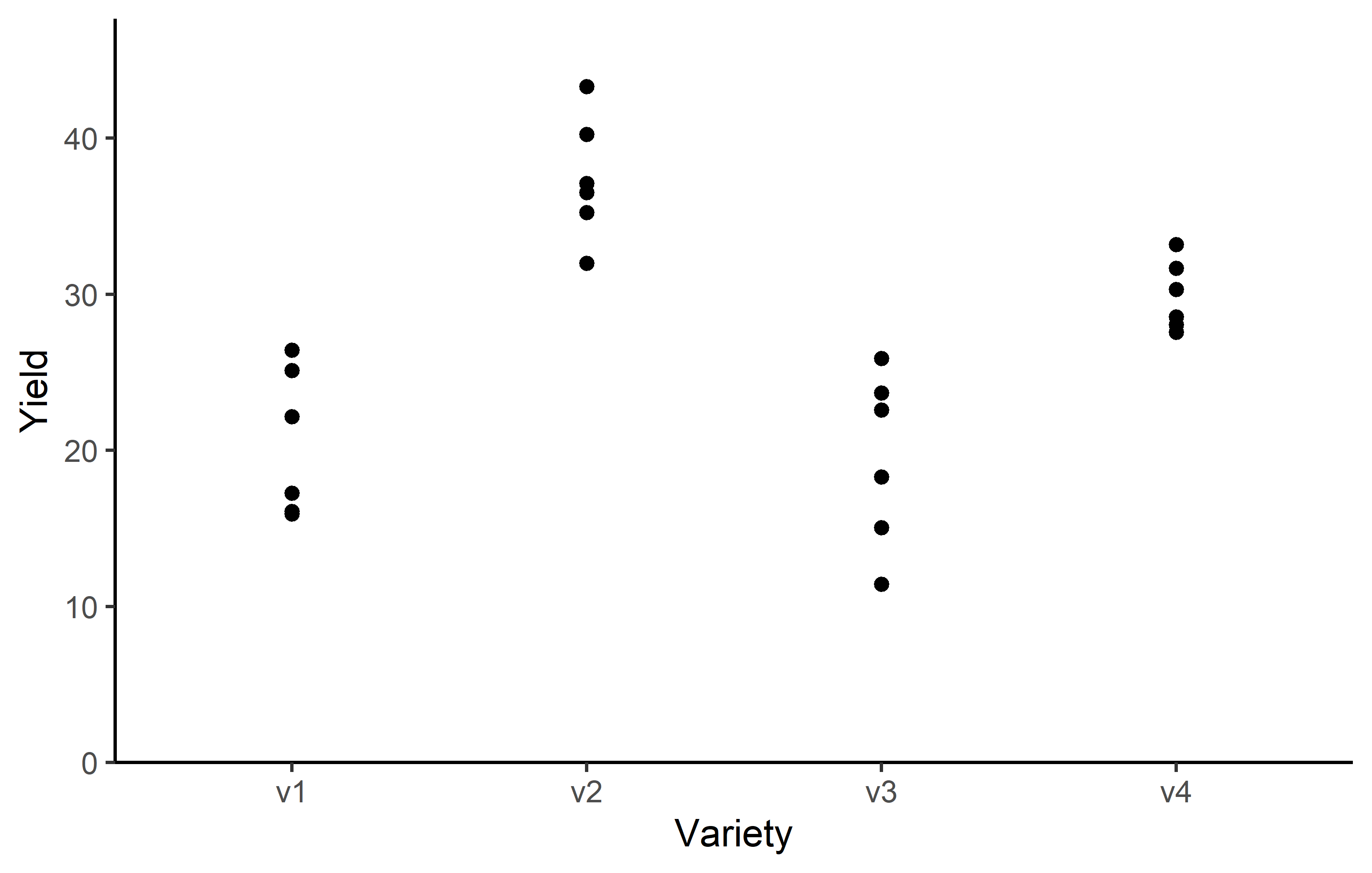
We make use of dlookr::describe() to conveniently obtain descriptive summary tables. Here, we get can a summary per variety.
dat %>%
  group_by(variety) %>%
  dlookr::describe(yield) %>%
  select(2:sd, p00, p100) %>%
  arrange(desc(mean))
# A tibble: 4 × 7
variety n na mean sd p00 p100
<fct> <int> <int> <dbl> <dbl> <dbl> <dbl>
1 v2 6 0 37.4 3.95 32.0 43.3
2 v4 6 0 29.9 2.23 27.6 33.2
3 v1 6 0 20.5 4.69 15.9 26.4
4 v3 6 0 19.5 5.56 11.4 25.9Additionally, we can decide to plot our data:
Code
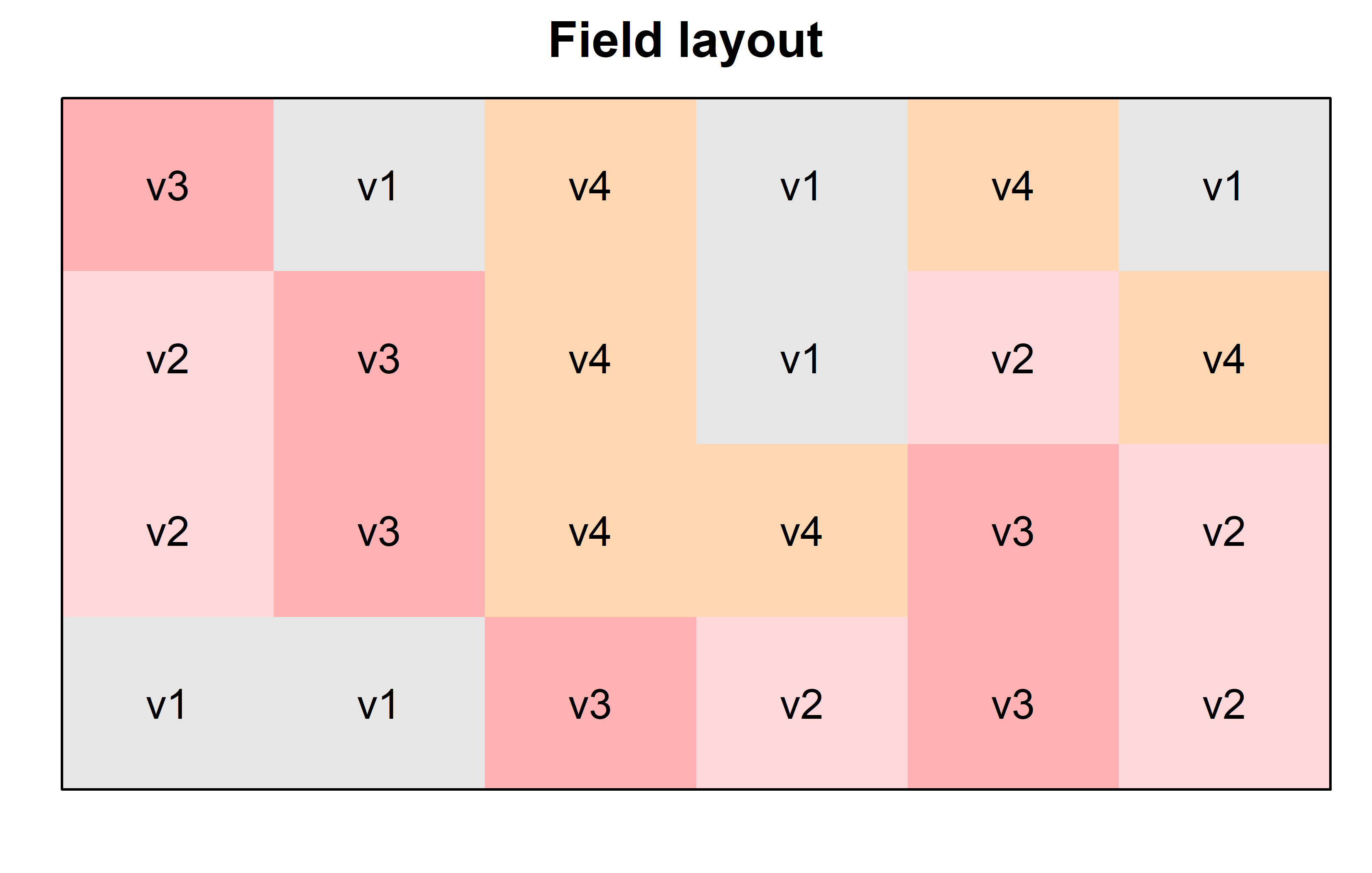
Finally, since this is an experiment that was laid with a certain experimental design (= a completely randomized design; CRD) - it makes sense to also get a field plan. This can be done via desplot() from {desplot}:
Code
desplot(
  data = dat,
  flip = TRUE, # row 1 on top, not on bottom
  form = variety ~ col + row, # fill color per variety
  text = variety, # variety names per plot
  cex = 1, # variety names: font size
  main = "Field layout", # plot title
  show.key = FALSE # hide legend
) 
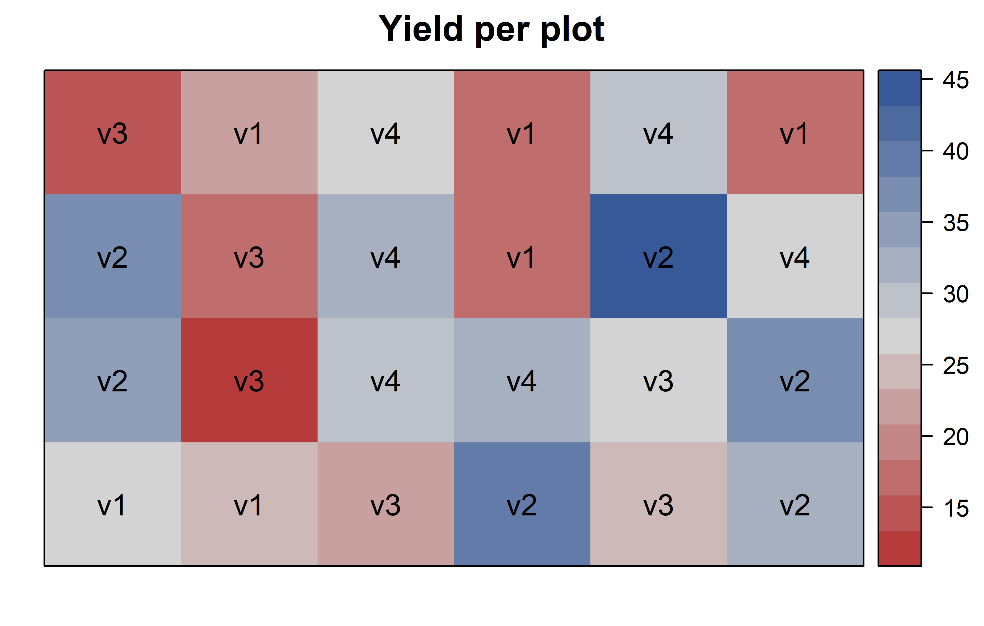
Code
desplot(
  data = dat,
  flip = TRUE, # row 1 on top, not on bottom
  form = yield ~ col + row, # fill color per variety
  text = variety, # variety names per plot
  cex = 1, # variety names: font size
  main = "Yield per plot", # plot title
  show.key = FALSE # hide legend
) 
Model
Finally, we can decide to fit a linear model with yield as the response variable and (fixed) variety effects.
mod <- lm(yield ~ variety, data = dat)It would be at this moment (i.e. after fitting the model and before running the ANOVA), that you should check whether the model assumptions are met. Find out more in the summary article “Model Diagnostics”
ANOVA
Based on our model, we can then conduct an ANOVA:
ANOVA <- anova(mod)
ANOVA
Analysis of Variance Table
Response: yield
Df Sum Sq Mean Sq F value Pr(>F)
variety 3 1291.48 430.49 23.418 9.439e-07 ***
Residuals 20 367.65 18.38
---
Signif. codes: 0 '***' 0.001 '**' 0.01 '*' 0.05 '.' 0.1 ' ' 1Accordingly, the ANOVA’s F-test found the variety effects to be statistically significant (p < .001***).
Mean comparison
Besides an ANOVA, one may also want to compare adjusted yield means between varieties via post hoc tests (t-test, Tukey test etc.).
mean_comp <- mod %>%
  emmeans(specs = ~ variety) %>% # adj. mean per variety
  cld(adjust = "Tukey", Letters = letters) # compact letter display (CLD)

mean_comp
variety emmean SE df lower.CL upper.CL .group
v3 19.5 1.75 20 14.7 24.3 a
v1 20.5 1.75 20 15.7 25.3 a
v4 29.9 1.75 20 25.1 34.7 b
v2 37.4 1.75 20 32.6 42.2 c
Confidence level used: 0.95
Conf-level adjustment: sidak method for 4 estimates
P value adjustment: tukey method for comparing a family of 4 estimates
significance level used: alpha = 0.05
NOTE: If two or more means share the same grouping symbol,
then we cannot show them to be different.
But we also did not show them to be the same. Note that if you would like to see the underlying individual contrasts/differences between adjusted means, simply add details = TRUE to the cld() statement. Furthermore, check out the Summary Article “Compact Letter Display”.
Finally, we can create a plot that displays both the raw data and the results, i.e. the comparisons of the adjusted means that are based on the linear model.
Code
my_caption <- "Black dots represent raw data. Red dots and error bars represent adjusted means with 95% confidence limits per variety. Means followed by a common letter are not significantly different according to the Tukey-test."

ggplot() +
  aes(x = variety) +
  # black dots representing the raw data
  geom_point(
    data = dat,
    aes(y = yield)
  ) +
  # red dots representing the adjusted means
  geom_point(
    data = mean_comp,
    aes(y = emmean),
    color = "red",
    position = position_nudge(x = 0.1)
  ) +
  # red error bars representing the confidence limits of the adjusted means
  geom_errorbar(
    data = mean_comp,
    aes(ymin = lower.CL, ymax = upper.CL),
    color = "red",
    width = 0.1,
    position = position_nudge(x = 0.1)
  ) +
  # red letters
  geom_text(
    data = mean_comp,
    aes(y = emmean, label = str_trim(.group)),
    color = "red",
    position = position_nudge(x = 0.2),
    hjust = 0
  ) +
  scale_x_discrete(
    name = "Variety"
  ) +
  scale_y_continuous(
    name = "Yield",
    limits = c(0, NA),
    expand = expansion(mult = c(0, 0.1))
  ) +
  theme_classic() +
  labs(caption = my_caption) +
  theme(plot.caption = element_textbox_simple(margin = margin(t = 5)),
        plot.caption.position = "plot")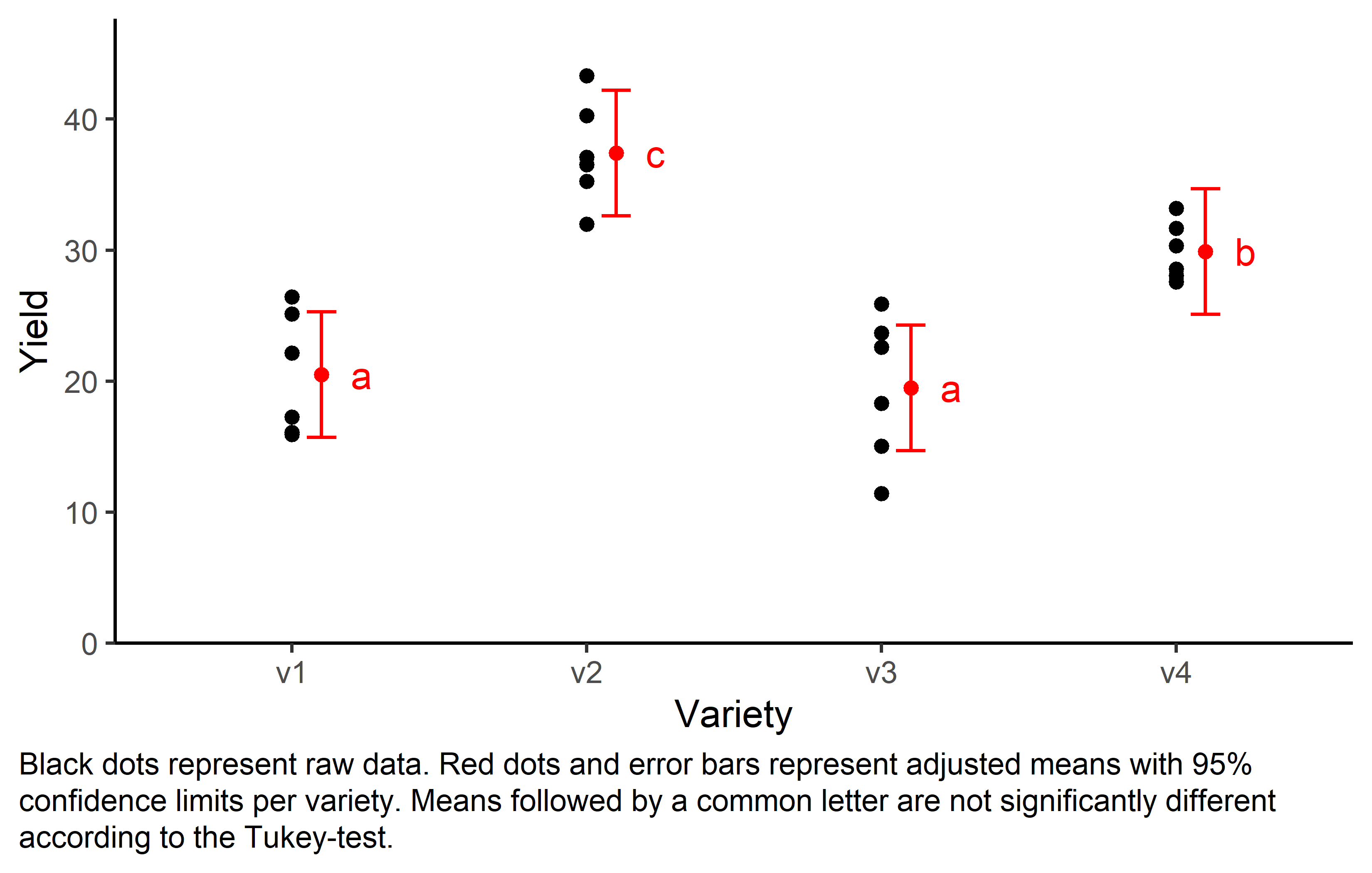
References
Citation
@online{schmidt2023,
  author = {Paul Schmidt},
  title = {One-Way Completely Randomized Design},
  date = {2023-11-16},
  url = {https://schmidtpaul.github.io/dsfair_quarto//ch/exan/simple/crd_mead1993.html},
  langid = {en},
  abstract = {One-way ANOVA \& pairwise comparison post hoc tests in a
    completely randomized design.}
}