One-way alpha design
Data
This example is taken from Chapter “3.8 Analysis of an \(\alpha\)-design” of the course material “Mixed models for metric data (3402-451)” by Prof. Dr. Hans-Peter Piepho. It considers data published in John and Williams (1995) from a yield (t/ha) trial laid out as an alpha design. The trial had 24 genotypes (gen), 3 complete replicates (rep) and 6 incomplete blocks (block) within each replicate. The block size was 4.
Import
The data is available as part of the {agridat} package and needs no further formatting:
dat <- as_tibble(agridat::john.alpha)
dat
# A tibble: 72 × 7
plot rep block gen yield row col
<int> <fct> <fct> <fct> <dbl> <int> <int>
1 1 R1 B1 G11 4.12 1 1
2 2 R1 B1 G04 4.45 2 1
3 3 R1 B1 G05 5.88 3 1
4 4 R1 B1 G22 4.58 4 1
5 5 R1 B2 G21 4.65 5 1
6 6 R1 B2 G10 4.17 6 1
7 7 R1 B2 G20 4.01 7 1
8 8 R1 B2 G02 4.34 8 1
9 9 R1 B3 G23 4.23 9 1
10 10 R1 B3 G14 4.76 10 1
# ℹ 62 more rowsExplore
We make use of dlookr::describe() to conveniently obtain descriptive summary tables. Here, we get can summarize per block and per cultivar.
dat %>%
  group_by(gen) %>%
  dlookr::describe(yield) %>%
  select(2:n, mean, sd) %>%
  arrange(desc(n), desc(mean)) %>%
  print(n = Inf)
# A tibble: 24 × 4
gen n mean sd
<fct> <int> <dbl> <dbl>
1 G01 3 5.16 0.534
2 G05 3 5.06 0.841
3 G12 3 4.91 0.641
4 G15 3 4.89 0.207
5 G19 3 4.87 0.398
6 G13 3 4.83 0.619
7 G21 3 4.82 0.503
8 G17 3 4.73 0.379
9 G16 3 4.73 0.502
10 G06 3 4.71 0.464
11 G22 3 4.64 0.432
12 G14 3 4.56 0.186
13 G02 3 4.51 0.574
14 G18 3 4.44 0.587
15 G04 3 4.40 0.0433
16 G10 3 4.39 0.450
17 G11 3 4.38 0.641
18 G08 3 4.32 0.584
19 G24 3 4.14 0.726
20 G23 3 4.14 0.232
21 G07 3 4.13 0.510
22 G20 3 3.78 0.209
23 G09 3 3.61 0.606
24 G03 3 3.34 0.456 dat %>%
group_by(rep, block) %>%
dlookr::describe(yield) %>%
select(2:n, mean, sd) %>%
arrange(desc(mean)) %>%
print(n = Inf)# A tibble: 18 × 5
rep block n mean sd
<fct> <fct> <int> <dbl> <dbl>
1 R2 B3 4 5.22 0.149
2 R2 B5 4 5.21 0.185
3 R2 B6 4 5.11 0.323
4 R2 B4 4 5.01 0.587
5 R1 B5 4 4.79 0.450
6 R1 B1 4 4.75 0.772
7 R1 B6 4 4.58 0.819
8 R3 B1 4 4.38 0.324
9 R1 B3 4 4.36 0.337
10 R1 B4 4 4.33 0.727
11 R3 B3 4 4.30 0.0710
12 R1 B2 4 4.29 0.273
13 R2 B2 4 4.23 0.504
14 R3 B4 4 4.22 0.375
15 R3 B5 4 4.15 0.398
16 R2 B1 4 4.12 0.411
17 R3 B2 4 3.96 0.631
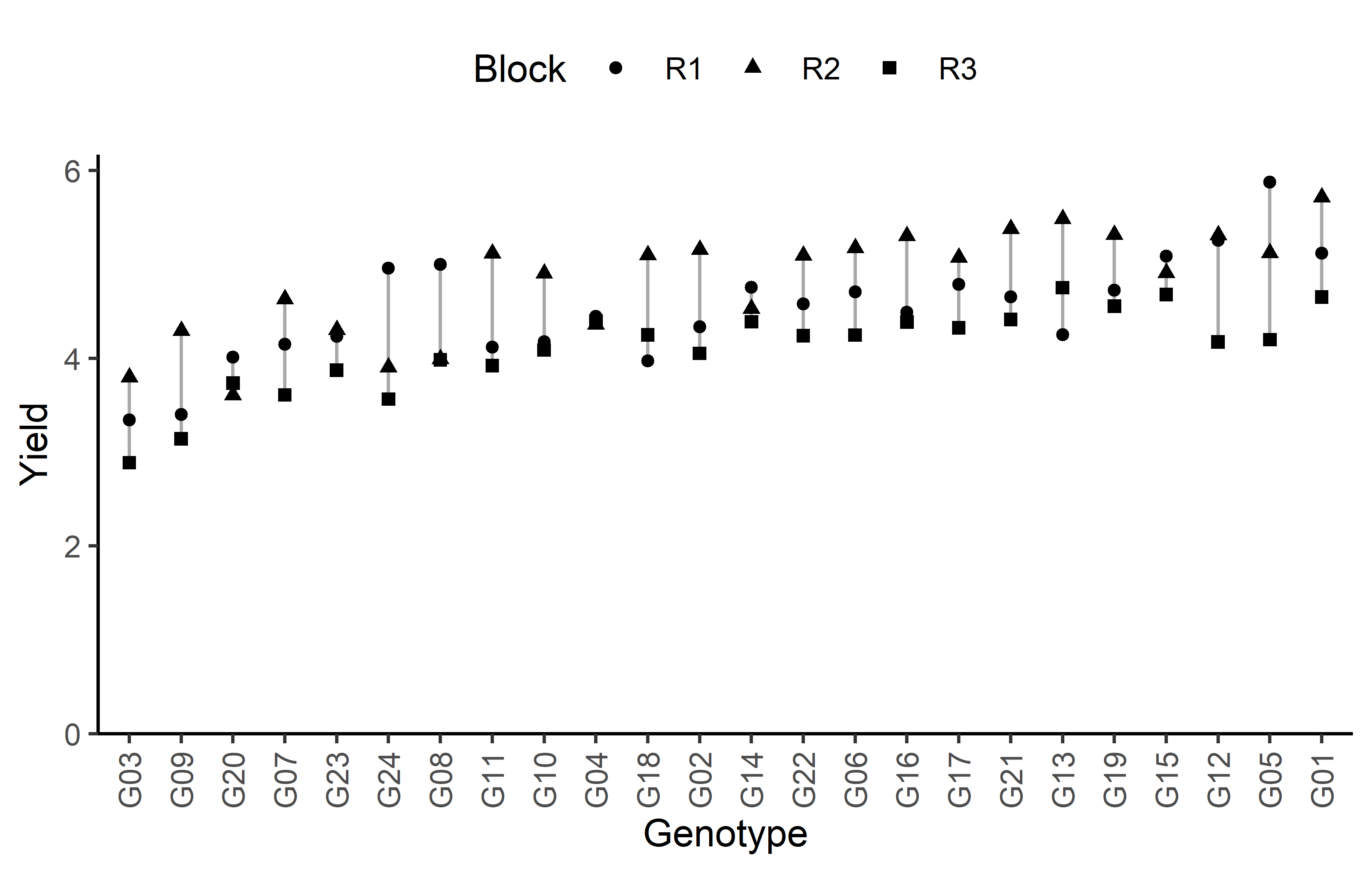
18 R3 B6 4 3.61 0.542 Additionally, we can decide to plot our data:
Code
# sort genotypes by mean yield
gen_order <- dat %>%
  group_by(gen) %>%
  summarise(mean = mean(yield)) %>%
  arrange(mean) %>%
  pull(gen) %>%
  as.character()

ggplot(data = dat) +
  aes(
    y = yield,
    x = gen,
    shape = rep
  ) +
  geom_line(
    aes(group = gen),
    color = "darkgrey"
  ) +
  geom_point() +
  scale_x_discrete(
    name = "Genotype",
    limits = gen_order
  ) +
  scale_y_continuous(
    name = "Yield",
    limits = c(0, NA),
    expand = expansion(mult = c(0, 0.05))
  ) +
  scale_shape_discrete(
    name = "Block"
  ) +
  guides(shape = guide_legend(nrow = 1)) +
  theme_classic() +
  theme(
    legend.position = "top",
    axis.text.x = element_text(angle = 90, vjust = 0.5)
  )
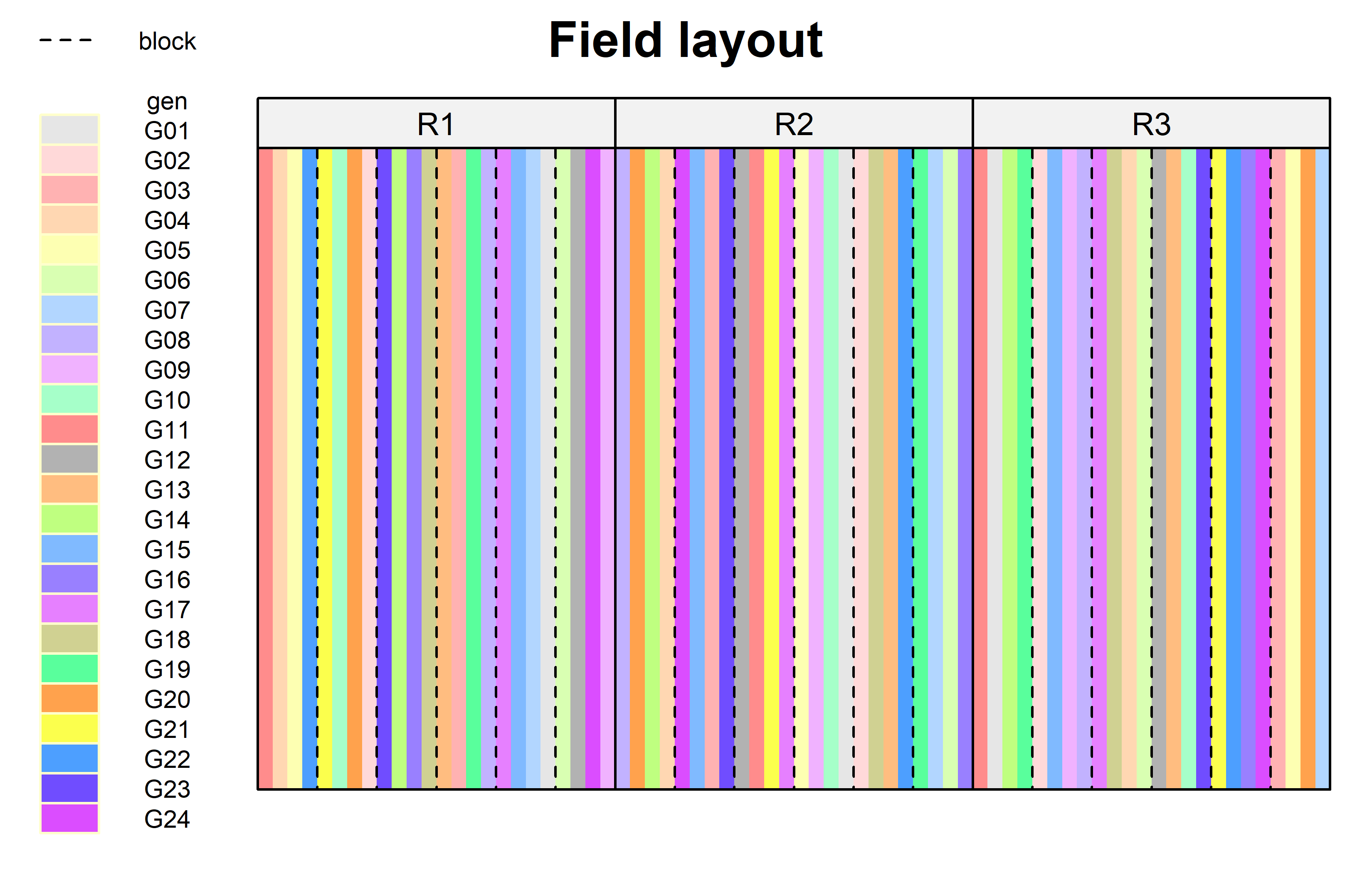
Finally, since this is an experiment that was laid with a certain experimental design (= a non-resolvable augmented design) - it makes sense to also get a field plan. This can be done via desplot() from {desplot}.
Code
desplot(
  data = dat,
  flip = TRUE, # row 1 on top, not on bottom
  form = gen ~ row + col | rep, # fill color per genotype, headers per replicate
  out1 = block, # lines between incomplete blocks
  out1.gpar = list(col = "black", lwd = 1, lty = "dashed"), # line type
  main = "Field layout", # title
  key.cex = 0.6,
  layout = c(3, 1) # force all reps drawn in one row
)
Modelling
Finally, we can decide to fit a linear model with yield as the response variable and (fixed) gen and block effects. There also needs to be term for the 18 incomplete blocks (i.e. rep:block) in the model, but it can be taken either as a fixed or a random effect. Since our goal is to compare genotypes, we will determine which of the two models we prefer by comparing the average standard error of a difference (s.e.d.) for the comparisons between adjusted genotype means - the lower the s.e.d. the better.
# blocks as fixed (linear model)
mod_fb <- lm(yield ~ gen + rep +
               rep:block,
             data = dat)

avg_sed_mod_fb <- mod_fb %>%
  emmeans(pairwise ~ "gen",
          adjust = "none") %>%
  pluck("contrasts") %>% # extract diffs
  as_tibble() %>% # format to table
  pull("SE") %>% # extract s.e.d. column
  mean() # get arithmetic mean

avg_sed_mod_fb
[1] 0.2766288# blocks as random (linear mixed model)
mod_rb <- lmer(yield ~ gen + rep +
(1 | rep:block),
data = dat)
avg_sed_mod_rb <- mod_rb %>%
emmeans(pairwise ~ "gen",
adjust = "none",
lmer.df = "kenward-roger") %>%
pluck("contrasts") %>% # extract diffs
as_tibble() %>% # format to table
pull("SE") %>% # extract s.e.d. column
mean() # get arithmetic mean
avg_sed_mod_rb[1] 0.2700388As a result, we find that the model with random block effects has the smaller s.e.d. and is therefore more precise in terms of comparing genotypes.
It would be at this moment (i.e. after fitting the model and before running the ANOVA), that you should check whether the model assumptions are met. Find out more in the summary article “Model Diagnostics”
ANOVA
Based on our model, we can then conduct an ANOVA:
ANOVA <- anova(mod_rb, ddf = "Kenward-Roger")
ANOVA
Type III Analysis of Variance Table with Kenward-Roger's method
Sum Sq Mean Sq NumDF DenDF F value Pr(>F)
gen 10.5070 0.45683 23 35.498 5.3628 4.496e-06 ***
rep 1.5703 0.78513 2 11.519 9.2124 0.004078 **
---
Signif. codes: 0 '***' 0.001 '**' 0.01 '*' 0.05 '.' 0.1 ' ' 1Accordingly, the ANOVA’s F-test found the cultivar effects to be statistically significant (p < .001***).
Mean comparison
Besides an ANOVA, one may also want to compare adjusted yield means between cultivars via post hoc tests (t-test, Tukey test etc.).
mean_comp <- mod_rb %>%
  emmeans(specs = ~ gen) %>% # adj. mean per genotype
  cld(adjust = "none", Letters = letters) # compact letter display (CLD)

mean_comp
gen emmean SE df lower.CL upper.CL .group
G03 3.50 0.199 44.3 3.10 3.90 a
G09 3.50 0.199 44.3 3.10 3.90 ab
G20 4.04 0.199 44.3 3.64 4.44 bc
G07 4.11 0.199 44.3 3.71 4.51 cd
G24 4.15 0.199 44.3 3.75 4.55 cd
G23 4.25 0.199 44.3 3.85 4.65 cde
G11 4.28 0.199 44.3 3.88 4.68 cde
G18 4.36 0.199 44.3 3.96 4.76 cdef
G10 4.37 0.199 44.3 3.97 4.77 cdef
G02 4.48 0.199 44.3 4.08 4.88 cdefg
G04 4.49 0.199 44.3 4.09 4.89 cdefg
G22 4.53 0.199 44.3 4.13 4.93 cdefgh
G08 4.53 0.199 44.3 4.13 4.93 cdefgh
G06 4.54 0.199 44.3 4.14 4.94 cdefgh
G17 4.60 0.199 44.3 4.20 5.00 defghi
G16 4.73 0.199 44.3 4.33 5.13 efghi
G12 4.76 0.199 44.3 4.35 5.16 efghi
G13 4.76 0.199 44.3 4.36 5.16 efghi
G14 4.78 0.199 44.3 4.37 5.18 efghi
G21 4.80 0.199 44.3 4.39 5.20 efghi
G19 4.84 0.199 44.3 4.44 5.24 fghi
G15 4.97 0.199 44.3 4.57 5.37 ghi
G05 5.04 0.199 44.3 4.64 5.44 hi
G01 5.11 0.199 44.3 4.71 5.51 i
Results are averaged over the levels of: rep
Degrees-of-freedom method: kenward-roger
Confidence level used: 0.95
significance level used: alpha = 0.05
NOTE: If two or more means share the same grouping symbol,
then we cannot show them to be different.
But we also did not show them to be the same. Note that if you would like to see the underlying individual contrasts/differences between adjusted means, simply add details = TRUE to the cld() statement. Furthermore, check out the Summary Article “Compact Letter Display”.
Finally, we can create a plot that displays both the raw data and the results, i.e. the comparisons of the adjusted means that are based on the linear model.
Code
# reorder genotype factor levels according to adjusted mean
my_caption <- "Black dots represent raw data. Red diamonds and error bars represent adjusted means with 95% confidence limits per cultivar. Means followed by a common letter are not significantly different according to the t-test."

ggplot() +
  # green/red dots representing the raw data
  geom_point(
    data = dat,
    aes(y = yield, x = gen)
  ) +
  # red diamonds representing the adjusted means
  geom_point(
    data = mean_comp,
    aes(y = emmean, x = gen),
    shape = 18,
    color = "red",
    position = position_nudge(x = 0.2)
  ) +
  # red error bars representing the confidence limits of the adjusted means
  geom_errorbar(
    data = mean_comp,
    aes(ymin = lower.CL, ymax = upper.CL, x = gen),
    color = "red",
    width = 0.1,
    position = position_nudge(x = 0.2)
  ) +
  # red letters
  geom_text(
    data = mean_comp,
    aes(y = lower.CL, x = gen, label = str_trim(.group)),
    color = "red",
    angle = 90,
    hjust = 1.1,
    position = position_nudge(x = 0.2)
  ) +
  scale_x_discrete(
    name = "Cultivar",
    limits = as.character(mean_comp$gen)
  ) +
  scale_y_continuous(
    name = "Yield",
    limits = c(0, NA),
    expand = expansion(mult = c(0, 0.05))
  ) +
  labs(caption = my_caption) +
  theme_classic() +
  theme(plot.caption = element_textbox_simple(margin = margin(t = 5)),
        plot.caption.position = "plot",
        axis.text.x = element_text(angle = 90, vjust = 0.5))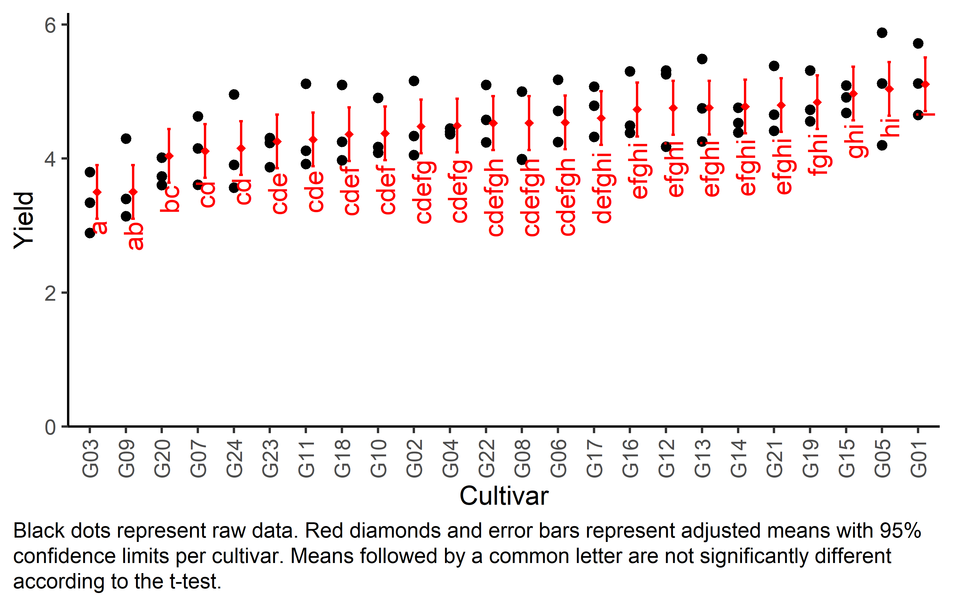
Bonus
Here are some other things you would maybe want to look at for the analysis of this dataset.
Variance components
To extract variance components from our models, we unfortunately need different functions per model since only of of them is a mixed model and we used different functions to fit them.
# Residual Variance
summary(mod_fb)$sigma^2
[1] 0.08346307# Both Variance Components
as_tibble(VarCorr(mod_rb))# A tibble: 2 × 5
grp var1 var2 vcov sdcor
<chr> <chr> <chr> <dbl> <dbl>
1 rep:block (Intercept) <NA> 0.0619 0.249
2 Residual <NA> <NA> 0.0852 0.292Efficiency
The efficiency of a resolvable design can be calculated as its mean s.e.d. compared to the (mean1) s.e.d. of the analogous RCBD, i.e. leaving out the incomplete block effects within the replicates. Above, we have already calculated the mean s.e.d. of our resolvable design so we can square it and get avg_sed_mod_rb^2 which is 0.07292. Accordingly, we can fit a model leaving out the incomplete block effects and get the s.e.d. just like before and also square it:
avg_sed_mod_RCBD <- lm(yield ~ gen + rep, data = dat) %>%
  emmeans(pairwise ~ "gen",
          adjust = "none",
          lmer.df = "kenward-roger") %>%
  pluck("contrasts") %>% # extract diffs
  as_tibble() %>% # format to table
  pull("SE") %>% # extract s.e.d. column
  mean()

avg_sed_mod_RCBD^2
[1] 0.08972397Finally, the efficiency of this resolvable design is then
avg_sed_mod_RCBD^2 / avg_sed_mod_rb^2[1] 1.230428meaning that the resolvable design is indeed more efficient since the efficiency is > 1.
References
Footnotes
In this scenario, all s.e.d. of the RCBD model would be identical so we don’t really need to get the average, but could instead argue that there is only one constant s.e.d.↩︎
Citation
@online{schmidt2023,
  author = {Paul Schmidt},
  title = {One-Way Alpha Design},
  date = {2023-11-16},
  url = {https://schmidtpaul.github.io/dsfair_quarto//ch/exan/simple/alpha_johnwilliams1995.html},
  langid = {en},
  abstract = {One-way ANOVA \& pairwise comparison post hoc tests in an
    alpha design.}
}