Bad data & Outliers
There are two download links:
Data
Imagine that this dataset was obtained by you. You spent an entire day walking around the campus of a university and asked a total of 29 people for things like how old they are and you also tested how well they could see on a scale of 1-10.
Import
Assuming you are working in a R-project, save the formatted file somewhere within the project directory. I have saved it within a sub folder called data so that the relative path to my file is data/vision_fixed.xls.
path <- here("data", "vision_fixed.xls")
dat <- read_excel(path)

dat
# A tibble: 29 × 9
Person Ages Gender `Civil state` Height Profession Vision Distance PercDist
<chr> <dbl> <chr> <chr> <dbl> <chr> <dbl> <dbl> <dbl>
1 Andrés 25 M S 180 Student 10 1.5 15
2 Anja 29 F S 168 Professio… 10 4.5 45
3 Armando 31 M S 169 Professio… 9 4.5 50
4 Carlos 25 M M 185 Professio… 8 6 75
5 Cristi… 23 F <NA> 170 Student 10 3 30
6 Delfa 39 F M 158 Professio… 6 4.5 75
7 Eduardo 28 M S 166 Professio… 8 4.5 56.2
8 Enrique NA <NA> <NA> NA Professio… NA 6 NA
9 Fanny 25 F M 164 Student 9 3 33.3
10 Franci… 46 M M 168 Professio… 8 4.5 56.2
# ℹ 19 more rowsThis is optional, but we could argue that our column names are not in a desirable format. To deal with this, we can use the clean_names() functions of {janitor}. This package has several more handy functions for cleaning data that are worth checking out.
dat <- dat %>% clean_names()
dat
# A tibble: 29 × 9
person ages gender civil_state height profession vision distance perc_dist
<chr> <dbl> <chr> <chr> <dbl> <chr> <dbl> <dbl> <dbl>
1 Andrés 25 M S 180 Student 10 1.5 15
2 Anja 29 F S 168 Professio… 10 4.5 45
3 Armando 31 M S 169 Professio… 9 4.5 50
4 Carlos 25 M M 185 Professio… 8 6 75
5 Cristina 23 F <NA> 170 Student 10 3 30
6 Delfa 39 F M 158 Professio… 6 4.5 75
7 Eduardo 28 M S 166 Professio… 8 4.5 56.2
8 Enrique NA <NA> <NA> NA Professio… NA 6 NA
9 Fanny 25 F M 164 Student 9 3 33.3
10 Francis… 46 M M 168 Professio… 8 4.5 56.2
# ℹ 19 more rowsGoal
Very much like in the previous chapter, our goal is to look at the relationship of two numeric variables: ages and vision. What is new about this data is, that it (i) has missing values and (ii) has a potential outlier.
Exploring
To quickly get a first feeling for this dataset, we can use summary() and draw a plot via plot() or ggplot().
summary(dat) person ages gender civil_state
Length:29 Min. :22.00 Length:29 Length:29
Class :character 1st Qu.:25.00 Class :character Class :character
Mode :character Median :26.00 Mode :character Mode :character
Mean :30.61
3rd Qu.:29.50
Max. :55.00
NA's :1
height profession vision distance
Min. :145.0 Length:29 Min. : 3.000 Min. :1.500
1st Qu.:164.8 Class :character 1st Qu.: 7.000 1st Qu.:1.500
Median :168.0 Mode :character Median : 9.000 Median :3.000
Mean :168.2 Mean : 8.357 Mean :3.466
3rd Qu.:172.8 3rd Qu.:10.000 3rd Qu.:4.500
Max. :190.0 Max. :10.000 Max. :6.000
NA's :1 NA's :1
perc_dist
Min. : 15.00
1st Qu.: 20.24
Median : 40.18
Mean : 45.45
3rd Qu.: 57.19
Max. :150.00
NA's :1 Code
plot(y = dat$vision, x = dat$ages)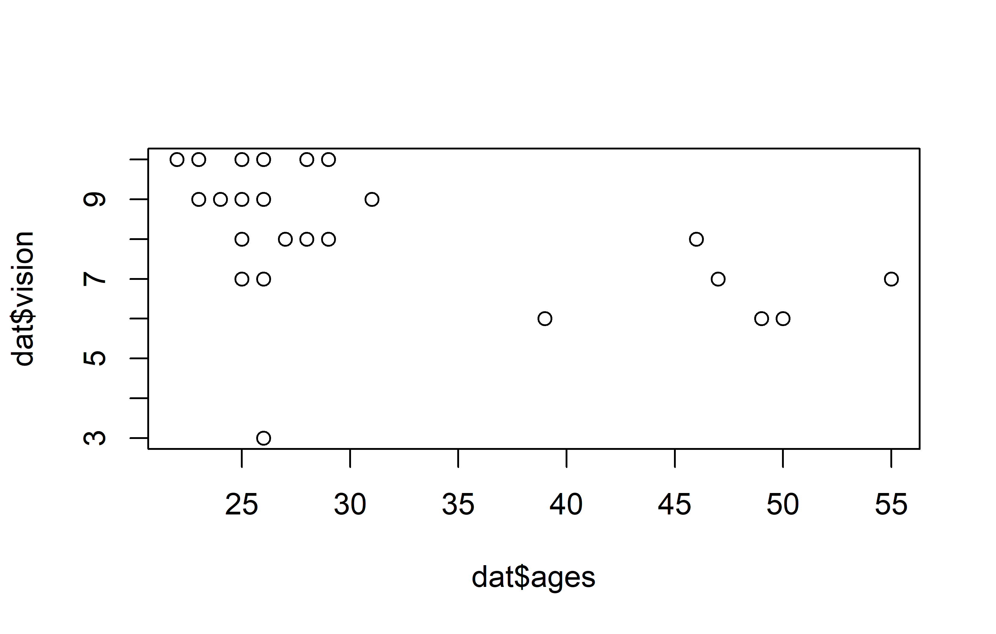
Code
ggplot(data = dat) +
  aes(x = ages, y = vision) +
  geom_point(size = 2) +
  scale_x_continuous(
    name = "Person's age",
    limits = c(20, 60),
    expand = expansion(mult = c(0, 0.05))
  ) +
  scale_y_continuous(
    name = "Person's vision",
    limits = c(0, NA),
    breaks = seq(0, 10, 2),
    expand = expansion(mult = c(0, 0.05))
  ) +
    theme_bw()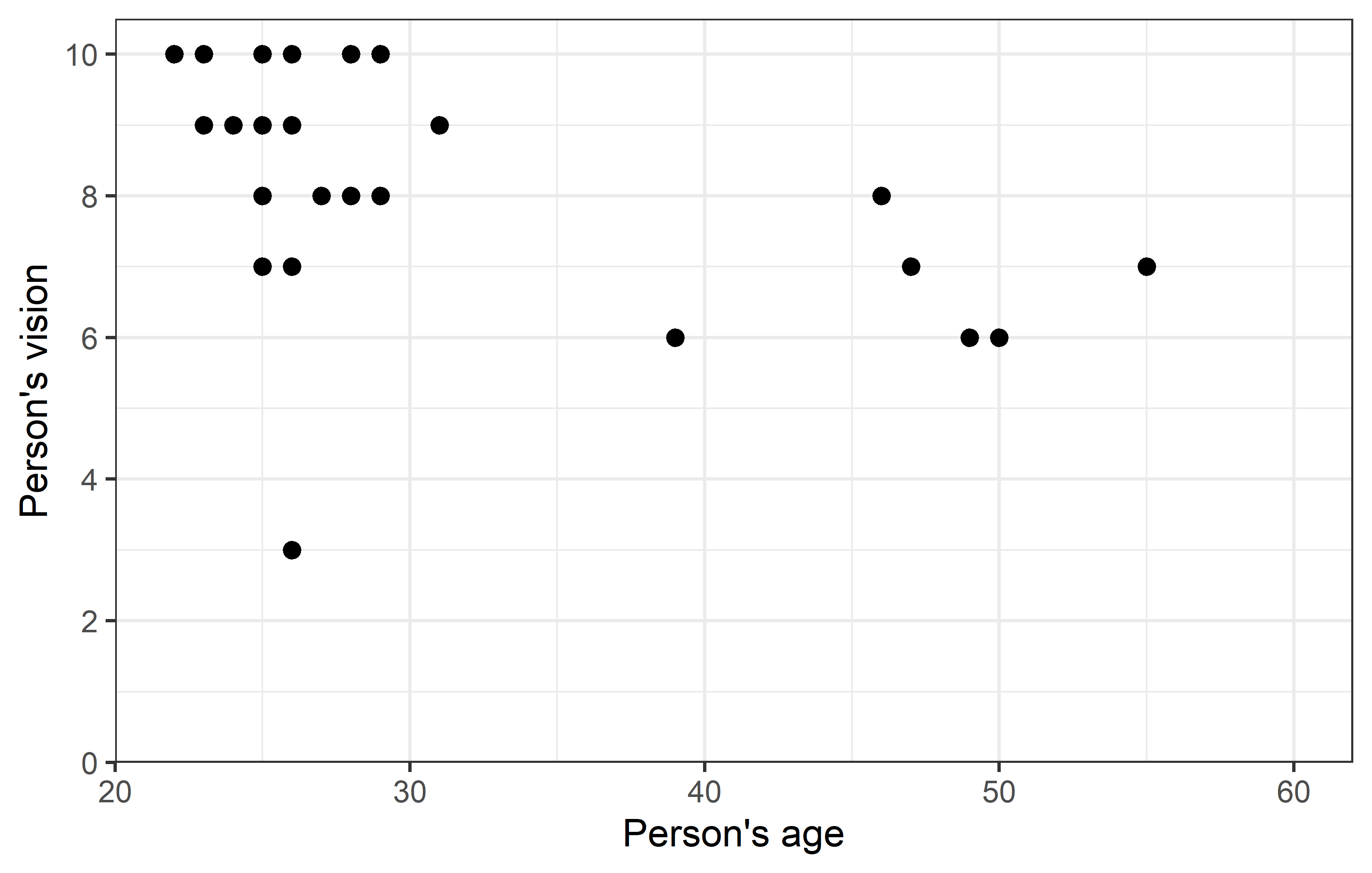
Apparently, most people are in their 20s and can see quite well, however some people are older and they tend to have a vision that’s a little worse.
Missing Data?
While the data has 29 rows, it actually only holds vision and ages information for 28 people. This is because instead of values, there are NA (Not Available) for one person. Note that NA as missing values are treated somewhat special in R. As an example: If you want to filter for missing values, you cannot write value == NA, but must instead write is.na(value):
# A tibble: 1 × 9
  person   ages gender civil_state height profession   vision distance perc_dist
  <chr>   <dbl> <chr>  <chr>        <dbl> <chr>         <dbl>    <dbl>     <dbl>
1 Enrique    NA <NA>   <NA>            NA Professional     NA        6        NA
Moreover, if you want to count the missing observations (per group) in a dataset, the most basic way of doing it is sum(is.na(values)) (or for not-missing: sum(!is.na(values))). However, if you are dealing with missing values a lot, you may also want to check out {naniar}, which provides principled, tidy ways to summarise, visualise, and manipulate missing data.
# naniar functions
dat %>%
  group_by(profession) %>%
  summarise(
    n_rows = n(),
    n_NA = n_miss(vision),
    n_notNA = n_complete(vision)
  )
# A tibble: 2 × 4
profession n_rows n_NA n_notNA
<chr> <int> <int> <int>
1 Professional 18 1 17
2 Student 11 0 11Corr. & Reg.
Let’s estimate the correlation and simple linear regression and look at the results in a tidy format:
cor <- cor.test(dat$vision, dat$ages)
tidy(cor)
# A tibble: 1 × 8
estimate statistic p.value parameter conf.low conf.high method alternative
<dbl> <dbl> <dbl> <int> <dbl> <dbl> <chr> <chr>
1 -0.497 -2.92 0.00709 26 -0.734 -0.153 Pearson's… two.sided reg <- lm(vision ~ ages, data = dat)
tidy(reg)# A tibble: 2 × 5
term estimate std.error statistic p.value
<chr> <dbl> <dbl> <dbl> <dbl>
1 (Intercept) 11.1 0.996 11.2 1.97e-11
2 ages -0.0910 0.0311 -2.92 7.09e- 3Thus, we have a moderate, negative correlation of -0.497 and for the regression we have vision = 11.14 + -0.09 ages. We can plot the regression line, too:
Code
ggplot(data = dat) +
  aes(x = ages, y = vision) +
  geom_point(size = 2) +
  geom_abline(
    intercept = reg$coefficients[1],
    slope = reg$coefficients[2],
    color = "#00923f",
    linewidth = 1
  ) +
  scale_x_continuous(
    name = "Person's age",
    limits = c(20, 55),
    expand = expansion(mult = c(0, 0.05))
  ) +
  scale_y_continuous(
    name = "Person's vision",
    limits = c(0, NA),
    breaks = seq(0, 10, 2),
    expand = expansion(mult = c(0, 0.05))
  ) +
  theme_bw()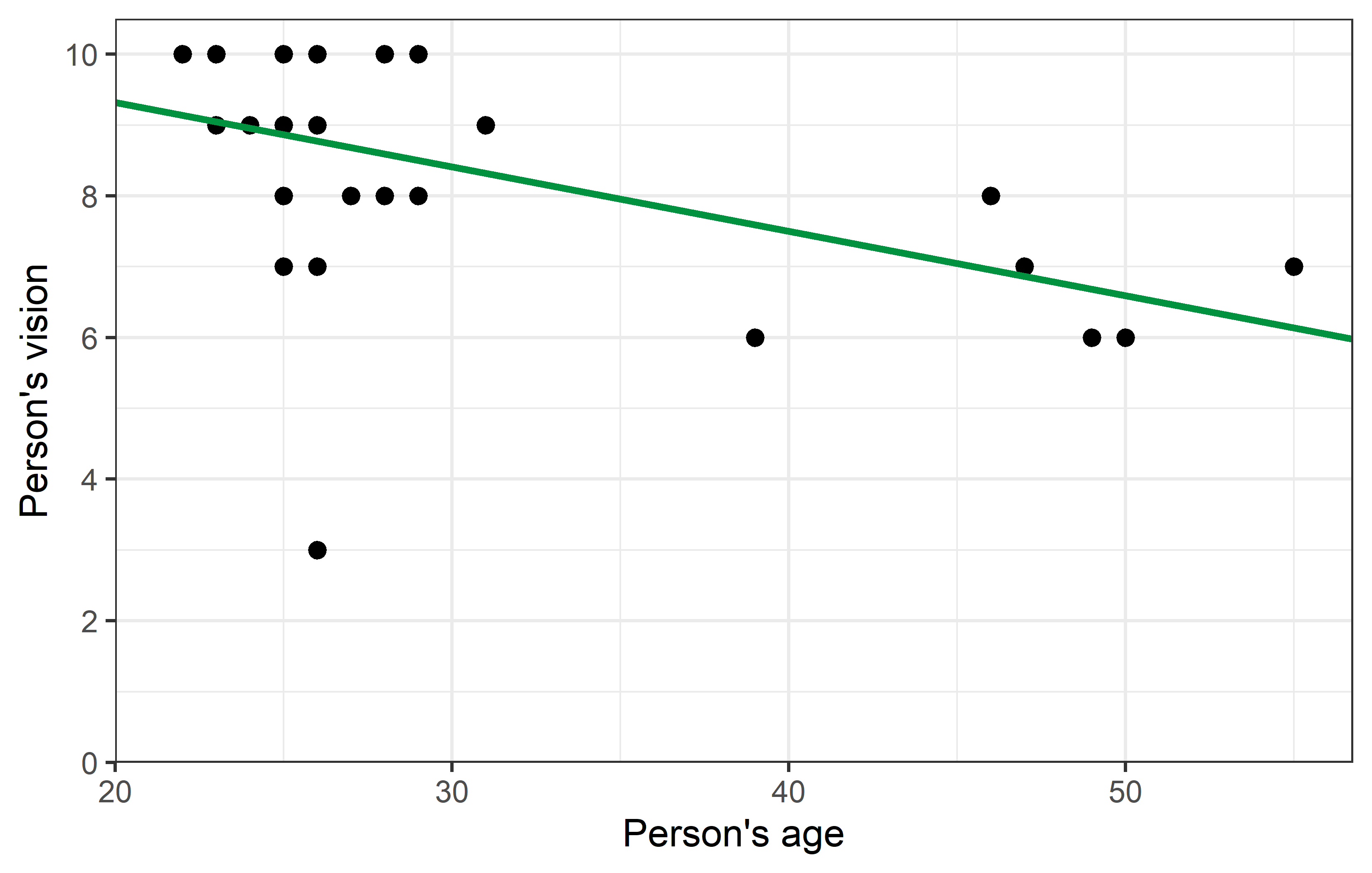
Outlier?
Looking at the plot, you may find one data point to oddly stick out from all others: Apparently there was one person in their mid-20s who had a vision score of only 3, which is the lowest by far.
Step 1: Investigate
In such a scenario, the first thing you should do is find out more about this suspicious data point. In our case, we would start by finding out the person’s name. One way of doing this is by simply filtering the data:
dat %>%
  filter(vision == 3)
# A tibble: 1 × 9
person ages gender civil_state height profession vision distance perc_dist
<chr> <dbl> <chr> <chr> <dbl> <chr> <dbl> <dbl> <dbl>
1 Rolando 26 M M 180 Professional 3 4.5 150We find that it was 26 year old Rolando who supposedly had a vision score of only 3.
Step 2: Act
Since we pretend it is you who collected the data, you should now
think back if you can actually remember Rolando and if he had poor vision and/or
find other documents such as your handwritten sheets to verify this number and make sure you did not make any typos transferring the data to your computer.
This may reaffirm or correct the suspicious data point and thus end the discussion on whether it is an outlier that should be removed from the data. However, you may also decide to delete this value. Yet, it must be realized, that deleting one or multiple values from a dataset almost always affects the results from subsequent statistical analyses - especially if the values stick out from the rest.
Corr. & Reg. - again
Let us estimate correlation and regression again, but this time excluding Rolando from the dataset. Note that there are multiple ways of obtaining such a subset - two are shown here:
We now apply the same functions to this new dataset:
and directly compare these results to those from above:
tidy(cor) %>%
  select(1, 3, 5, 6)
# A tibble: 1 × 4
estimate p.value conf.low conf.high
<dbl> <dbl> <dbl> <dbl>
1 -0.497 0.00709 -0.734 -0.153tidy(reg) %>%
select(1, 2, 3)# A tibble: 2 × 3
term estimate std.error
<chr> <dbl> <dbl>
1 (Intercept) 11.1 0.996
2 ages -0.0910 0.0311tidy(cor_noRo) %>%
select(1, 3, 5, 6)# A tibble: 1 × 4
estimate p.value conf.low conf.high
<dbl> <dbl> <dbl> <dbl>
1 -0.696 0.0000548 -0.851 -0.430tidy(reg_noRo) %>%
select(1, 2, 3)# A tibble: 2 × 3
term estimate std.error
<chr> <dbl> <dbl>
1 (Intercept) 11.7 0.679
2 ages -0.102 0.0211Code
ggplot(data = dat) +
  aes(x = ages, y = vision) +
  geom_point(size = 2) +
  geom_abline(
    intercept = reg$coefficients[1],
    slope = reg$coefficients[2],
    color = "#00923f",
    linewdith = 1
  ) +
  scale_x_continuous(
    name = "Person's age",
    limits = c(20, 55),
    expand = expansion(mult = c(0, 0.05))
  ) +
  scale_y_continuous(
    name = "Person's vision",
    limits = c(0, NA),
    breaks = seq(0, 10, 2),
    expand = expansion(mult = c(0, 0.05))
  ) +
  theme_bw()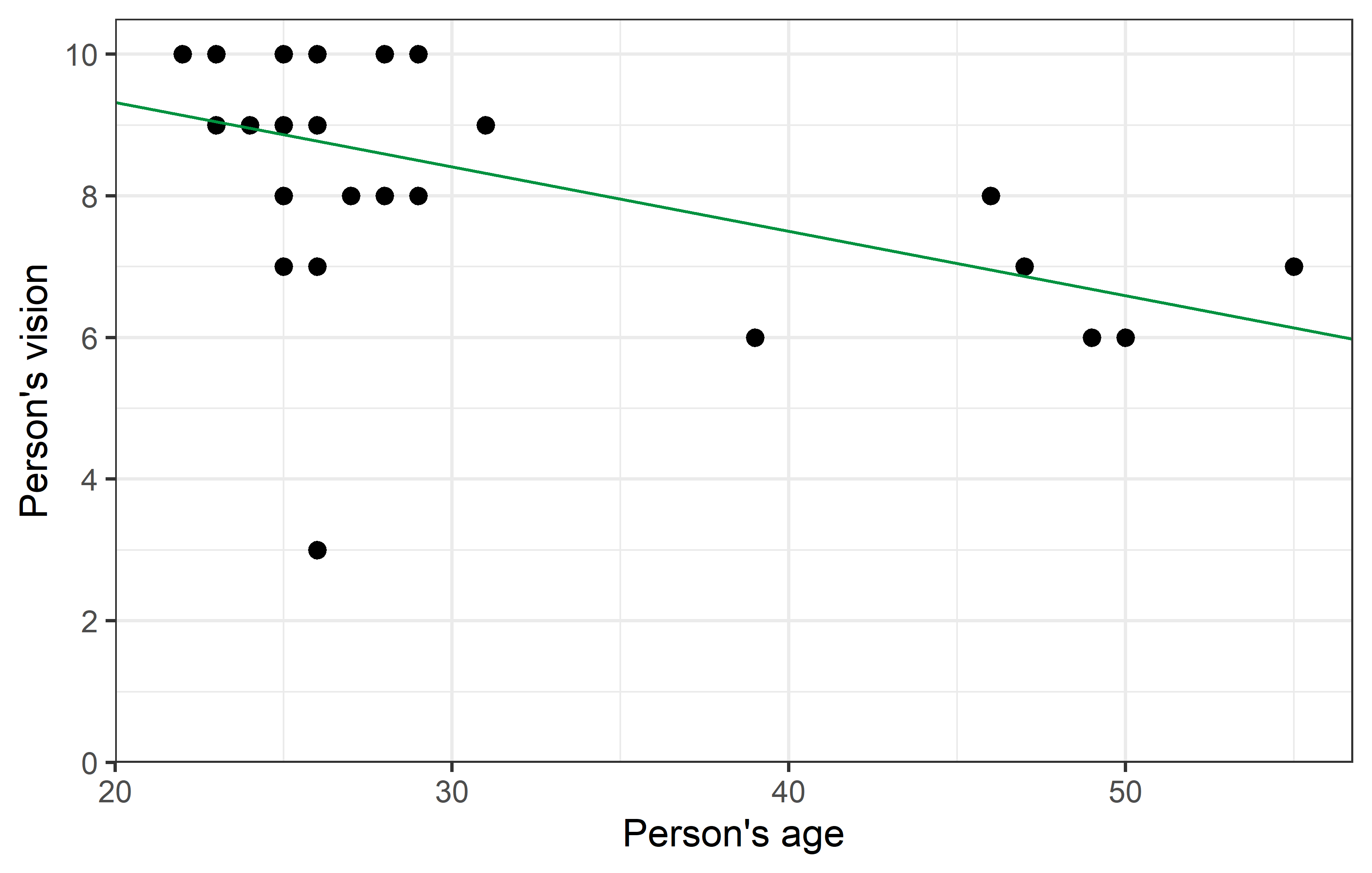
Code
ggplot(data = dat_noRo) +
  aes(x = ages, y = vision) +
  geom_point(size = 2) +
  geom_abline(
    intercept = reg_noRo$coefficients[1],
    slope = reg_noRo$coefficients[2],
    color = "#e4572e",
    linewdith = 1
  ) +
  scale_x_continuous(
    name = "Person's age",
    limits = c(20, 55),
    expand = expansion(mult = c(0, 0.05))
  ) +
  scale_y_continuous(
    name = "Person's vision",
    limits = c(0, NA),
    breaks = seq(0, 10, 2),
    expand = expansion(mult = c(0, 0.05))
  ) +
  theme_bw()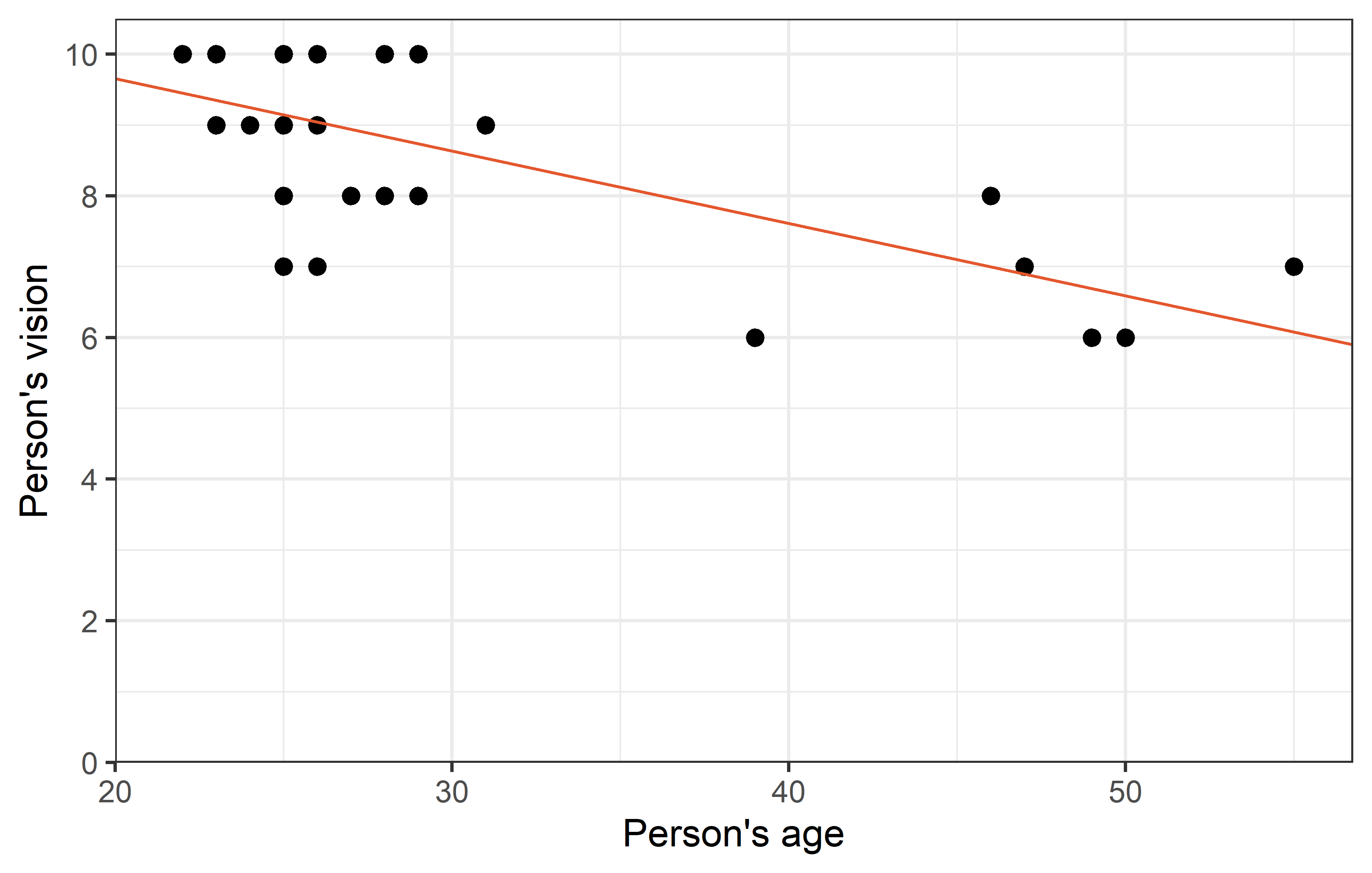
As we can see, removing Rolando from the dataset changed the correlation quite a bit from -0.5 to -0.7. Furthermore, it’s p-value became notably smaller. While it was already < 0.05 and thus statistically significant in this case, it must be realized that in other cases removing a single data point can indeed make the difference between a p-value larger and smaller 0.05.
Yet, regarding the parameter estimates - intercept (\(a\)) and slope (\(b\)) - of the simple linear regression, the changes are not as striking. Even with a visual comparison of the two regression lines, one must look closely to spot the differences.
R² - Coeff. of det.
Nevertheless, it is clear that the red line has a much better fit to the remaining data points, than the green line has - simply because Rolando’s data point sticks out so much. One way of measuring how well a regression fits the data is by calculating the coefficient of determination \(R^2\), which measures the proportion of total variation in the data explained by the model and can thus range from 0 (=bad) to 1 (=good). It can easily obtained via glance(), which is another function from {broom}:
glance(reg)# A tibble: 1 × 12
r.squared adj.r.squared sigma statistic p.value df logLik AIC BIC
<dbl> <dbl> <dbl> <dbl> <dbl> <dbl> <dbl> <dbl> <dbl>
1 0.247 0.218 1.54 8.54 0.00709 1 -50.9 108. 112.
# ℹ 3 more variables: deviance <dbl>, df.residual <int>, nobs <int>glance(reg_noRo)# A tibble: 1 × 12
r.squared adj.r.squared sigma statistic p.value df logLik AIC BIC
<dbl> <dbl> <dbl> <dbl> <dbl> <dbl> <dbl> <dbl> <dbl>
1 0.485 0.464 1.04 23.5 0.0000548 1 -38.4 82.7 86.6
# ℹ 3 more variables: deviance <dbl>, df.residual <int>, nobs <int>Finally, we find that removing Rolando from the dataset increased the \(R^2\) for the simple linear regression from 25% to 49%.
Citation
@online{schmidt2023,
  author = {Paul Schmidt},
  title = {Bad Data \& {Outliers}},
  date = {2023-11-14},
  url = {https://schmidtpaul.github.io/dsfair_quarto//ch/rbasics/baddata.html},
  langid = {en},
  abstract = {Cleaning data, dealing with missing data and comparing
    results for correlation and regression before vs. after removing an
    outlier from the data.}
}