Two-way split-plot design
Data
This dataset was originally published in Gomez and Gomez (1984) from a yield (kg/ha) trial with 4 genotypes (G) and 6 nitrogen levels (N), leading to 24 treatment level combinations. The data set here has 3 complete replicates (rep) and is laid out as a split-plot design.
Import
# data is available online:
path <- "https://raw.githubusercontent.com/SchmidtPaul/dsfair_quarto/master/data/Gomez&Gomez1984.csv"
dat <- read_csv(path) # use path from above
dat# A tibble: 72 × 7
yield row col rep mainplot G N
<dbl> <dbl> <dbl> <chr> <chr> <chr> <chr>
1 4520 4 1 rep1 mp01 Simba Goomba
2 5598 2 2 rep1 mp02 Simba Koopa
3 6192 1 3 rep1 mp03 Simba Toad
4 8542 2 4 rep1 mp04 Simba Peach
5 5806 2 5 rep1 mp05 Simba Diddy
6 7470 1 6 rep1 mp06 Simba Yoshi
7 4034 2 1 rep1 mp01 Nala Goomba
8 6682 4 2 rep1 mp02 Nala Koopa
9 6869 3 3 rep1 mp03 Nala Toad
10 6318 4 4 rep1 mp04 Nala Peach
# ℹ 62 more rowsFormat
Before anything, the columns rep, N and G should be encoded as factors, since R by default encoded them as character.
Explore
We make use of dlookr::describe() to conveniently obtain descriptive summary tables. Here, we get can summarize per nitrogen level, per genotype and also per nitrogen-genotype-combination.
dat %>%
  group_by(N) %>%
  dlookr::describe(yield) %>%
  select(2:sd) %>%
  arrange(desc(mean))
# A tibble: 6 × 5
N n na mean sd
<fct> <int> <int> <dbl> <dbl>
1 Diddy 12 0 5866. 832.
2 Toad 12 0 5864. 1434.
3 Yoshi 12 0 5812 2349.
4 Peach 12 0 5797. 2660.
5 Koopa 12 0 5478. 657.
6 Goomba 12 0 4054. 672.dat %>%
group_by(G) %>%
dlookr::describe(yield) %>%
select(2:sd) %>%
arrange(desc(mean))# A tibble: 4 × 5
G n na mean sd
<fct> <int> <int> <dbl> <dbl>
1 Simba 18 0 6554. 1475.
2 Nala 18 0 6156. 1078.
3 Timon 18 0 5563. 1269.
4 Pumba 18 0 3642. 1434.dat %>%
group_by(N, G) %>%
dlookr::describe(yield) %>%
select(2:sd) %>%
arrange(desc(mean)) %>%
print(n=Inf)# A tibble: 24 × 6
N G n na mean sd
<fct> <fct> <int> <int> <dbl> <dbl>
1 Peach Simba 3 0 8701. 270.
2 Yoshi Simba 3 0 7563. 86.9
3 Yoshi Nala 3 0 6951. 808.
4 Toad Nala 3 0 6895 166.
5 Toad Simba 3 0 6733. 490.
6 Yoshi Timon 3 0 6687. 496.
7 Peach Nala 3 0 6540. 936.
8 Diddy Simba 3 0 6400 523.
9 Diddy Nala 3 0 6259 499.
10 Peach Timon 3 0 6065. 1097.
11 Toad Timon 3 0 6014 515.
12 Diddy Timon 3 0 5994 101.
13 Koopa Nala 3 0 5982 684.
14 Koopa Simba 3 0 5672 458.
15 Koopa Timon 3 0 5443. 589.
16 Koopa Pumba 3 0 4816 506.
17 Diddy Pumba 3 0 4812 963.
18 Goomba Pumba 3 0 4481. 463.
19 Goomba Nala 3 0 4306 646.
20 Goomba Simba 3 0 4253. 248.
21 Toad Pumba 3 0 3816 1311.
22 Goomba Timon 3 0 3177. 453.
23 Yoshi Pumba 3 0 2047. 703.
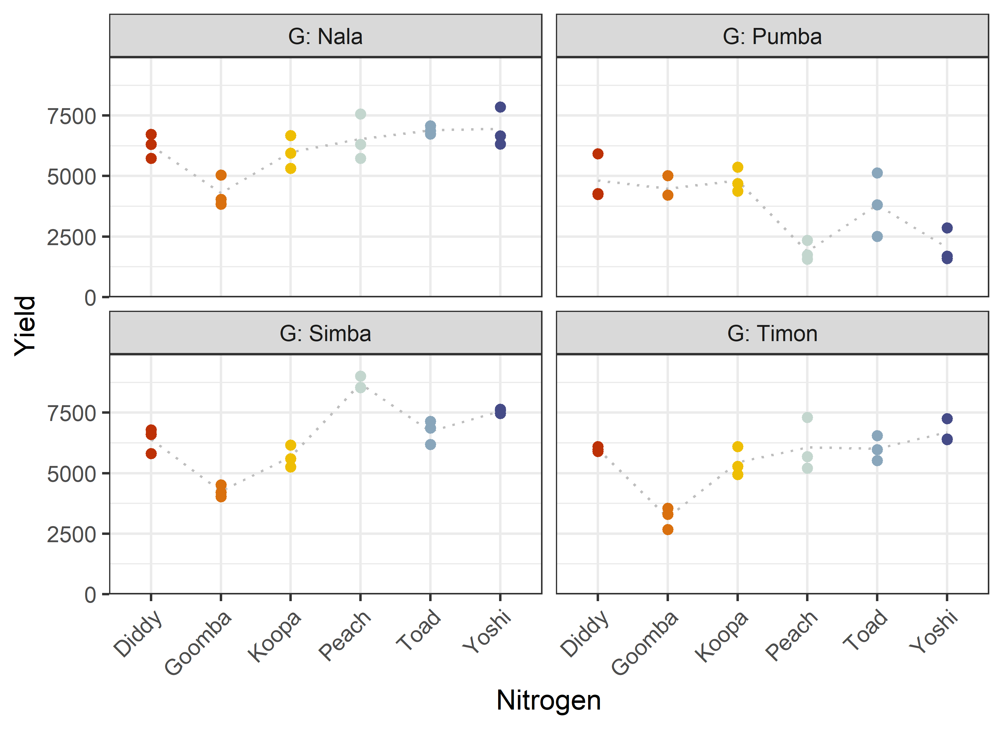
24 Peach Pumba 3 0 1881. 407. Additionally, we can decide to plot our data. One way to deal with the combination of two factors would be to use panels/facets in ggplot2.
Note that we here define a custom set of colors for the Nitrogen levels that will be used throughout this chapter.
Code
ggplot(data = dat) +
  aes(y = yield, x = N, color = N) +
  facet_wrap(~G, labeller = label_both) +
  stat_summary(
    fun = mean,
    colour = "grey",
    geom = "line",
    linetype = "dotted",
    group = 1
  ) +
  geom_point() +
  scale_x_discrete(
    name = "Nitrogen"
  ) +
  scale_y_continuous(
    name = "Yield",
    limits = c(0, NA),
    expand = expansion(mult = c(0, 0.1))
  ) +
  scale_color_manual(
    values = Ncolors,
    guide = "none"
  ) +
  theme_bw() +
  theme(axis.text.x = element_text(
    angle = 45,
    hjust = 1,
    vjust = 1
  ))
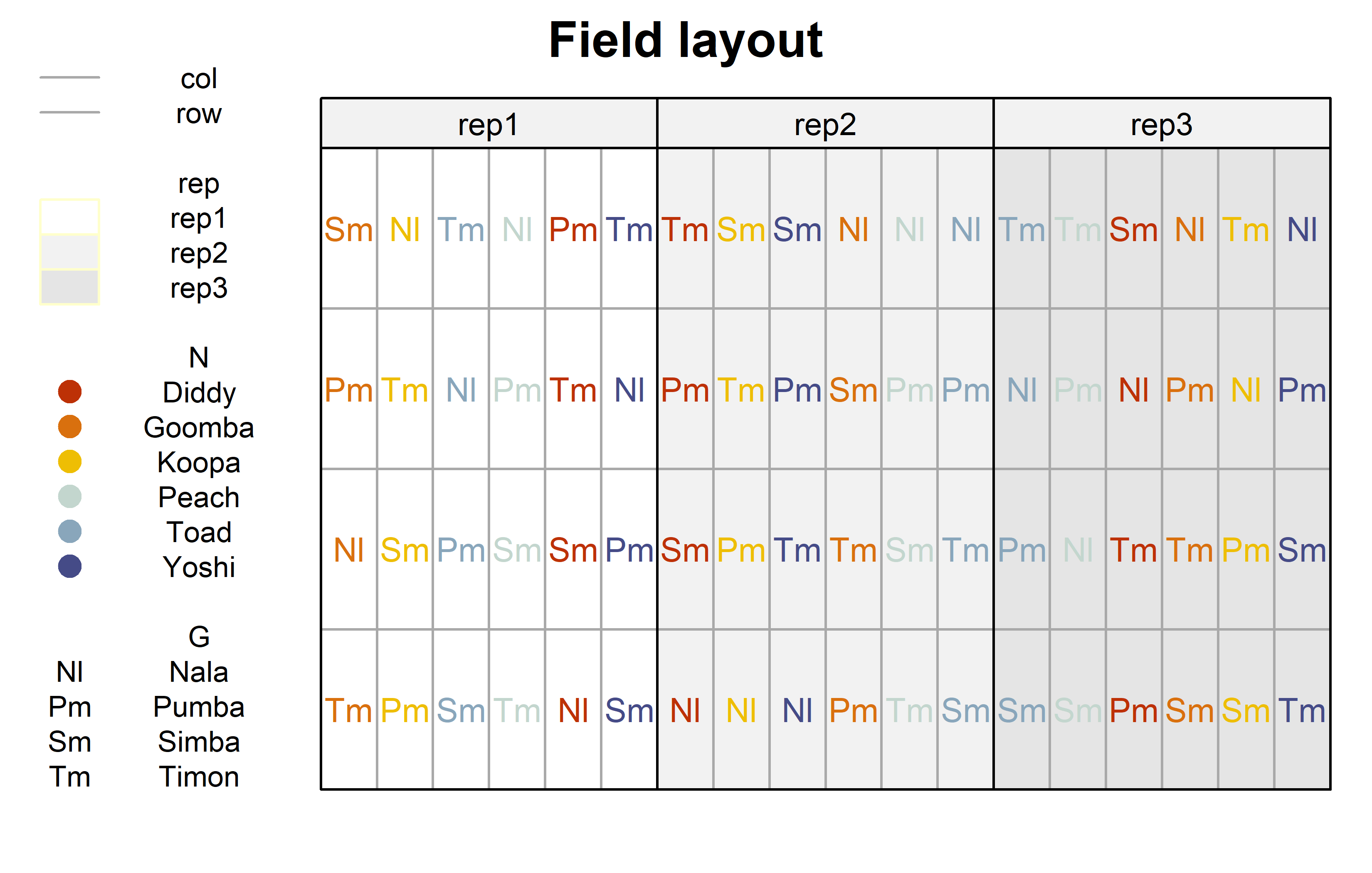
Finally, since this is an experiment that was laid with a certain experimental design (= a split-plot design) - it makes sense to also get a field plan. This can be done via desplot() from {desplot}.
Code
desplot(
  data = dat,
  form = rep ~ col + row | rep, # fill color per rep, headers per rep
  col.regions = c("white", "grey95", "grey90"),
  text = G, # genotype names per plot
  cex = 0.8, # genotype names: font size
  shorten = "abb", # genotype names: abbreviate
  col = N, # color of genotype names for each N-level
  col.text = Ncolors, # use custom colors from above
  out1 = col, out1.gpar = list(col = "darkgrey"), # lines between columns
  out2 = row, out2.gpar = list(col = "darkgrey"), # lines between rows
  main = "Field layout", # plot title
  show.key = TRUE, # show legend
  key.cex = 0.7 # legend font size
  )
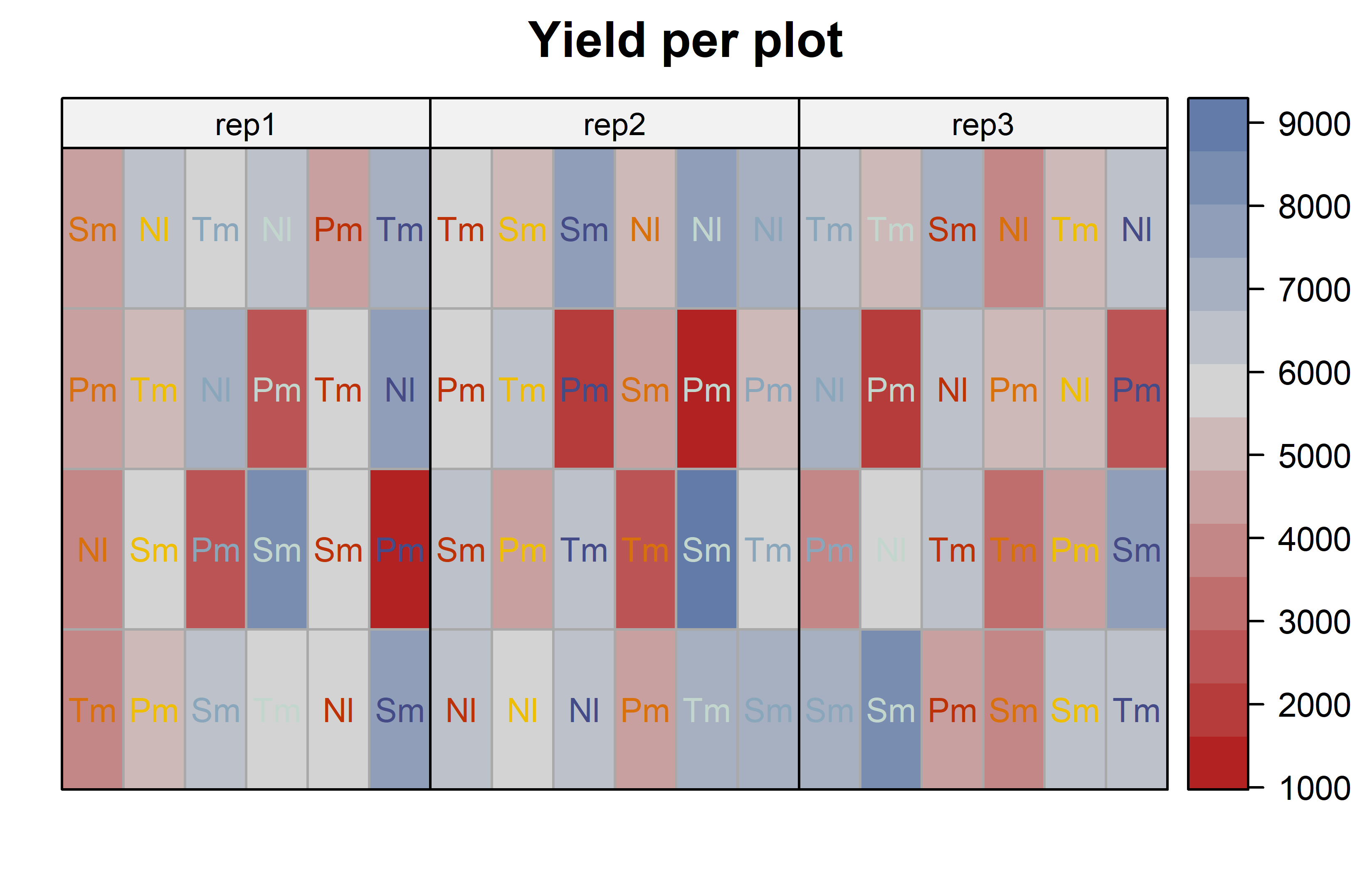
Code
desplot(
  data = dat,
  form = yield ~ col + row | rep, # fill color per rep, headers per rep
  text = G, # genotype names per plot
  cex = 0.8, # genotype names: font size
  shorten = "abb", # genotype names: abbreviate
  col  = N, # color of genotype names for each N-level
  col.text = Ncolors, # use custom colors from above
  out1 = col, out1.gpar = list(col = "darkgrey"), # lines between columns
  out2 = row, out2.gpar = list(col = "darkgrey"), # lines between rows
  main = "Yield per plot", # plot title
  show.key = FALSE # show legend
  )
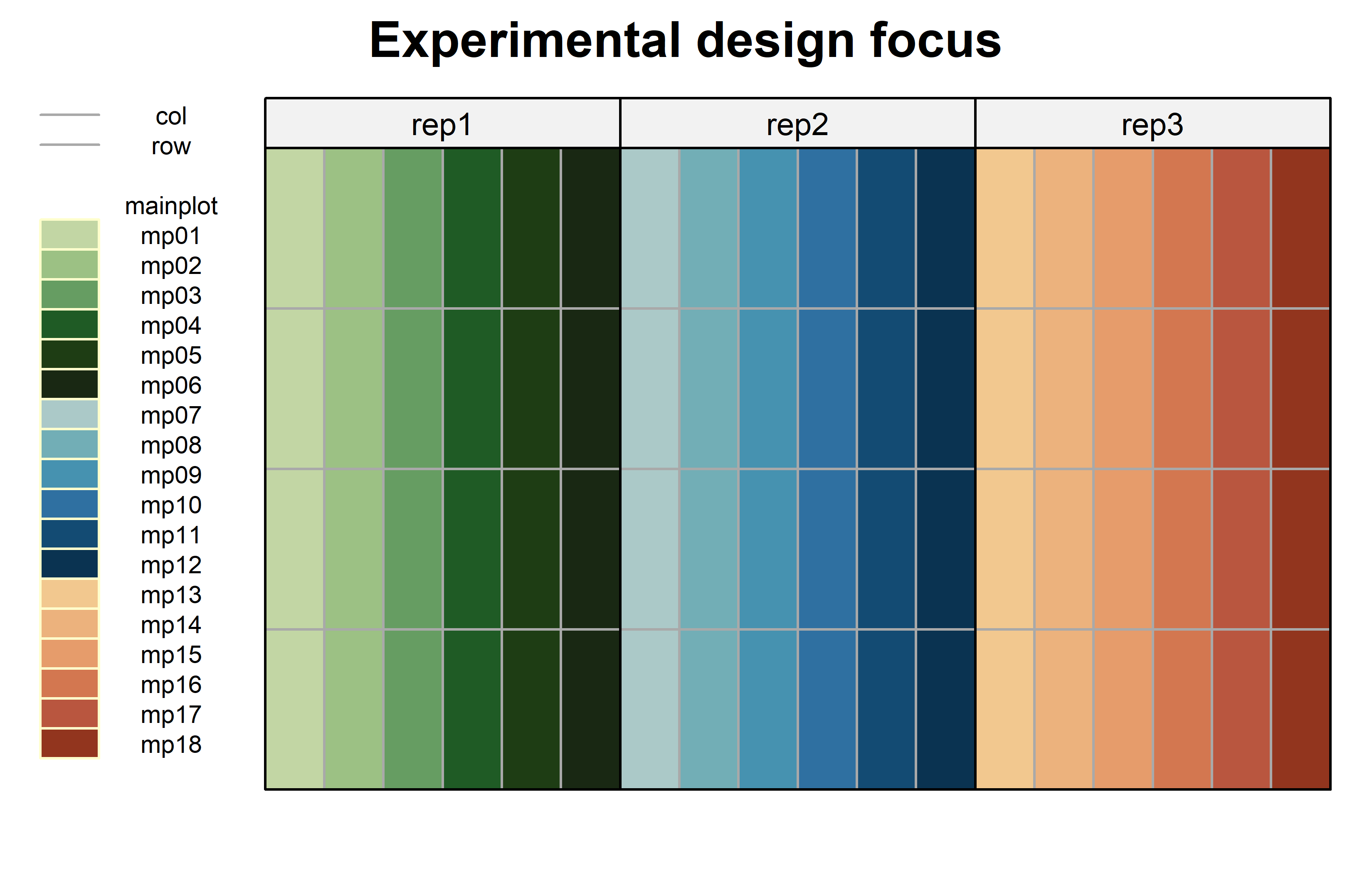
Code
mainplotcolors <- c(met.brewer("VanGogh3", 6),
                    met.brewer("Hokusai2", 6),
                    met.brewer("OKeeffe2", 6)) %>%
  as.vector() %>%
  set_names(levels(dat$mainplot))

desplot(
  data = dat,
  form = mainplot ~ col + row | rep, # fill color per rep, headers per rep
  col.regions = mainplotcolors,
  out1 = col, out1.gpar = list(col = "darkgrey"), # lines between columns
  out2 = row, out2.gpar = list(col = "darkgrey"), # lines between rows
  main = "Experimental design focus", # plot title
  show.key = TRUE, # don't show legend
  key.cex = 0.6
  )
Model
Finally, we can decide to fit a linear model with yield as the response variable. In this example it makes sense to mentally group the effects in our model as either design effects or treatment effects. The treatments here are the genotypes G and the nitrogen levels N which we will include in the model as main effects, but also via their interaction effect N:G. Regarding the design, the model needs to contain a block (rep) effect representing the three complete blocks. Additionally, there should also be random effects for the 18 mainplots, since they represent additional randomization units.
mod <- lmer(yield ~ G + N + G:N +
              rep + (1 | rep:mainplot),
data = dat)It would be at this moment (i.e. after fitting the model and before running the ANOVA), that you should check whether the model assumptions are met. Find out more in the summary article “Model Diagnostics”
ANOVA
Based on our model, we can then conduct an ANOVA:
ANOVA <- anova(mod)
ANOVA
Type III Analysis of Variance Table with Satterthwaite's method
Sum Sq Mean Sq NumDF DenDF F value Pr(>F)
G 89885051 29961684 3 36 85.7416 < 2.2e-16 ***
N 19192886 3838577 5 10 10.9849 0.0008277 ***
rep 683088 341544 2 10 0.9774 0.4095330
G:N 69378044 4625203 15 36 13.2360 2.078e-10 ***
---
Signif. codes: 0 '***' 0.001 '**' 0.01 '*' 0.05 '.' 0.1 ' ' 1Accordingly, the ANOVA’s F-test found the nitrogen-genotype-interaction to be statistically significant (p < .001***).
Mean comparison
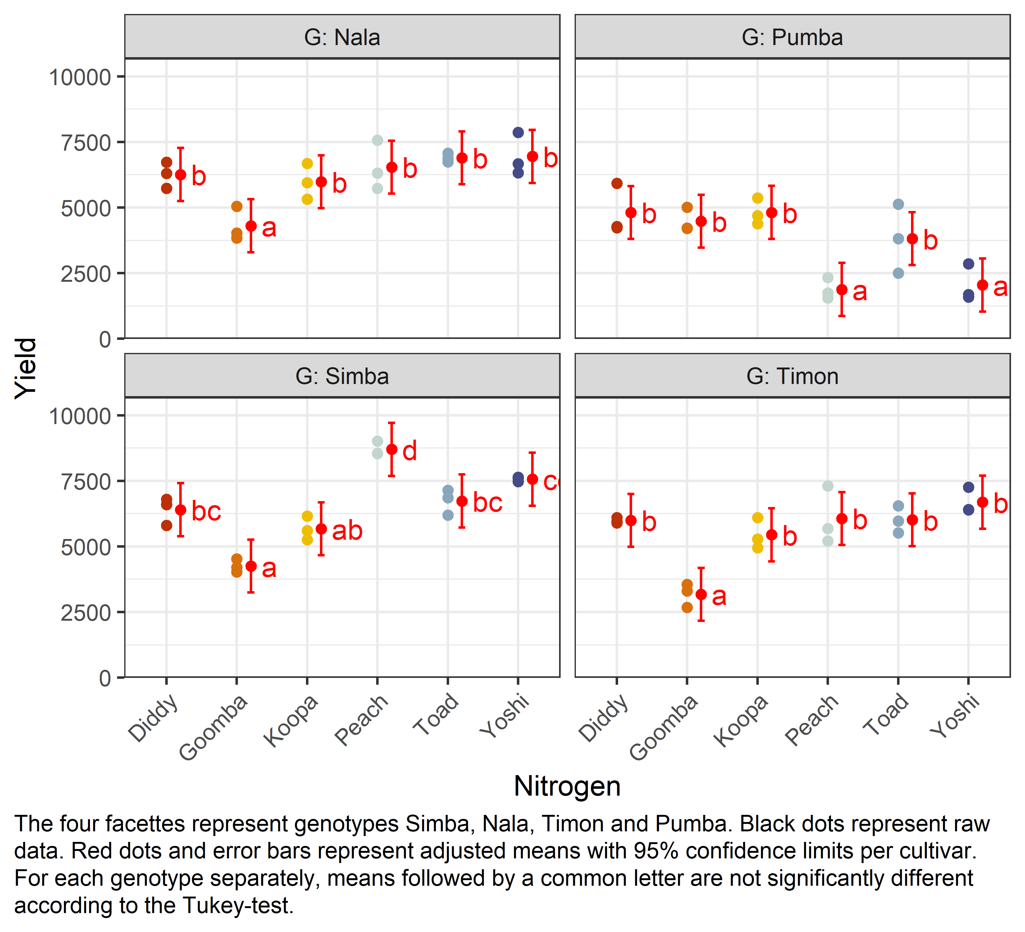
Besides an ANOVA, one may also want to compare adjusted yield means between cultivars via post hoc tests (t-test, Tukey test etc.). Especially because of the results of this ANOVA, we should compare means for all N:G interactions and not for the N and/or G main effects. When doing so, we still have multiple options to choose from. I here decide to compare all genotype means per nitrogen
mean_comp <- mod %>%
  emmeans(specs = ~ N|G) %>% # adj. mean per cultivar
  cld(adjust = "Tukey", Letters = letters) # compact letter display (CLD)

mean_comp
G = Nala:
N emmean SE df lower.CL upper.CL .group
Goomba 4306 366 41.9 3297 5315 a
Koopa 5982 366 41.9 4973 6991 b
Diddy 6259 366 41.9 5250 7268 b
Peach 6540 366 41.9 5531 7550 b
Toad 6895 366 41.9 5886 7904 b
Yoshi 6951 366 41.9 5941 7960 b
G = Pumba:
N emmean SE df lower.CL upper.CL .group
Peach 1881 366 41.9 871 2890 a
Yoshi 2047 366 41.9 1037 3056 a
Toad 3816 366 41.9 2807 4825 b
Goomba 4481 366 41.9 3472 5491 b
Diddy 4812 366 41.9 3803 5821 b
Koopa 4816 366 41.9 3807 5825 b
G = Simba:
N emmean SE df lower.CL upper.CL .group
Goomba 4253 366 41.9 3243 5262 a
Koopa 5672 366 41.9 4663 6681 ab
Diddy 6400 366 41.9 5391 7409 bc
Toad 6733 366 41.9 5723 7742 bc
Yoshi 7563 366 41.9 6554 8573 cd
Peach 8701 366 41.9 7691 9710 d
G = Timon:
N emmean SE df lower.CL upper.CL .group
Goomba 3177 366 41.9 2168 4187 a
Koopa 5443 366 41.9 4433 6452 b
Diddy 5994 366 41.9 4985 7003 b
Toad 6014 366 41.9 5005 7023 b
Peach 6065 366 41.9 5056 7075 b
Yoshi 6687 366 41.9 5678 7697 b
Results are averaged over the levels of: rep
Degrees-of-freedom method: kenward-roger
Confidence level used: 0.95
Conf-level adjustment: sidak method for 6 estimates
P value adjustment: tukey method for comparing a family of 6 estimates
significance level used: alpha = 0.05
NOTE: If two or more means share the same grouping symbol,
then we cannot show them to be different.
But we also did not show them to be the same. Note that if you would like to see the underlying individual contrasts/differences between adjusted means, simply add details = TRUE to the cld() statement. Furthermore, check out the Summary Article “Compact Letter Display”.
Finally, we can create a plot that displays both the raw data and the results, i.e. the comparisons of the adjusted means that are based on the linear model.
Code
my_caption <- "The four facettes represent genotypes Simba, Nala, Timon and Pumba. Black dots represent raw data. Red dots and error bars represent adjusted means with 95% confidence limits per cultivar. For each genotype separately, means followed by a common letter are not significantly different according to the Tukey-test."

ggplot() +
  facet_wrap(~G, labeller = label_both) + # facette per G level
  aes(x = N) +
  # black dots representing the raw data
  geom_point(
    data = dat,
    aes(y = yield, color = N)
  ) +
  # red dots representing the adjusted means
  geom_point(
    data = mean_comp,
    aes(y = emmean),
    color = "red",
    position = position_nudge(x = 0.2)
  ) +
  # red error bars representing the confidence limits of the adjusted means
  geom_errorbar(
    data = mean_comp,
    aes(ymin = lower.CL, ymax = upper.CL),
    color = "red",
    width = 0.1,
    position = position_nudge(x = 0.2)
  ) +
  # red letters
  geom_text(
    data = mean_comp,
    aes(y = emmean, label = str_trim(.group)),
    color = "red",
    position = position_nudge(x = 0.35),
    hjust = 0
  ) +
  scale_x_discrete(
    name = "Nitrogen"
  ) +
  scale_y_continuous(
    name = "Yield",
    limits = c(0, NA),
    expand = expansion(mult = c(0, 0.1))
  ) +
  scale_color_manual(
    values = Ncolors,
    guide = "none"
  ) +
  theme_bw() +
  labs(caption = my_caption) +
  theme(
    plot.caption = element_textbox_simple(margin = margin(t = 5)),
    plot.caption.position = "plot",
    axis.text.x = element_text(
      angle = 45,
      hjust = 1,
      vjust = 1
    )
  )
References
Citation
@online{schmidt2023,
  author = {Paul Schmidt},
  title = {Two-Way Split-Plot Design},
  date = {2023-11-17},
  url = {https://schmidtpaul.github.io/dsfair_quarto//ch/exan/simple/splitplot_gomezgomez1984.html},
  langid = {en},
  abstract = {Two-way ANOVA \& pairwise comparison post hoc tests in a
    split-plot design.}
}