One-way latin square design
Data
This example data is taken from {agridat}. It considers data published in Bridges (1989) from a cucumber yield trial with four genotypes set up as a Latin square design. Notice that the original dataset considers two trials (at two locations), but we will focus on only a single trial here.
Import
dat <- agridat::bridges.cucumber %>%
  as_tibble() %>%
  filter(loc == "Clemson") %>% # filter data from only one location
  select(-loc) # remove loc column which is now unnecessary

dat
# A tibble: 16 × 4
gen row col yield
<fct> <int> <int> <dbl>
1 Dasher 1 3 44.2
2 Dasher 2 4 54.1
3 Dasher 3 2 47.2
4 Dasher 4 1 36.7
5 Guardian 1 4 33
6 Guardian 2 2 13.6
7 Guardian 3 1 44.1
8 Guardian 4 3 35.8
9 Poinsett 1 1 11.5
10 Poinsett 2 3 22.4
11 Poinsett 3 4 30.3
12 Poinsett 4 2 21.5
13 Sprint 1 2 15.1
14 Sprint 2 1 20.3
15 Sprint 3 3 41.3
16 Sprint 4 4 27.1Format
For our analysis, gen, row and col should be encoded as factors. However, the desplot() function needs row and col as formatted as integers. Therefore we create copies of these columns encoded as factors and named rowF and colF. Below are two ways how to achieve this:
Explore
We make use of dlookr::describe() to conveniently obtain descriptive summary tables. Here, we get can summarize per genotype, per row and per column.
dat %>%
  group_by(gen) %>%
  dlookr::describe(yield) %>%
  select(2:sd) %>%
  arrange(desc(mean))
# A tibble: 4 × 5
gen n na mean sd
<fct> <int> <int> <dbl> <dbl>
1 Dasher 4 0 45.6 7.21
2 Guardian 4 0 31.6 12.9
3 Sprint 4 0 26.0 11.4
4 Poinsett 4 0 21.4 7.71dat %>%
group_by(rowF) %>%
dlookr::describe(yield) %>%
select(2:sd) %>%
arrange(desc(mean))# A tibble: 4 × 5
rowF n na mean sd
<fct> <int> <int> <dbl> <dbl>
1 3 4 0 40.7 7.36
2 4 4 0 30.3 7.28
3 2 4 0 27.6 18.1
4 1 4 0 26.0 15.4 dat %>%
group_by(colF) %>%
dlookr::describe(yield) %>%
select(2:sd) %>%
arrange(desc(mean))# A tibble: 4 × 5
colF n na mean sd
<fct> <int> <int> <dbl> <dbl>
1 4 4 0 36.1 12.2
2 3 4 0 35.9 9.67
3 1 4 0 28.2 14.9
4 2 4 0 24.4 15.6 Additionally, we can decide to plot our data:
Code
ggplot(data = dat) +
  aes(y = yield, x = gen, color = colF, shape = rowF) +
  geom_point() +
    scale_x_discrete(
    name = "Genotype"
  ) +
  scale_y_continuous(
    name = "Yield",
    limits = c(0, NA),
    expand = expansion(mult = c(0, 0.1))
  ) +
  scale_color_discrete(
    name = "Column"
  ) +
  scale_shape_discrete(
    name = "Row"
  ) +
  theme_classic()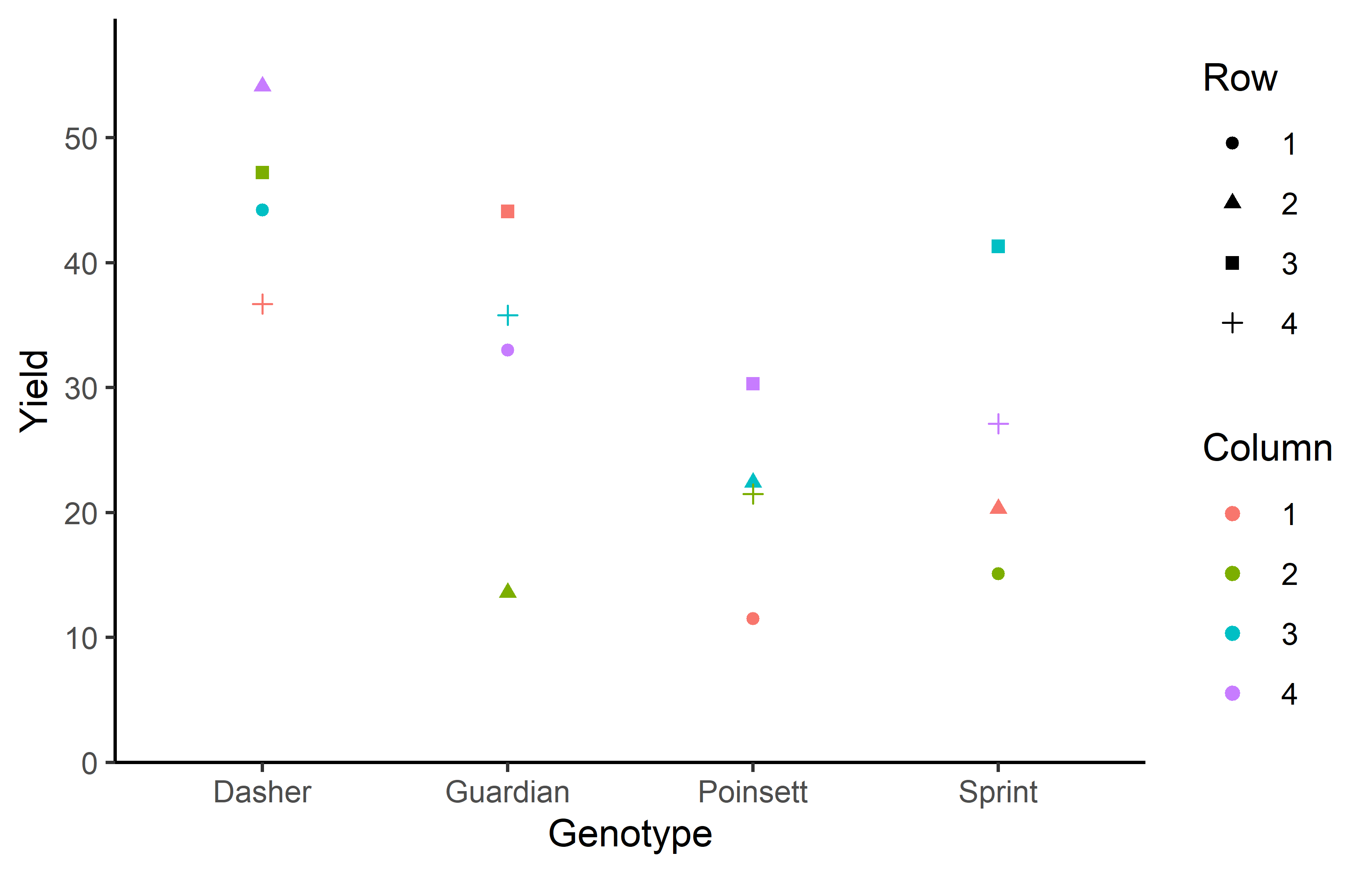
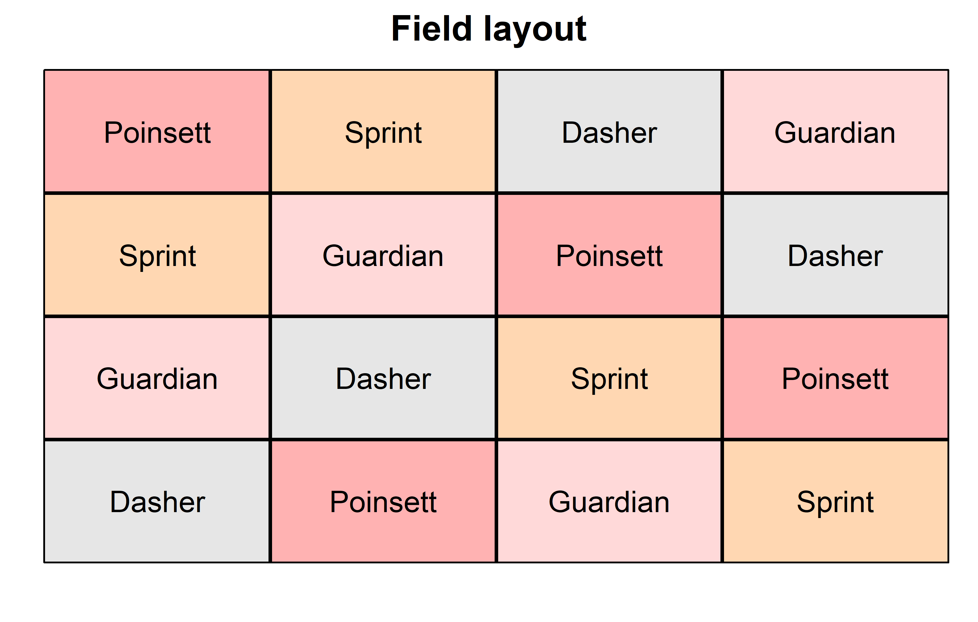
Finally, since this is an experiment that was laid with a certain experimental design (= a Latin square design) - it makes sense to also get a field plan. This can be done via desplot() from {desplot}. We can even create a second field plan that gives us a feeling for the yields per plot.
Code
desplot(
  data = dat,
  flip = TRUE, # row 1 on top, not on bottom
  form = gen ~ col + row, # fill color per genotype
  out1 = rowF, # line between rows
  out2 = colF, # line between columns
  out1.gpar = list(col = "black", lwd = 2), # out1 line style
  out2.gpar = list(col = "black", lwd = 2), # out2 line style
  text = gen, # gen names per plot
  cex = 1, # gen names: font size
  shorten = FALSE, # gen names: don't abbreviate
  main = "Field layout", # plot title
  show.key = FALSE # hide legend
) 
Code
desplot(
  data = dat,
  flip = TRUE, # row 1 on top, not on bottom
  form = yield ~ col + row, # fill color according to yield
  out1 = rowF, # line between rows
  out2 = colF, # line between columns
  out1.gpar = list(col = "black", lwd = 2), # out1 line style
  out2.gpar = list(col = "black", lwd = 2), # out2 line style
  text = gen, # gen names per plot
  cex = 1, # gen names: font size
  shorten = FALSE, # gen names: don't abbreviate
  main = "Yield per plot", # plot title
  show.key = FALSE # hide legend
) 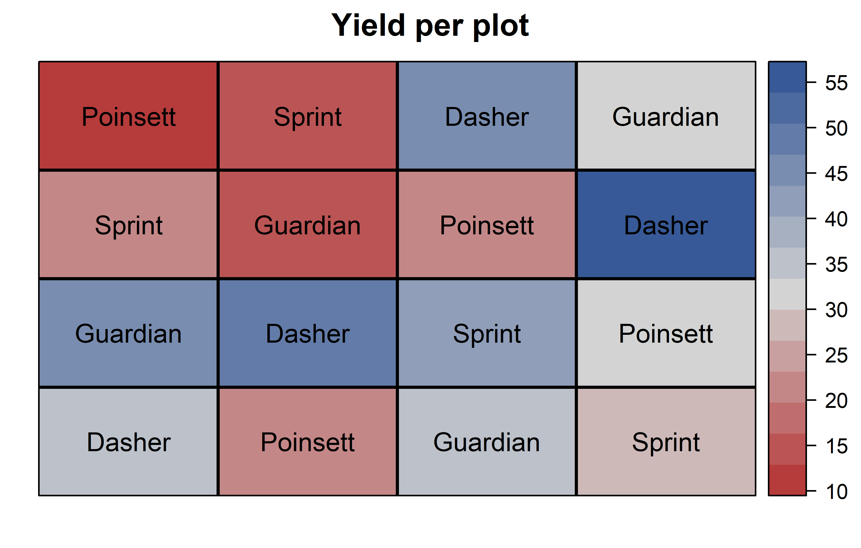
Thus, Dasher seems to be the most promising genotype in terms of yield. Moreover, it can be seen that yields were generally higher in column 4 and row 3.
Model
Finally, we can decide to fit a linear model with yield as the response variable and (fixed) gen, rowF and colF effects.
mod <- lm(yield ~ gen + rowF + colF, data = dat)It is crucial to add rowF/colF and not row/col to the model here, since only the former are formatted as factors. They should be formatted as factors, so that the model estimates one effect for each of their levels. The model would estimate a single slope for row and col, respectively, which is nonsensical: It would suggest that row 4 is twice as much as row 2 etc.
It would be at this moment (i.e. after fitting the model and before running the ANOVA), that you should check whether the model assumptions are met. Find out more in the summary article “Model Diagnostics”
ANOVA
Based on our model, we can then conduct an ANOVA:
ANOVA <- anova(mod)
ANOVA
Analysis of Variance Table
Response: yield
Df Sum Sq Mean Sq F value Pr(>F)
gen 3 1316.80 438.93 9.3683 0.01110 *
rowF 3 528.35 176.12 3.7589 0.07872 .
colF 3 411.16 137.05 2.9252 0.12197
Residuals 6 281.12 46.85
---
Signif. codes: 0 '***' 0.001 '**' 0.01 '*' 0.05 '.' 0.1 ' ' 1Accordingly, the ANOVA’s F-test found the genotype effects to be statistically significant (p = 0.011*).
Mean comparison
Besides an ANOVA, one may also want to compare adjusted yield means between genotypes via post hoc tests (t-test, Tukey test etc.).
mean_comp <- mod %>%
  emmeans(specs = ~ gen) %>% # adj. mean per genotype
  cld(adjust = "Tukey", Letters = letters) # compact letter display (CLD)

mean_comp
gen emmean SE df lower.CL upper.CL .group
Poinsett 21.4 3.42 6 9.43 33.4 a
Sprint 25.9 3.42 6 13.95 37.9 a
Guardian 31.6 3.42 6 19.63 43.6 ab
Dasher 45.5 3.42 6 33.55 57.5 b
Results are averaged over the levels of: rowF, colF
Confidence level used: 0.95
Conf-level adjustment: sidak method for 4 estimates
P value adjustment: tukey method for comparing a family of 4 estimates
significance level used: alpha = 0.05
NOTE: If two or more means share the same grouping symbol,
then we cannot show them to be different.
But we also did not show them to be the same. Note that if you would like to see the underlying individual contrasts/differences between adjusted means, simply add details = TRUE to the cld() statement. Furthermore, check out the Summary Article “Compact Letter Display”.
Finally, we can create a plot that displays both the raw data and the results, i.e. the comparisons of the adjusted means that are based on the linear model.
Code
my_caption <- "Black dots represent raw data. Red dots and error bars represent adjusted means with 95% confidence limits per genotype Means followed by a common letter are not significantly different according to the Tukey-test."

ggplot() +
  aes(x = gen) +
  # black dots representing the raw data
  geom_point(
    data = dat,
    aes(y = yield)
  ) +
  # red dots representing the adjusted means
  geom_point(
    data = mean_comp,
    aes(y = emmean),
    color = "red",
    position = position_nudge(x = 0.1)
  ) +
  # red error bars representing the confidence limits of the adjusted means
  geom_errorbar(
    data = mean_comp,
    aes(ymin = lower.CL, ymax = upper.CL),
    color = "red",
    width = 0.1,
    position = position_nudge(x = 0.1)
  ) +
  # red letters
  geom_text(
    data = mean_comp,
    aes(y = emmean, label = str_trim(.group)),
    color = "red",
    position = position_nudge(x = 0.2),
    hjust = 0
  ) +
  scale_x_discrete(
    name = "Genotype"
  ) +
  scale_y_continuous(
    name = "Yield",
    limits = c(0, NA),
    expand = expansion(mult = c(0, 0.1))
  ) +
  scale_color_discrete(
    name = "Block"
  ) +
  theme_classic() +
  labs(caption = my_caption) +
  theme(plot.caption = element_textbox_simple(margin = margin(t = 5)),
        plot.caption.position = "plot")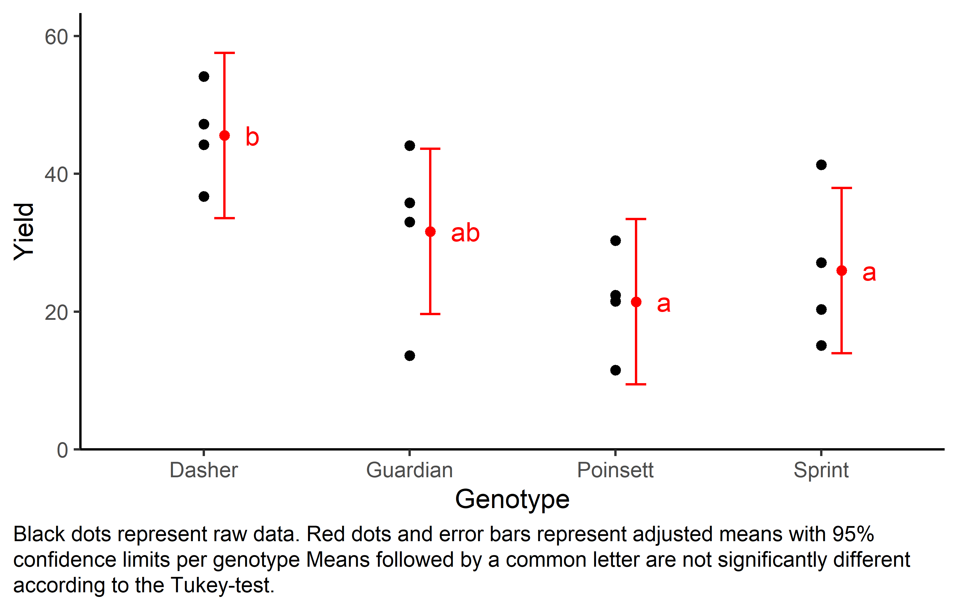
References
Citation
@online{schmidt2023,
  author = {Paul Schmidt},
  title = {One-Way Latin Square Design},
  date = {2023-11-08},
  url = {https://schmidtpaul.github.io/dsfair_quarto//ch/exan/simple/latsq_bridges1989.html},
  langid = {en},
  abstract = {One-way ANOVA \& pairwise comparison post hoc tests in a
    latin square design.}
}