One-way row column design
Data
This example is taken from Chapter “3.10 Analysis of a resolvable row-column design” of the course material “Mixed models for metric data (3402-451)” by Prof. Dr. Hans-Peter Piepho. It considers data published in Kempton, Fox, and Cerezo (1996) from a yield trial laid out as a resolvable row-column design. The trial had 35 genotypes (gen), 2 complete replicates (rep) with 5 rows (row) and 7 columns (col). Thus, a complete replicate is subdivided into incomplete rows and columns.
Import
The data is available as part of the {agridat} package:
dat <- as_tibble(agridat::kempton.rowcol)
dat
# A tibble: 68 × 5
rep row col gen yield
<fct> <int> <int> <fct> <dbl>
1 R1 1 1 G20 3.77
2 R1 1 2 G04 3.21
3 R1 1 3 G33 4.55
4 R1 1 4 G28 4.09
5 R1 1 5 G07 5.05
6 R1 1 6 G12 4.19
7 R1 1 7 G30 3.27
8 R1 2 1 G10 3.44
9 R1 2 2 G14 4.3
10 R1 2 4 G21 3.86
# ℹ 58 more rowsFormat
For our analysis, gen, row and col should be encoded as factors. However, the desplot() function needs row and col as formatted as integers. Therefore we create copies of these columns encoded as factors and named rowF and colF:
Explore
We make use of dlookr::describe() to conveniently obtain descriptive summary tables. Here, we get can summarize per block and per cultivar.
dat %>%
  group_by(gen) %>%
  dlookr::describe(yield) %>%
  select(2:sd) %>%
  arrange(desc(mean))
# A tibble: 35 × 5
gen n na mean sd
<fct> <int> <int> <dbl> <dbl>
1 G19 2 0 6.07 1.84
2 G07 2 0 5.74 0.976
3 G33 2 0 5.13 0.820
4 G06 2 0 4.96 0.940
5 G09 2 0 4.94 1.68
6 G11 2 0 4.93 1.03
7 G14 2 0 4.92 0.877
8 G27 2 0 4.89 1.80
9 G03 2 0 4.78 0.0424
10 G25 2 0 4.78 0.361
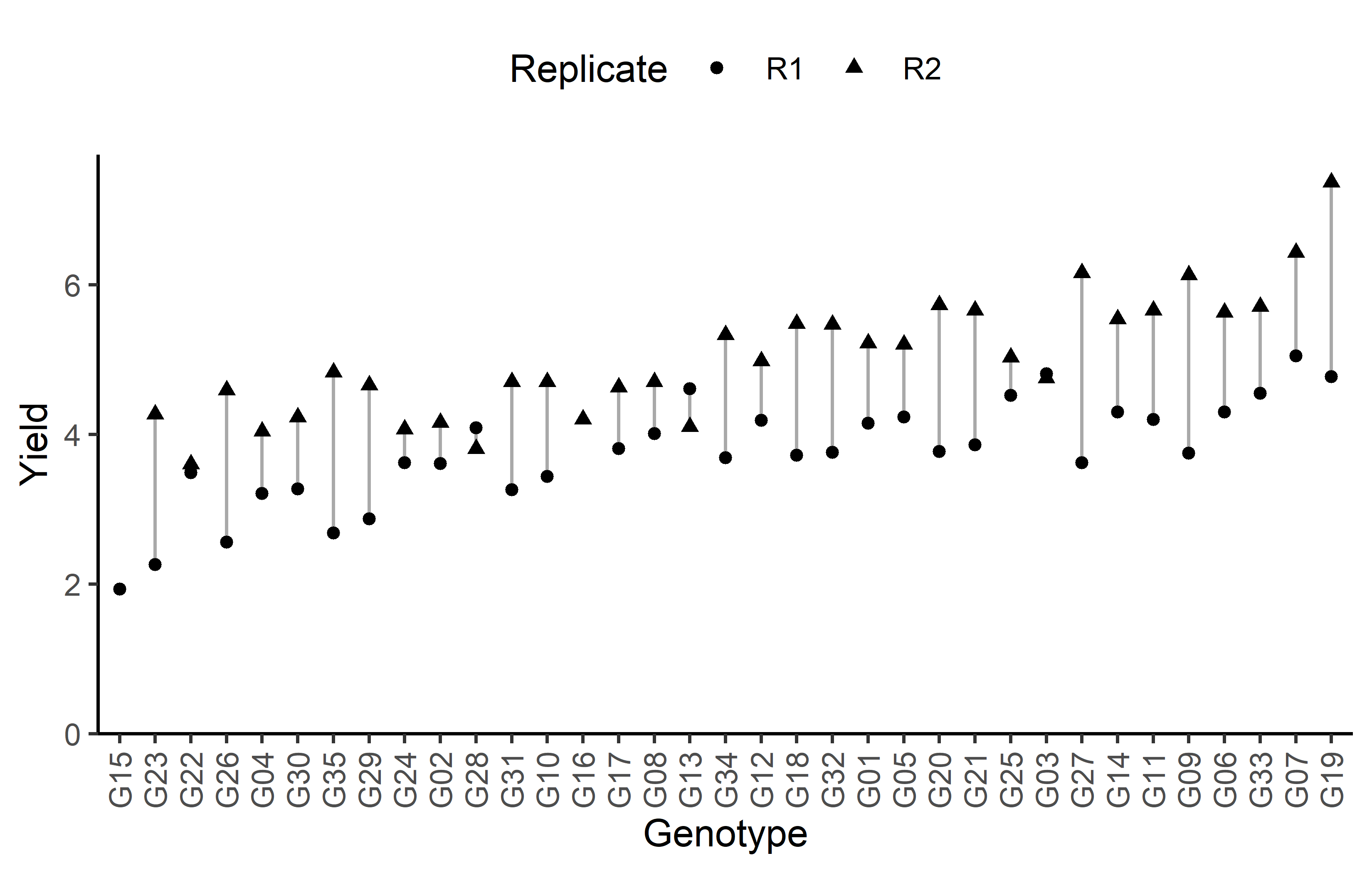
# ℹ 25 more rowsAdditionally, we can decide to plot our data.
Code
# sort genotypes by mean yield
gen_order <- dat %>%
  group_by(gen) %>%
  summarise(mean = mean(yield, na.rm = TRUE)) %>%
  arrange(mean) %>%
  pull(gen) %>%
  as.character()

ggplot(data = dat) +
  aes(
    y = yield,
    x = gen,
    shape = rep
  ) +
  geom_line(
    aes(group = gen),
    color = "darkgrey"
  ) +
  geom_point() +
  scale_x_discrete(
    name = "Genotype",
    limits = gen_order
  ) +
  scale_y_continuous(
    name = "Yield",
    limits = c(0, NA),
    expand = expansion(mult = c(0, 0.05))
  ) +
  scale_shape_discrete(
    name = "Replicate"
  ) +
  guides(shape = guide_legend(nrow = 1)) +
  theme_classic() +
  theme(
    legend.position = "top",
    axis.text.x = element_text(angle = 90, vjust = 0.5)
  )
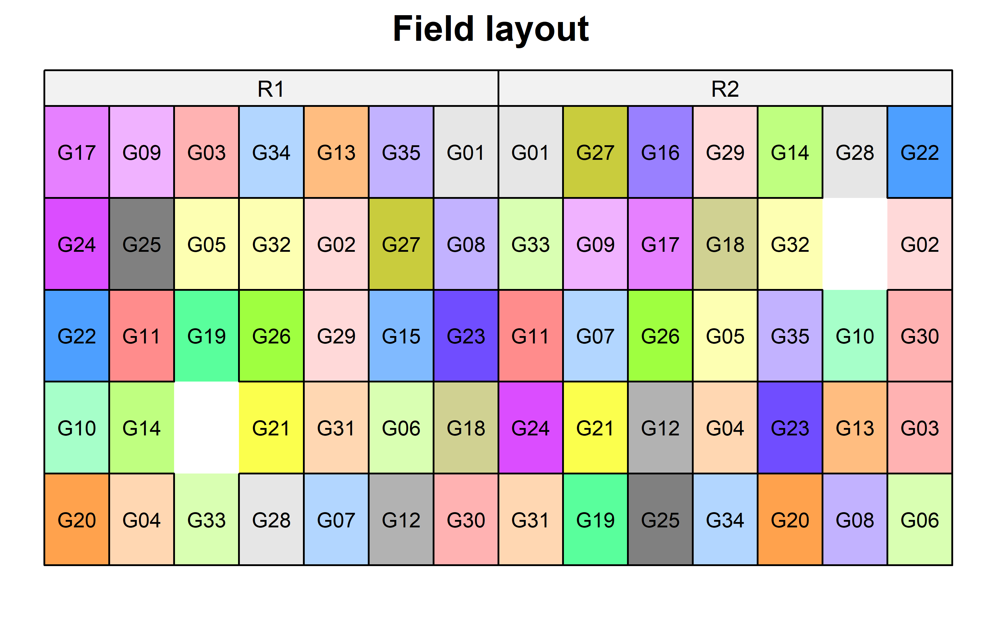
Finally, since this is an experiment that was laid with a certain experimental design (= a resolvable row column design) - it makes sense to also get a field plan. This can be done via desplot() from {desplot}. In this case it is worth noting that there is missing data, as yield values for two plots are not present in the data.
Code
desplot(
  data = dat,
  form = gen ~ col + row | rep, # fill color per genotype, headers per replicate
  text = gen,
  cex = 0.7,
  shorten = "no",
  out1 = row, out1.gpar=list(col="black"), # lines between rows
  out2 = col, out2.gpar=list(col="black"), # lines between columns
  main = "Field layout",
  show.key = FALSE
) 
Model
Finally, we can decide to fit a linear model with yield as the response variable and gen as fixed effects, since our goal is to compare them to each other. Since the trial was laid out in rows and columns, we also need rowF and colF effects in the model, but these can be taken either as a fixed or as random effects. Since our goal is to compare genotypes, we will determine which of the two models we prefer by comparing the average standard error of a difference (s.e.d.) for the comparisons between adjusted genotype means - the lower the s.e.d. the better.
# blocks as fixed (linear model)
mod_frc <- lm(yield ~ gen + rep + rowF + colF,
             data = dat)

avg_sed_mod_frc <- mod_frc %>%
  emmeans(pairwise ~ "gen",
          adjust = "none") %>%
  pluck("contrasts") %>% # extract diffs
  as_tibble() %>% # format to table
  pull("SE") %>% # extract s.e.d. column
  mean() # get arithmetic mean

avg_sed_mod_frc
[1] 0.4828268# blocks as random (linear mixed model)
mod_rrc <- lmer(yield ~ gen + rep + (1 | rowF) + (1 | colF),
data = dat)
avg_sed_mod_rrc <- mod_rrc %>%
emmeans(pairwise ~ "gen",
adjust = "none",
lmer.df = "kenward-roger") %>%
pluck("contrasts") %>% # extract diffs
as_tibble() %>% # format to table
pull("SE") %>% # extract s.e.d. column
mean() # get arithmetic mean
avg_sed_mod_rrc[1] 0.4834463As a result, we find that the model with fixed row and column effects has the slightly smaller s.e.d. and is therefore more precise in terms of comparing genotypes.
It would be at this moment (i.e. after fitting the model and before running the ANOVA), that you should check whether the model assumptions are met. Find out more in the summary article “Model Diagnostics”
ANOVA
Based on our model, we can then conduct an ANOVA:
ANOVA <- anova(mod_frc)
ANOVA
Analysis of Variance Table
Response: yield
Df Sum Sq Mean Sq F value Pr(>F)
gen 34 32.157 0.9458 5.6767 3.505e-05 ***
rep 1 24.901 24.9014 149.4615 2.778e-11 ***
rowF 4 1.436 0.3591 2.1553 0.107861
colF 6 4.794 0.7990 4.7956 0.002873 **
Residuals 22 3.665 0.1666
---
Signif. codes: 0 '***' 0.001 '**' 0.01 '*' 0.05 '.' 0.1 ' ' 1Accordingly, the ANOVA’s F-test did not find the cultivar effects to be statistically significant (p < .001***).
Mean comparison
Besides an ANOVA, one may also want to compare adjusted yield means between cultivars via post hoc tests (t-test, Tukey test etc.).
mean_comp <- mod_frc %>%
  emmeans(specs = ~ gen) %>% # adj. mean per genotype
  cld(adjust = "none", Letters = letters) # compact letter display (CLD)

mean_comp
gen emmean SE df lower.CL upper.CL .group
G15 3.29 0.475 22 2.31 4.28 ab
G04 3.35 0.326 22 2.67 4.03 a
G23 3.54 0.323 22 2.87 4.21 ab
G29 3.57 0.323 22 2.90 4.25 ab
G16 3.59 0.470 22 2.61 4.56 abcde
G26 3.63 0.350 22 2.90 4.35 abc
G02 3.71 0.347 22 2.99 4.43 abcd
G22 3.79 0.327 22 3.12 4.47 abcde
G24 3.82 0.351 22 3.09 4.54 abcdef
G31 3.82 0.322 22 3.15 4.49 abcdef
G35 3.94 0.324 22 3.27 4.61 abcdefg
G17 4.07 0.326 22 3.39 4.75 abcdefgh
G28 4.12 0.320 22 3.45 4.78 abcdefgh
G32 4.15 0.347 22 3.43 4.87 abcdefgh
G30 4.18 0.352 22 3.45 4.91 abcdefgh
G09 4.24 0.352 22 3.51 4.98 abcdefghi
G25 4.28 0.326 22 3.60 4.95 bcdefghi
G34 4.30 0.349 22 3.58 5.03 bcdefghij
G20 4.32 0.337 22 3.62 5.02 bcdefghij
G10 4.56 0.323 22 3.90 5.23 cdefghij
G05 4.60 0.325 22 3.93 5.28 defghijk
G14 4.61 0.322 22 3.94 5.28 cdefghij
G13 4.66 0.322 22 3.99 5.32 cdefghij
G11 4.69 0.347 22 3.98 5.41 defghijk
G08 4.70 0.326 22 4.03 5.38 efghij
G21 4.75 0.344 22 4.04 5.47 defghijk
G27 4.80 0.323 22 4.13 5.48 fghijkl
G18 4.84 0.322 22 4.18 5.51 ghijkl
G33 4.88 0.325 22 4.21 5.56 ghijkl
G01 4.88 0.343 22 4.17 5.60 ghijkl
G12 4.98 0.322 22 4.31 5.65 hijkl
G03 5.20 0.321 22 4.53 5.86 ijkl
G07 5.21 0.323 22 4.54 5.88 jkl
G06 5.59 0.326 22 4.92 6.27 kl
G19 5.73 0.326 22 5.06 6.41 l
Results are averaged over the levels of: rep, rowF, colF
Confidence level used: 0.95
significance level used: alpha = 0.05
NOTE: If two or more means share the same grouping symbol,
then we cannot show them to be different.
But we also did not show them to be the same. It can be seen that the compact letter display is kind of reaching its limit as the way differences are found to be statistically significant here is quite complex.
Note that if you would like to see the underlying individual contrasts/differences between adjusted means, simply add details = TRUE to the cld() statement. Furthermore, check out the Summary Article “Compact Letter Display”.
Finally, we can create a plot that displays both the raw data and the results, i.e. the comparisons of the adjusted means that are based on the linear model.
Code
# reorder genotype factor levels according to adjusted mean
my_caption <- "Black dots represent raw data. Red diamonds and error bars represent adjusted means with 95% confidence limits per cultivar. Means followed by a common letter are not significantly different according to the t-test."

ggplot() +
  # green/red dots representing the raw data
  geom_point(
    data = dat,
    aes(y = yield, x = gen)
  ) +
  # red diamonds representing the adjusted means
  geom_point(
    data = mean_comp,
    aes(y = emmean, x = gen),
    shape = 18,
    color = "red",
    position = position_nudge(x = 0.2)
  ) +
  # red error bars representing the confidence limits of the adjusted means
  geom_errorbar(
    data = mean_comp,
    aes(ymin = lower.CL, ymax = upper.CL, x = gen),
    color = "red",
    width = 0.1,
    position = position_nudge(x = 0.2)
  ) +
  # red letters
  geom_text(
    data = mean_comp,
    aes(y = upper.CL, x = gen, label = str_trim(.group)),
    color = "red",
    angle = 90,
    hjust = -0.2,
    position = position_nudge(x = 0.2)
  ) +
  scale_x_discrete(
    name = "Cultivar",
    limits = as.character(mean_comp$gen)
  ) +
  scale_y_continuous(
    name = "Yield",
    # limits = c(0, NA),
    expand = expansion(mult = c(0, 0.05))
  ) +
  coord_cartesian(ylim = c(0, NA)) +
  labs(caption = my_caption) +
  theme_classic() +
  theme(plot.caption = element_textbox_simple(margin = margin(t = 5)),
        plot.caption.position = "plot",
        axis.text.x = element_text(angle = 90, vjust = 0.5))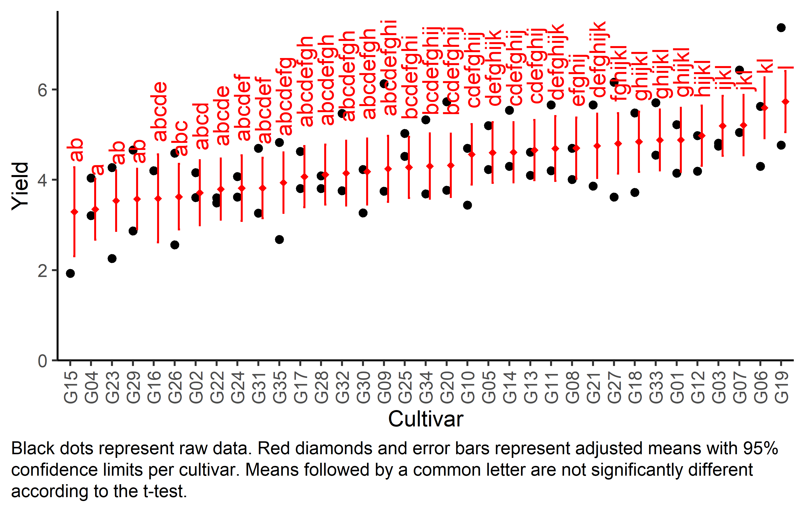
Bonus
Here are some other things you would maybe want to look at for the analysis of this dataset.
Variance components
To extract variance components from our models, we unfortunately need different functions per model since only of of them is a mixed model and we used different functions to fit them.
# Residual Variance
summary(mod_frc)$sigma^2
[1] 0.1666074# Both Variance Components
as_tibble(VarCorr(mod_rrc))# A tibble: 3 × 5
grp var1 var2 vcov sdcor
<chr> <chr> <chr> <dbl> <dbl>
1 colF (Intercept) <NA> 0.144 0.380
2 rowF (Intercept) <NA> 0.0293 0.171
3 Residual <NA> <NA> 0.167 0.409Efficiency
The efficiency of a resolvable design can be calculated as its mean s.e.d. compared to the (mean1) s.e.d. of the analogous RCBD, i.e. leaving out the incomplete block effects within the replicates. Above, we have already calculated the mean s.e.d. of our resolvable design so we can square it and get avg_sed_mod_frc^2 which is 0.23312. Accordingly, we can fit a model leaving out the incomplete block effects and get the s.e.d. just like before and also square it:
avg_sed_mod_RCBD <- lm(yield ~ gen + rep, data = dat) %>%
  emmeans(pairwise ~ "gen",
          adjust = "none",
          lmer.df = "kenward-roger") %>%
  pluck("contrasts") %>% # extract diffs
  as_tibble() %>% # format to table
  pull("SE") %>% # extract s.e.d. column
  mean()

avg_sed_mod_RCBD^2
[1] 0.3257469Finally, the efficiency of this resolvable design is then
avg_sed_mod_RCBD^2 / avg_sed_mod_frc^2[1] 1.397325meaning that the resolvable design is more efficient since the efficiency is > 1.
References
Footnotes
In this scenario, all s.e.d. of the RCBD model would be identical so we don’t really need to get the average, but could instead argue that there is only one constant s.e.d.↩︎
Citation
@online{schmidt2023,
  author = {Paul Schmidt},
  title = {One-Way Row Column Design},
  date = {2023-11-16},
  url = {https://schmidtpaul.github.io/dsfair_quarto//ch/exan/simple/rowcol_kemptonfox1997.html},
  langid = {en},
  abstract = {One-way ANOVA \& pairwise comparison post hoc tests in a
    resolvable row column design.}
}