Subsampling
# packages
pacman::p_load(tidyverse,         # data import and handling
               conflicted,        # handling function conflicts
               lme4, lmerTest, pbkrtest, # linear mixed model
               emmeans, multcomp, multcompView, # adjusted mean comparisons
               ggplot2, desplot, see) # plots

# conflicts: identical function names from different packages
conflict_prefer("select", "dplyr")
conflict_prefer("filter", "dplyr")
conflict_prefer("lmer", "lmerTest")
Data
This example is taken from Chapter “4.1 The sorghum
experiment” of the course material “Mixed models for metric data (3402-451)” by Prof. Dr. Hans-Peter Piepho. It considers data
published in Piepho (1997) from a greenhouse experiment with
sorghum, three intensities of double use of grain and leaves were
tested: (1) control (grain only) Ctrl; (2) removal of all
leaves except top leaf Top1; (3) removal of all leaves
except top six leaves Top6.
Import
# data (import via URL)
dataURL <- "https://raw.githubusercontent.com/SchmidtPaul/DSFAIR/master/data/Piepho1997.csv"
dat <- read_csv(dataURL)

dat
## # A tibble: 120 × 6
## treat block plant TKW row col
## <chr> <chr> <dbl> <dbl> <dbl> <dbl>
## 1 Ctrl I 1 41.9 1 5
## 2 Ctrl I 2 30.0 2 5
## 3 Ctrl I 3 27.8 3 5
## 4 Ctrl I 4 29.7 4 5
## 5 Ctrl I 5 27.8 5 5
## 6 Ctrl I 6 33.9 1 6
## 7 Ctrl I 7 34.8 2 6
## 8 Ctrl I 8 30 3 6
## 9 Ctrl I 9 27.7 4 6
## 10 Ctrl I 10 32.7 5 6
## # … with 110 more rowsFormatting
Before anything, the columns treat, block
and plant should be encoded as factors, since R by default
encoded them as character. Furthermore, I would like to arrange the
factors in a specific order that is different from the default
alphabetical order:
dat <- dat %>%
  mutate_at(vars(treat, block, plant), as.factor) %>%
  mutate(treat = fct_relevel(treat, c("Ctrl", "Top6", "Top1")))
Exploring
In order to obtain a layout of the trial, we can use the
desplot() function. Notice that for this we need two data
columns that identify the row and column of
each plot in the trial. In addition, we I would like to manually choose
colors for the three treatments here and stick to them throughout the
example:
treat_colors <- c(Ctrl="seagreen", Top6="seagreen3" , Top1="seagreen2")

desplot(data = dat, flip = TRUE,
  form = treat ~ col + row | block,
  col.regions = treat_colors,
  main = "Trial layout", show.key = TRUE)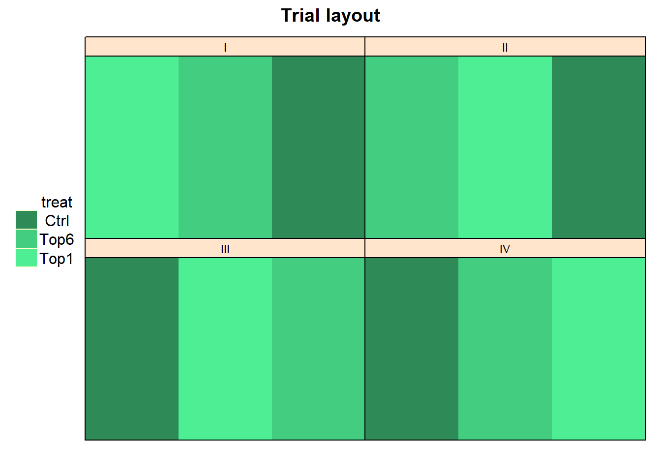
Looking at this, it seems like the trial was laid out as a randomized complete block design with 4 complete blocks. This, however, would mean that we have 3x4=12 observations in our dataset. Yet, our dataset has 120 observations.
This is because what we are looking at in the plot above are only the 12 trays laid on the 4 tables that stood in the greenhouse. On top of each tray were 10 separate sorghum plant pots, respectively. To make this clear, we can plot this trial again as:
treat_colors <- c(Ctrl="seagreen", Top6="seagreen3" , Top1="seagreen2")

desplot(data = dat, flip = TRUE,
  form = treat ~ col + row | block,
  text = plant, cex = 1,
  out1 = treat,
  out2 = plant, out2.gpar=list(col="darkgrey"),
  col.regions = treat_colors,
  main = "Trial layout", show.key = TRUE)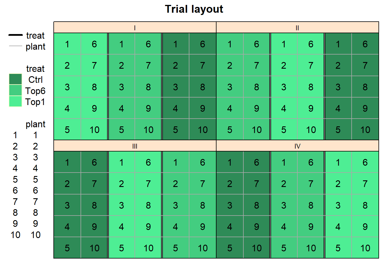
At this point we must realize that there is an important difference between this trial and a regular RCBD (randomized complete block design) trial (like this one). It is important to reflect that trays, not pots, are the randomization units. Clearly, pots are pseudo-replications, while trays are true replications. Another way of looking at the experiment is to consider plots (or measurements taken on pots) as repeated measurements on the same experimental unit (tray).
dat %>%
  group_by(treat) %>%
  summarize(mean    = mean(TKW, na.rm = TRUE),
            std.dev = sd(TKW, na.rm = TRUE),
            n_missing  = sum(is.na(TKW))) %>%
  arrange(desc(mean)) %>% # sort
  print(n=Inf) # print full table
## # A tibble: 3 × 4
## treat mean std.dev n_missing
## <fct> <dbl> <dbl> <int>
## 1 Ctrl 33.1 4.99 1
## 2 Top6 31.1 4.36 6
## 3 Top1 30.6 7.90 4We can also create a plot to get a better feeling for the data. We
here use the geom_violindot() extension to
ggplot2 from the see package as an alternative
to boxplots.
ggplot(data = dat,
       aes(y=TKW, x=treat, fill=treat)) +
  geom_violindot(fill_dots = "black", size_dots = 15) +
  scale_fill_manual(name = "Treatment", values = treat_colors) +
  ylim(0, NA) +
  theme_modern()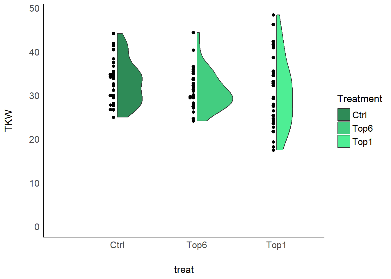
Modelling
Because of the way that 10 plants with the same treatment always
stand together on a tray, our model ignores the fact that plants from
the same tray will be correlated due to common environmental conditions.
Clearly, if the treatments are the same on each tray, plants on the same
tray are expected to be more similar than plants from different trays.
The correlation of plants on the same tray can be modeled by adding a
random tray effect. Notice that a tray is always all
plant pots from one treatment (=treat) on one of the four
tables (=block):
mod <- lmer(TKW ~ treat + block + (1|block:treat),
            data=dat)
Why can’t I just get the mean value per tray and then use these in a regular RCBD analysis? There are four tray means per treatment (one for each block), so the means data has a total of twelve observations. Ideally, the means would have been computed from ten plants on each tray. However, some observations are missing, so some means are based on only nine or eight observations. It is known the the standard error of a mean decreases with the number of observations, so some means will be more accurate than others. This difference in acuracy cannot be accounted for by a simple analysis of means. In fact, the analysis of means is not strictly valid because heterogeneity of variance is ignored. We will see later how a mixed model can be used for a more refined analysis.
Variance component estimates
We can extract the variance component estimates for our mixed model as follows:
mod %>%
  VarCorr() %>%
  as.data.frame() %>%
  select(grp, vcov)
## grp vcov
## 1 block:treat 1.28148
## 2 Residual 34.34461ANOVA
Thus, we can conduct an ANOVA for this model. As can be seen, the
F-test of the ANOVA (using Kenward-Roger’s method for denominator
degrees-of-freedom and F-statistic) does not find the treat
effects to be statistically significant (p = 0.31 > 0.05).
mod %>% anova(ddf="Kenward-Roger")## Type III Analysis of Variance Table with Kenward-Roger's method
## Sum Sq Mean Sq NumDF DenDF F value Pr(>F)
## treat 97.997 48.999 2 5.9920 1.4265 0.3114
## block 114.613 38.204 3 5.9689 1.1123 0.4153Mean comparisons
Analogous to the result from the F-test in the ANOVA, the comparing the means does not find any significant differences between the treatment means either:
mean_comparisons <- mod %>%
  emmeans(specs = "treat",
          lmer.df = "kenward-roger") %>% # get adjusted means for cultivars
  cld(adjust="tukey", Letters=letters) # add compact letter display

mean_comparisons
## treat emmean SE df lower.CL upper.CL .group
## Top1 30.6 1.13 6.06 26.9 34.3 a
## Top6 31.2 1.15 6.61 27.5 34.8 a
## Ctrl 33.1 1.10 5.39 29.4 36.9 a
##
## Results are averaged over the levels of: block
## Degrees-of-freedom method: kenward-roger
## Confidence level used: 0.95
## Conf-level adjustment: sidak method for 3 estimates
## P value adjustment: tukey method for comparing a family of 3 estimates
## significance level used: alpha = 0.05
## NOTE: If two or more means share the same grouping symbol,
## then we cannot show them to be different.
## But we also did not show them to be the same.Note that if you would like to see the underyling individual
contrasts/differences between adjusted means, simply add
details = TRUE to the cld() statement. Also,
find more information on mean comparisons and the Compact Letter Display
in the separate Compact Letter
Display Chapter
Present results
Mean comparisons
For this example we can create a plot that displays both the raw data and the results, i.e. the comparisons of the adjusted means that are based on the linear model. If you would rather have e.g. a bar plot to show these results, check out the separate Compact Letter Display Chapter
ggplot() +
  # black dots representing the raw data
  geom_violindot(
    data = dat,
    aes(y = TKW, x = treat, fill = treat),
    fill_dots = "black",
    size_dots = 15
  ) +
  # red dots representing the adjusted means
  geom_point(
    data = mean_comparisons,
    aes(y = emmean, x = treat),
    color = "red",
    position = position_nudge(x = - 0.2)
  ) +
  # red error bars representing the confidence limits of the adjusted means
  geom_errorbar(
    data = mean_comparisons,
    aes(ymin = lower.CL, ymax = upper.CL, x = treat),
    color = "red",
    width = 0.1,
    position = position_nudge(x = - 0.2)
  ) +
  # red letters
  geom_text(
    data = mean_comparisons,
    aes(y = emmean, x = treat, label = str_trim(.group)),
    color = "red",
    hjust = 1,
    position = position_nudge(x = -0.3)
  ) +
  scale_fill_manual(name = "Treatment", values = treat_colors) +
  ylim(0, NA) + # force y-axis to start at 0
  ylab("Yield in t/ha") + # label y-axis
  xlab("Treatment") +      # label x-axis
  labs(caption = "Black dots represent raw data
       Red dots and error bars represent adjusted mean with 95% confidence limits per treatment
       Means followed by a common letter are not significantly different according to the Tukey-test") +
  theme_classic() + # clearer plot format
  theme(plot.caption.position = "plot")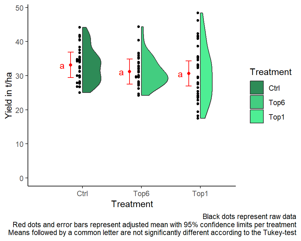
R-Code and exercise solutions
Please click here to find a folder with .R
files. Each file contains
- the entire R-code of each example combined, including
- solutions to the respective exercise(s).
Please feel free to contact me about any of this!
schmidtpaul1989@outlook.com