Latin square design
# packages
pacman::p_load(agridat, tidyverse, # data import and handling
               conflicted, # handling function conflicts
               emmeans, multcomp, multcompView, # adjusted mean comparisons
               ggplot2, desplot) # plots

# conflicts: identical function names from different packages
conflict_prefer("filter", "dplyr")
conflict_prefer("select", "dplyr")
Data
This example is taken from the agridat: Agricultural
Datasets package. It considers data published in Bridges (1989) from a cucumber yield trial set up as
a latin square design. Notice that the original dataset considers two
trials (at two locations), but we will focus on only a single trial
here.
Import
# data (from agridat package)
dat <- agridat::bridges.cucumber %>%
  filter(loc == "Clemson") %>% # subset data from only one location
  select(-loc) # remove loc column which is now unnecessary

dat
## gen row col yield
## 1 Dasher 1 3 44.2
## 2 Dasher 2 4 54.1
## 3 Dasher 3 2 47.2
## 4 Dasher 4 1 36.7
## 5 Guardian 1 4 33.0
## 6 Guardian 2 2 13.6
## 7 Guardian 3 1 44.1
## 8 Guardian 4 3 35.8
## 9 Poinsett 1 1 11.5
## 10 Poinsett 2 3 22.4
## 11 Poinsett 3 4 30.3
## 12 Poinsett 4 2 21.5
## 13 Sprint 1 2 15.1
## 14 Sprint 2 1 20.3
## 15 Sprint 3 3 41.3
## 16 Sprint 4 4 27.1Formatting
While gen is already correctly encoded as factor, the
columns row and col should be encoded as
factors, too, since R by default encoded them as integer. However, we
also want to keep row and col as integer for
the desplot() function. Therefore we create copies of these
columns encoded as factors and named rowF and
colF
dat <- dat %>%
  as_tibble() %>% # tibble data format for convenience
  mutate(rowF = row %>% as.factor,
         colF = col %>% as.factor)
Exploring
In order to obtain a field layout of the trial, we can use the
desplot() function. Notice that for this we need two data
columns that identify the row and col of each
plot in the trial.
desplot(data = dat, flip = TRUE,
        form = gen ~ row + col,
        out1 = row, out1.gpar=list(col="black", lwd=3),
        out2 = col, out2.gpar=list(col="black", lwd=3),
        text = gen, cex = 1, shorten = "no",
        main = "Field layout",
        show.key = FALSE)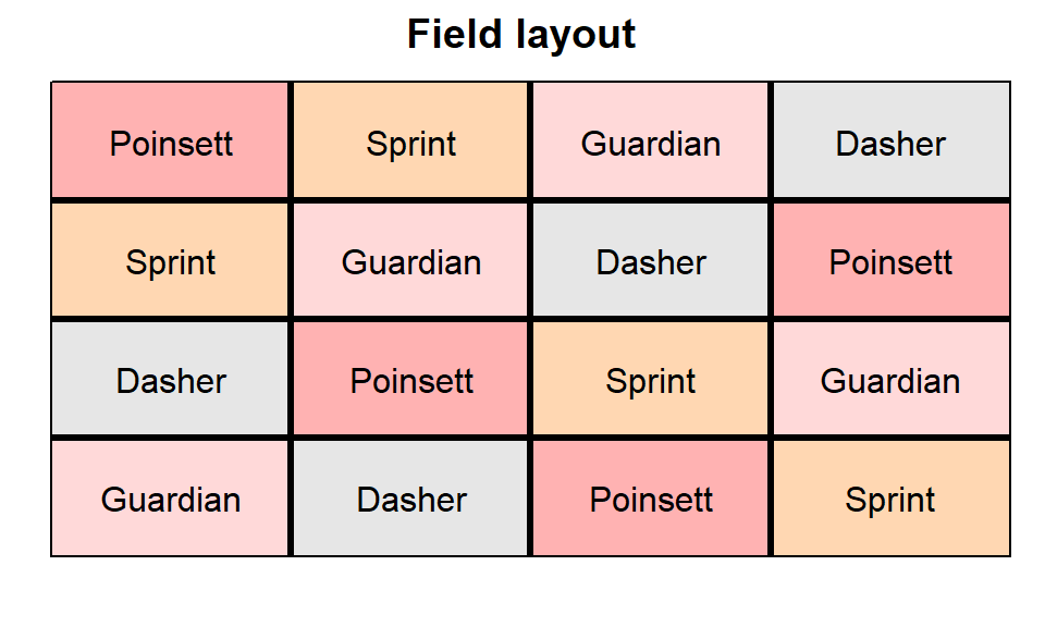
We could also have a look at the arithmetic means and standard
deviations for yield per genotype, row or
col.
dat %>%
  group_by(gen) %>% # genotype
  summarize(mean    = mean(yield),
            std.dev = sd(yield)) %>%
  arrange(desc(mean))
## # A tibble: 4 × 3
## gen mean std.dev
## <fct> <dbl> <dbl>
## 1 Dasher 45.6 7.21
## 2 Guardian 31.6 12.9
## 3 Sprint 26.0 11.4
## 4 Poinsett 21.4 7.71dat %>%
group_by(row) %>% # row
summarize(mean = mean(yield),
std.dev = sd(yield))## # A tibble: 4 × 3
## row mean std.dev
## <int> <dbl> <dbl>
## 1 1 26.0 15.4
## 2 2 27.6 18.1
## 3 3 40.7 7.36
## 4 4 30.3 7.28dat %>%
group_by(col) %>% # column
summarize(mean = mean(yield),
std.dev = sd(yield))## # A tibble: 4 × 3
## col mean std.dev
## <int> <dbl> <dbl>
## 1 1 28.2 14.9
## 2 2 24.4 15.6
## 3 3 35.9 9.67
## 4 4 36.1 12.2We can also create a plot to get a better feeling for the data.
ggplot(data = dat,
       aes(y = yield, x = gen, color = rowF, shape=colF)) +
  geom_point(size=2) +  # scatter plot with larger points
  ylim(0, NA) +   # force y-axis to start at 0
theme_classic() # clearer plot format 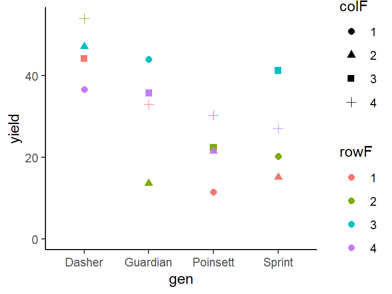
Modelling
Finally, we can decide to fit a linear model with yield
as the response variable and (fixed) gen effects, as well
as rowF and colF effects.
Important: Don’t forget to use the variables for rows
and columns that are encoded as factors and thus not the ones used in
the desplot() function above.
mod <- lm(yield ~ gen + rowF + colF, data = dat)ANOVA
Thus, we can conduct an ANOVA for this model. As can be seen, the
F-test of the ANOVA finds the gen effects to be
statistically significant (p = 0.011 < 0.05).
mod %>% anova()## Analysis of Variance Table
##
## Response: yield
## Df Sum Sq Mean Sq F value Pr(>F)
## gen 3 1316.80 438.93 9.3683 0.01110 *
## rowF 3 528.35 176.12 3.7589 0.07872 .
## colF 3 411.16 137.05 2.9252 0.12197
## Residuals 6 281.12 46.85
## ---
## Signif. codes: 0 '***' 0.001 '**' 0.01 '*' 0.05 '.' 0.1 ' ' 1Mean comparisons
Following a significant F-test, one will want to compare genotype means.
mean_comparisons <- mod %>%
  emmeans(specs = "gen") %>% # get adjusted means for cultivars
  cld(adjust="tukey", Letters=letters) # add compact letter display

mean_comparisons
## gen emmean SE df lower.CL upper.CL .group
## Poinsett 21.4 3.42 6 9.43 33.4 a
## Sprint 25.9 3.42 6 13.95 37.9 a
## Guardian 31.6 3.42 6 19.63 43.6 ab
## Dasher 45.5 3.42 6 33.55 57.5 b
##
## Results are averaged over the levels of: rowF, colF
## Confidence level used: 0.95
## Conf-level adjustment: sidak method for 4 estimates
## P value adjustment: tukey method for comparing a family of 4 estimates
## significance level used: alpha = 0.05
## NOTE: If two or more means share the same grouping symbol,
## then we cannot show them to be different.
## But we also did not show them to be the same.Note that if you would like to see the underyling individual
contrasts/differences between adjusted means, simply add
details = TRUE to the cld() statement. Also,
find more information on mean comparisons and the Compact Letter Display
in the separate Compact Letter
Display Chapter
Present results
Mean comparisons
For this example we can create a plot that displays both the raw data and the results, i.e. the comparisons of the adjusted means that are based on the linear model. If you would rather have e.g. a bar plot to show these results, check out the separate Compact Letter Display Chapter
ggplot() +
  # black dots representing the raw data
  geom_point(
    data = dat,
    aes(y = yield, x = gen)
  ) +
  # red dots representing the adjusted means
  geom_point(
    data = mean_comparisons,
    aes(y = emmean, x = gen),
    color = "red",
    position = position_nudge(x = 0.1)
  ) +
  # red error bars representing the confidence limits of the adjusted means
  geom_errorbar(
    data = mean_comparisons,
    aes(ymin = lower.CL, ymax = upper.CL, x = gen),
    color = "red",
    width = 0.1,
    position = position_nudge(x = 0.1)
  ) +
  # red letters
  geom_text(
    data = mean_comparisons,
    aes(y = emmean, x = gen, label = .group),
    color = "red",
    position = position_nudge(x = 0.2)
  ) +
  ylim(0, NA) + # force y-axis to start at 0
  ylab("Yield") + # label y-axis
  xlab("Cucumber genotype") + # label x-axis
  labs(caption = "Black dots represent raw data
       Red dots and error bars represent adjusted mean with 95% confidence limits per genotype
       Means followed by a common letter are not significantly different according to the Tukey-test") +
theme_classic() # clearer plot format 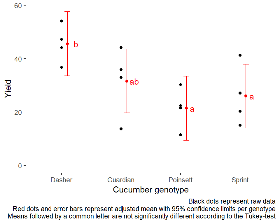
R-Code and exercise solutions
Please click here to find a folder with .R
files. Each file contains
- the entire R-code of each example combined, including
- solutions to the respective exercise(s).
Please feel free to contact me about any of this!
schmidtpaul1989@outlook.com