Augmented design
# packages
pacman::p_load(tidyverse,        # data import and handling
               conflicted,       # handling function conflicts
               lme4, lmerTest,   # linear mixed model
               emmeans, multcomp, multcompView, # mean comparisons
               ggplot2, desplot) # plots

# conflicts: identical function names from different packages
conflict_prefer("lmer", "lmerTest")
Data
This example is taken from Chapter “3.7 Analysis of a
non-resolvable augmented design” of the course material “Mixed models for metric data (3402-451)” by Prof. Dr. Hans-Peter Piepho. It considers data
published in Peterson (1994) from a yield trial laid out as an
augmented design. The genotypes (gen) include 3 standards
(st, ci, wa) and 30 new cultivars
of interest. The trial was laid out in 6 blocks (block).
The 3 standards are tested in each block, while each entry is tested in
only one of the blocks. Therefore, the blocks are “incomplete
blocks”.
Import
# data (import via URL)
dataURL <- "https://raw.githubusercontent.com/SchmidtPaul/DSFAIR/master/data/Pattersen1994.csv"
dat <- read_csv(dataURL)

dat
## # A tibble: 48 × 5
## gen yield block row col
## <chr> <dbl> <chr> <dbl> <dbl>
## 1 st 2972 I 1 1
## 2 14 2405 I 2 1
## 3 26 2855 I 3 1
## 4 ci 2592 I 4 1
## 5 17 2572 I 5 1
## 6 wa 2608 I 6 1
## 7 22 2705 I 7 1
## 8 13 2391 I 8 1
## 9 st 3122 II 1 2
## 10 ci 3023 II 2 2
## # … with 38 more rowsFormatting
Before anything, the columns gen and block
should be encoded as factors, since R by default encoded them as
character.
dat <- dat %>%
  mutate_at(vars(gen, block), as.factor)
Exploring
In order to obtain a field layout of the trial, we can use the
desplot() function. Notice that for this we need two data
columns that identify the row and column of
each plot in the trial. Notice that for this example it makes sense to
put in some extra effort to explicitly assign colors to the genotypes in
a way that differentiates the standards (st,
ci, wa) from all other genotypes.
# create a color-generating function
get_shades_of_blue <- colorRampPalette(colors=c("skyblue", "royalblue4"))
blue_30  <- get_shades_of_blue(30) # 30 shades of blue
orange_3 <- c("darkorange", "darkorange2", "darkorange3") # 3 shades of orange
blue_30_and_orange_3 <- c(blue_30, orange_3) # combine into single vector

# name this vector of colors with genotype names
names(blue_30_and_orange_3) <- dat %>%
  pull(gen) %>% as.character() %>% sort %>% unique

desplot(data = dat, flip = TRUE,
        form = gen ~ col + row, # fill color per genotype, headers per replicate
        col.regions = blue_30_and_orange_3,  # custom colors
        text = gen, cex = 1, shorten = "no", # show genotype names per plot
        out1 = block,                        # lines between complete blocks/replicates
        main = "Field layout", show.key = F) # formatting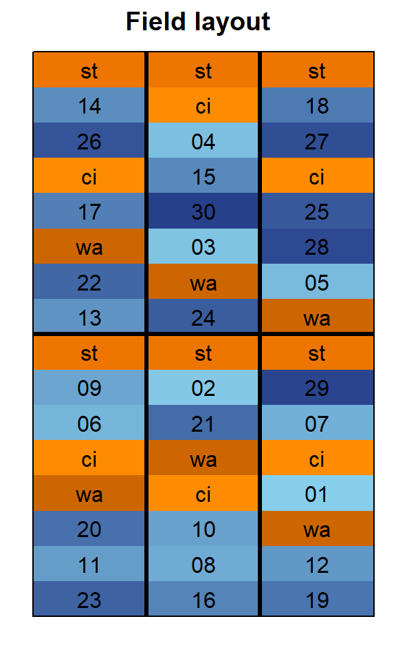
We could also have a look at the arithmetic means and standard
deviations for yield per genotype (gen) or block (inc.block). It must be
clear, however, that except for the standards (st,
ci, wa), there is always only a single value
per genotype, so that the mean simply is that value and a standard error
cannot be calculated at all.
dat %>%
  group_by(gen) %>%
  summarize(mean    = mean(yield),
            std.dev = sd(yield)) %>%
  arrange(std.dev, desc(mean)) %>% # sort
  print(n=Inf) # print full table
## # A tibble: 33 × 3
## gen mean std.dev
## <fct> <dbl> <dbl>
## 1 wa 2678. 615.
## 2 ci 2726. 711.
## 3 st 2759. 832.
## 4 19 3643 NA
## 5 11 3380 NA
## 6 07 3265 NA
## 7 03 3055 NA
## 8 04 3018 NA
## 9 01 3013 NA
## 10 30 2955 NA
## 11 29 2915 NA
## 12 27 2857 NA
## 13 26 2855 NA
## 14 25 2825 NA
## 15 24 2783 NA
## 16 23 2770 NA
## 17 22 2705 NA
## 18 20 2670 NA
## 19 18 2603 NA
## 20 17 2572 NA
## 21 15 2477 NA
## 22 14 2405 NA
## 23 13 2391 NA
## 24 12 2385 NA
## 25 09 2268 NA
## 26 06 2148 NA
## 27 05 2065 NA
## 28 28 1903 NA
## 29 21 1688 NA
## 30 16 1495 NA
## 31 10 1293 NA
## 32 08 1253 NA
## 33 02 1055 NAdat %>%
group_by(block) %>%
summarize(mean = mean(yield),
std.dev = sd(yield)) %>%
arrange(desc(mean)) %>% # sort
print(n=Inf) # print full table## # A tibble: 6 × 3
## block mean std.dev
## <fct> <dbl> <dbl>
## 1 VI 3205. 417.
## 2 II 2864. 258.
## 3 IV 2797. 445.
## 4 I 2638. 202.
## 5 III 2567. 440.
## 6 V 1390. 207.ggplot(data = dat,
aes(y = yield,
x = gen,
color = gen,
shape = block)) +
geom_point(size = 2) + # scatter plot with larger dots
ylim(0, NA) + # force y-axis to start at 0
scale_color_manual(values = blue_30_and_orange_3) + # custom colors
guides(color = "none") + # turn off legend for colors
theme_classic() + # clearer plot format
theme(legend.position = "top") # legend on top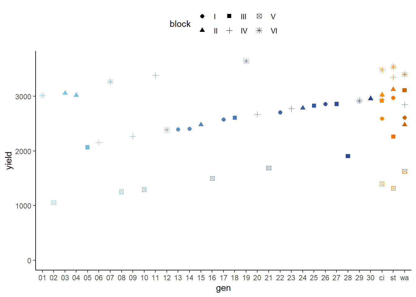
Modelling
Finally, we can decide to fit a linear model with yield
as the response variable and gen as fixed effects, since
our goal is to compare them to each other. Since the trial was laid out
in blocks, we also need block effects in the model, but
these can be taken either as a fixed or as random effects. Since our
goal is to compare genotypes, we will determine which of the two models
we prefer by comparing the average standard error of a difference
(s.e.d.) for the comparisons between adjusted genotype means - the lower
the s.e.d. the better.
# blocks as fixed (linear model)
mod.fb <- lm(yield ~ gen + block,
             data = dat)

mod.fb %>%
  emmeans(pairwise ~ "gen",
          adjust = "tukey") %>%
  pluck("contrasts") %>% # extract diffs
  as_tibble %>% # format to table
  pull("SE") %>% # extract s.e.d. column
  mean() # get arithmetic mean
## [1] 461.3938# blocks as random (linear mixed model)
mod.rb <- lmer(yield ~ gen + (1 | block),
data = dat)
mod.rb %>%
emmeans(pairwise ~ "gen",
adjust = "tukey",
lmer.df = "kenward-roger") %>%
pluck("contrasts") %>% # extract diffs
as_tibble %>% # format to table
pull("SE") %>% # extract s.e.d. column
mean() # get arithmetic mean## [1] 462.0431As a result, we find that the model with fixed block effects has the slightly smaller s.e.d. and is therefore more precise in terms of comparing genotypes.
ANOVA
Thus, we can conduct an ANOVA for this model. As can be seen, the
F-test of the ANOVA finds the gen effects to be
statistically significant (p = 0.0091 < 0.05).
mod.fb %>% anova()## Analysis of Variance Table
##
## Response: yield
## Df Sum Sq Mean Sq F value Pr(>F)
## gen 32 12626173 394568 4.331 0.0091056 **
## block 5 6968486 1393697 15.298 0.0002082 ***
## Residuals 10 911027 91103
## ---
## Signif. codes: 0 '***' 0.001 '**' 0.01 '*' 0.05 '.' 0.1 ' ' 1Mean comparisons
It can be seen that while some genotypes have a higher yield than
others, no differences are found to be statistically significant here.
Accordingly, notice that e.g. for gen 11, which is
the genotype with the highest adjusted yield mean (=3055), its lower
confidence limit (=1587) includes gen 12, which is the
genotype with the lowest adjusted yield mean (=1632).
mean_comparisons <- mod.fb %>%
  emmeans(pairwise ~ "gen",
          adjust = "tukey") %>%
  pluck("emmeans") %>%
  cld(details = TRUE, Letters = letters) # add letter display

# If cld() does not work, try CLD() instead.
# Add 'adjust="none"' to the emmeans() and cld() statement
# in order to obtain t-test instead of Tukey!

mean_comparisons$emmeans # adjusted genotype means
## gen emmean SE df lower.CL upper.CL .group
## 12 1632 341 10 872 2392 a
## 06 1823 341 10 1063 2583 a
## 28 1862 341 10 1102 2622 a
## 09 1943 341 10 1183 2703 a
## 05 2024 341 10 1264 2784 a
## 29 2162 341 10 1402 2922 a
## 01 2260 341 10 1500 3020 a
## 15 2324 341 10 1564 3084 a
## 02 2330 341 10 1570 3090 a
## 20 2345 341 10 1585 3105 a
## 13 2388 341 10 1628 3148 a
## 14 2402 341 10 1642 3162 a
## 23 2445 341 10 1685 3205 a
## 07 2512 341 10 1752 3272 a
## 08 2528 341 10 1768 3288 a
## 18 2562 341 10 1802 3322 a
## 10 2568 341 10 1808 3328 a
## 17 2569 341 10 1809 3329 a
## 24 2630 341 10 1870 3390 a
## wa 2678 123 10 2403 2952 a
## 22 2702 341 10 1942 3462 a
## ci 2726 123 10 2451 3000 a
## st 2759 123 10 2485 3034 a
## 16 2770 341 10 2010 3530 a
## 25 2784 341 10 2024 3544 a
## 30 2802 341 10 2042 3562 a
## 27 2816 341 10 2056 3576 a
## 26 2852 341 10 2092 3612 a
## 04 2865 341 10 2105 3625 a
## 19 2890 341 10 2130 3650 a
## 03 2902 341 10 2142 3662 a
## 21 2963 341 10 2203 3723 a
## 11 3055 341 10 2295 3815 a
##
## Results are averaged over the levels of: block
## Confidence level used: 0.95
## P value adjustment: tukey method for comparing a family of 33 estimates
## significance level used: alpha = 0.05
## NOTE: If two or more means share the same grouping symbol,
## then we cannot show them to be different.
## But we also did not show them to be the same.Present results
Mean comparisons
For this example we can create a plot that displays both the raw data and the results, i.e. the comparisons of the adjusted means that are based on the linear model.
# genotypes ordered by mean yield
gen_order_emmean <- mean_comparisons$emmeans %>%
  arrange(emmean) %>%
  pull(gen) %>%
  as.character()

# assign this order to emmeans object
mean_comparisons$emmeans <- mean_comparisons$emmeans %>%
  mutate(gen = fct_relevel(gen, gen_order_emmean))

# assign this order to dat object
dat <- dat %>%
mutate(gen = fct_relevel(gen, gen_order_emmean))ggplot() +
# blue/orange dots representing the raw data
geom_point(
data = dat,
aes(y = yield, x = gen, color = gen)
) +
scale_color_manual(values = blue_30_and_orange_3) + # custom colors
guides(color = "none") + # turn off legend for colors
# red dots representing the adjusted means
geom_point(
data = mean_comparisons$emmeans,
aes(y = emmean, x = gen),
color = "red",
position = position_nudge(x = 0.2)
) +
# red error bars representing the confidence limits of the adjusted means
geom_errorbar(
data = mean_comparisons$emmeans,
aes(ymin = lower.CL, ymax = upper.CL, x = gen),
color = "red",
width = 0.1,
position = position_nudge(x = 0.2)
) +
# red letters
geom_text(
data = mean_comparisons$emmeans,
aes(y = lower.CL, x = gen, label = .group),
color = "red",
angle = 90,
hjust = 1,
position = position_nudge(y = - 25)
) +
ylim(0, NA) + # force y-axis to start at 0
ylab("Yield in t/ha") + # label y-axis
xlab("Genotype") + # label x-axis
labs(caption = "Blue/orange dots represent raw data
Red dots and error bars represent adjusted mean with 95% confidence limits per genotype
Means followed by a common letter are not significantly different according to the Tukey-test") +
theme_classic() # clearer plot format 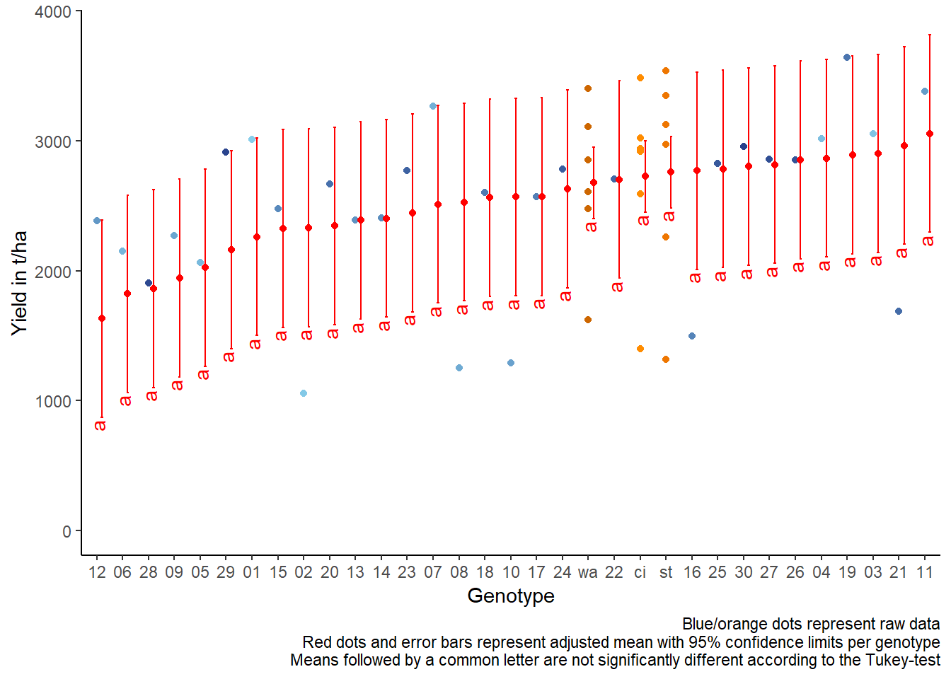
Exercises
Exercise 1
TThis example is taken from Chapter “3.9 Analysis of a resolvable design with checks” of the course material “Mixed models for metric data (3402-451)” by Prof. Dr. Hans-Peter Piepho. It considers data from an augmented design that was laid out for 90 entries and 6 checks. The block size was 10. Incomplete blocks were formed according to a 10 x 10 lattice design, in which incomplete blocks can be grouped into complete replicates. Thus, this is a resolvable design. Checks are coded as 1001 to 1006, while the 90 entries are coded as 2 to 100 (note that there are no entries with labels 11, 21, 31, 41, 51, 61, 71, 81 and 91). Some of the checks have extra replication. We here consider the trait “yield”.
- Explore
- Draw a plot with yield per genotype
- Analyze
- Set up two models: One with blocks as fixed and one with blocks as random. Compare their average s.e.d. between genotype means. Choose the model with the smaller value.
- Compute an ANOVA for the chose model.
- Perform multiple (mean) comparisons based on the chosen model.
# data (import via URL)
dataURL <- "https://raw.githubusercontent.com/SchmidtPaul/DSFAIR/master/data/PiephoAugmentedLattice.csv"
ex1dat <- read_csv(dataURL)

desplot(data = ex1dat, flip = TRUE,
        form = block ~ col + row | rep, # fill color per block, headers per replicate
        text = geno, cex = 0.75, shorten = "no", # show genotype names per plot
        col  = genoCheck, # different color for check genotypes
        out1 = rep,   out1.gpar = list(col = "black"), # lines between reps
        out2 = block, out2.gpar = list(col = "darkgrey"), # lines between blocks
        main = "Field layout", show.key = F) # formatting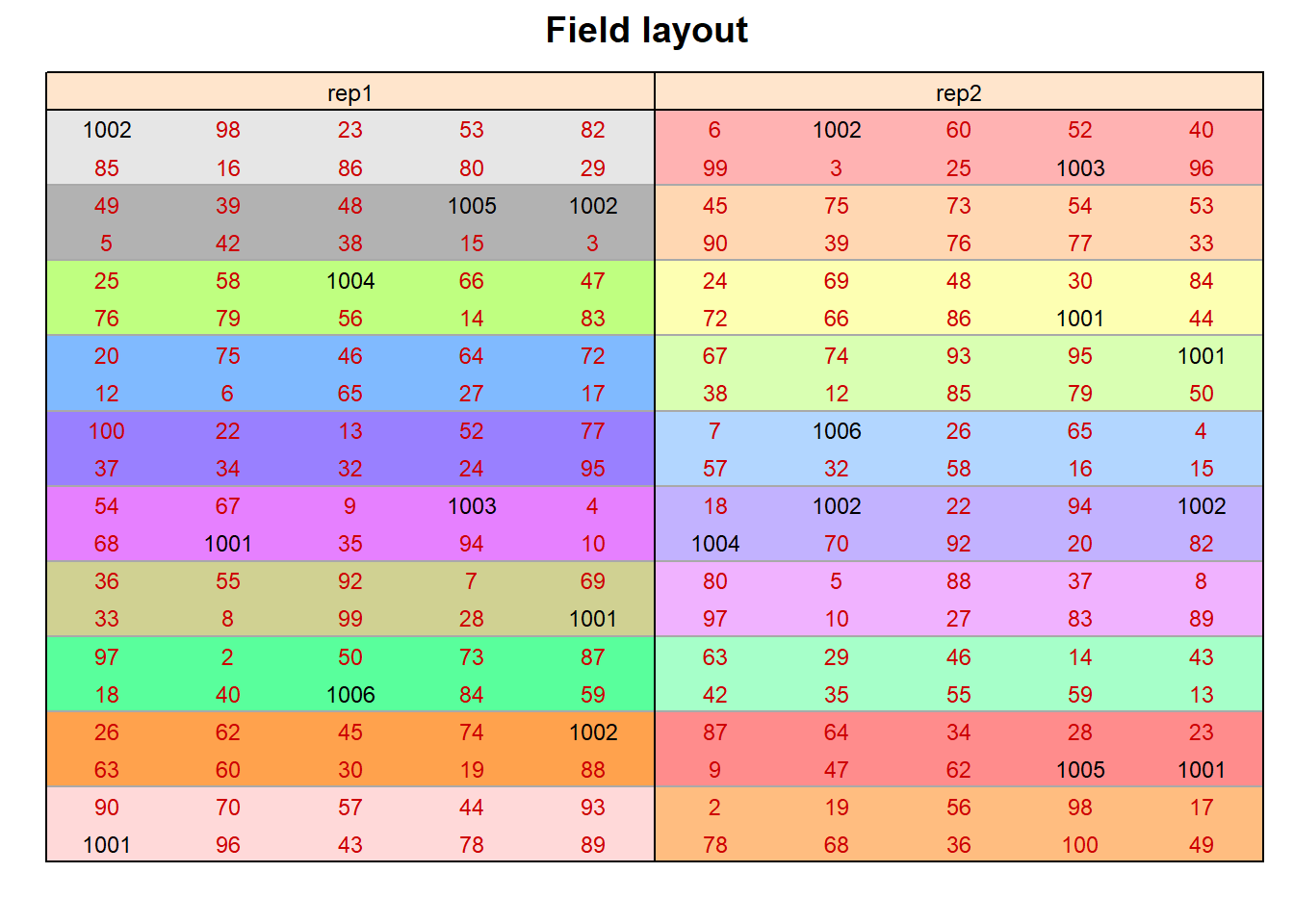
R-Code and exercise solutions
Please click here to find a folder with .R
files. Each file contains
- the entire R-code of each example combined, including
- solutions to the respective exercise(s).
Please feel free to contact me about any of this!
schmidtpaul1989@outlook.com