Row-column design
# packages
pacman::p_load(janitor, tidyverse, # data import and handling
               conflicted,         # handling function conflicts
               lme4, lmerTest,     # linear mixed model
               emmeans, multcomp, multcompView, # adjusted mean comparisons
               ggplot2, desplot)   # plots

# conflicts: identical function names from different packages
conflict_prefer("select", "dplyr")
conflict_prefer("filter", "dplyr")
conflict_prefer("lmer", "lmerTest")
Data
This example is taken from Chapter “3.10 Analysis of a resolvable
row-column design” of the course material “Mixed models for metric data (3402-451)” by Prof. Dr. Hans-Peter Piepho. It considers data
published in Kempton and Fox (1997) from a yield trial laid out
as a resolvable row-column design. The trial had 35 genotypes
(gen), 2 complete replicates (rep) with 5 rows
(row) and 7 columns (col). Thus, a complete
replicate is subdivided into incomplete rows and columns.
Import
# data (import via URL)
dataURL <- "https://raw.githubusercontent.com/SchmidtPaul/DSFAIR/master/data/Kempton%26Fox1997.csv"
dat <- read_csv(dataURL)

dat
## # A tibble: 70 × 5
## rep row col gen yield
## <chr> <dbl> <dbl> <chr> <dbl>
## 1 Rep1 1 1 G20 3.77
## 2 Rep1 1 2 G04 3.21
## 3 Rep1 1 3 G33 4.55
## 4 Rep1 1 4 G28 4.09
## 5 Rep1 1 5 G07 5.05
## 6 Rep1 1 6 G12 4.19
## 7 Rep1 1 7 G30 3.27
## 8 Rep1 2 1 G10 3.44
## 9 Rep1 2 2 G14 4.3
## 10 Rep1 2 3 G16 NA
## # … with 60 more rowsFormatting
Before anything, the columns gen and rep
should be encoded as factors, since R by default encoded them as
character.
dat <- dat %>%
  mutate_at(vars(gen, rep), as.factor)
Exploring
In order to obtain a field layout of the trial, we can use the
desplot() function. Notice that for this we need two data
columns that identify the row and col of each
plot in the trial.
desplot(data = dat,
        form = gen ~ col + row | rep,            # fill color per genotype, headers per replicate
        text = gen, cex = 0.7, shorten = "no",   # show genotype names per plot
        out1 = row, out1.gpar=list(col="black"), # lines between rows
        out2 = col, out2.gpar=list(col="black"), # lines between columns
        main = "Field layout", show.key = F)     # formatting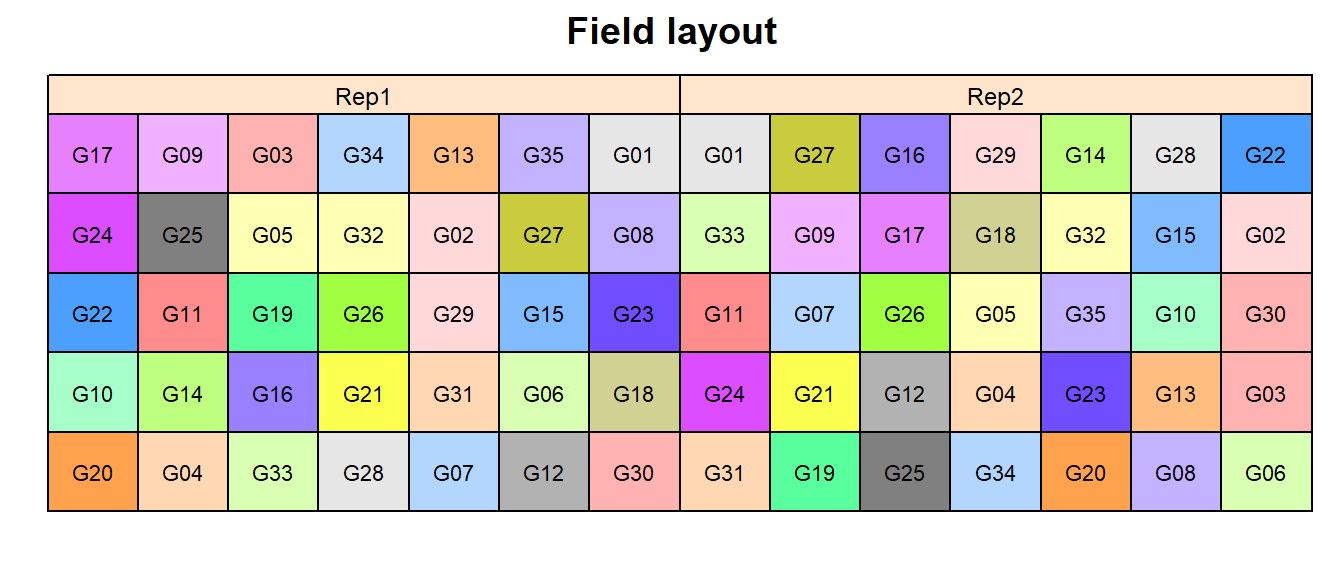
When two blocking structures are used which are arranged in rows and columns, we have a row-column design. If rows and columns can be grouped to form complete replicates, the design is resolvable, as in case of one-way blocking.
We could also have a look at the arithmetic means and standard
deviations for yield per genotype (gen).
dat %>%
  group_by(gen) %>%
  summarize(mean    = mean(yield, na.rm=TRUE),
            std.dev = sd(yield, na.rm=TRUE),
            n_missing  = sum(is.na(yield))) %>%
  arrange(desc(mean)) %>% # sort
  print(n=Inf) # print full table
## # A tibble: 35 × 4
## gen mean std.dev n_missing
## <fct> <dbl> <dbl> <int>
## 1 G19 6.07 1.84 0
## 2 G07 5.74 0.976 0
## 3 G33 5.13 0.820 0
## 4 G06 4.96 0.940 0
## 5 G09 4.94 1.68 0
## 6 G11 4.93 1.03 0
## 7 G14 4.92 0.877 0
## 8 G27 4.89 1.80 0
## 9 G03 4.78 0.0424 0
## 10 G25 4.78 0.361 0
## 11 G21 4.76 1.27 0
## 12 G20 4.75 1.39 0
## 13 G05 4.72 0.686 0
## 14 G01 4.69 0.757 0
## 15 G32 4.62 1.21 0
## 16 G18 4.6 1.24 0
## 17 G12 4.59 0.559 0
## 18 G34 4.51 1.16 0
## 19 G08 4.36 0.488 0
## 20 G13 4.36 0.361 0
## 21 G17 4.22 0.580 0
## 22 G16 4.2 NA 1
## 23 G10 4.07 0.891 0
## 24 G31 3.98 1.02 0
## 25 G28 3.95 0.198 0
## 26 G02 3.88 0.389 0
## 27 G24 3.84 0.318 0
## 28 G29 3.76 1.27 0
## 29 G35 3.76 1.52 0
## 30 G30 3.75 0.679 0
## 31 G04 3.62 0.587 0
## 32 G26 3.58 1.44 0
## 33 G22 3.54 0.0778 0
## 34 G23 3.26 1.42 0
## 35 G15 1.93 NA 1We can also create a plot to get a better feeling for the data.
ggplot(data = dat,
       aes(y = yield, x = gen, color=rep)) +
  geom_point() +  # scatter plot
  ylim(0, NA) +   # force y-axis to start at 0
  theme_classic() + # clearer plot format
  theme(axis.text.x = element_text(angle=90, vjust=0.5), # rotate x-axis label
        panel.grid.major.x = element_line(), # add vertikal grid lines
legend.position = "top") # legend on top 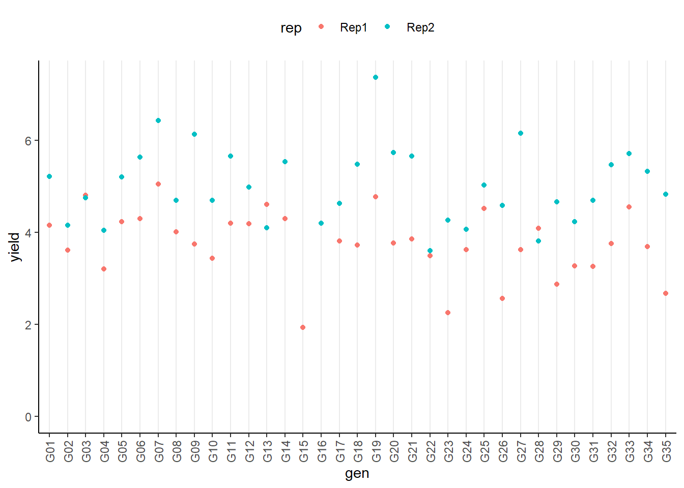
Modelling
Finally, we can decide to fit a linear model with yield
as the response variable and fixed gen and rep
effects. There also need to be terms for the 5 rows (row)
and 7 columns (col) per replicate. Notice that they can
either be taken as a fixed or a random effects. Since our goal is to
compare genotypes, we will determine which of the two models we prefer
by comparing the average standard error of a difference (s.e.d.) for the
comparisons between adjusted genotype means - the lower the s.e.d. the
better.
Also notice that in our dataset the row and
col columns were defined as numeric because this
format is needed when creating the field layout with desplot as we did
above. However, now in order to have row and column effects in our
model, we need to define them as factors. To make this clear, we will
not just change the format, but create a copy of these two columns in
the correct format:
dat <- dat %>%
  mutate(row_fct = as.factor(row),
         col_fct = as.factor(col))
Furthermore, when building our model we must ensure that row and column effects are being estimated per replicate. Thuse, we have 2x5 row effects and 2x7 column effects. This can be done as:
# rows and cols fixed (linear model)
mod.fb <- lm(yield ~ gen + rep +
               rep:row_fct +
               rep:col_fct,
             data = dat)

mod.fb %>%
  emmeans(specs = "gen") %>% # get adjusted means
  contrast(method = "pairwise") %>% # get differences between adjusted means
  as_tibble() %>% # format to table
  summarise(mean(SE)) # mean of SE (=Standard Error) column
## # A tibble: 1 × 1
## `mean(SE)`
## <dbl>
## 1 0.408# rows and cols random (linear mixed model)
mod.rb <- lmer(yield ~ gen + rep +
(1|rep:row_fct) +
(1|rep:col_fct),
data = dat)
mod.rb %>%
emmeans(specs = "gen",
lmer.df = "kenward-roger") %>% # get adjusted means
contrast(method = "pairwise") %>% # get differences between adjusted means
as_tibble() %>% # format to table
summarise(mean(SE)) # mean of SE (=Standard Error) column## # A tibble: 1 × 1
## `mean(SE)`
## <dbl>
## 1 0.402As a result, we find that the model with random row and column effects has the smaller s.e.d. and is therefore more precise in terms of comparing genotypes.
Variance component estimates
We can extract the variance component estimates for our mixed model as follows:
mod.rb %>%
  VarCorr() %>%
  as.data.frame() %>%
  select(grp, vcov)
## grp vcov
## 1 rep:col_fct 0.19244082
## 2 rep:row_fct 0.06405412
## 3 Residual 0.09014691ANOVA
Thus, we can conduct an ANOVA for this model. As can be seen, the
F-test of the ANOVA (using Kenward-Roger’s method for denominator
degrees-of-freedom and F-statistic) finds the gen effects
to be statistically significant (p = 0.0025 < 0.05).
mod.rb %>% anova(ddf="Kenward-Roger")## Type III Analysis of Variance Table with Kenward-Roger's method
## Sum Sq Mean Sq NumDF DenDF F value Pr(>F)
## gen 14.4965 0.42637 34 12.358 4.8394 0.002515 **
## rep 1.5596 1.55956 1 13.009 17.3002 0.001120 **
## ---
## Signif. codes: 0 '***' 0.001 '**' 0.01 '*' 0.05 '.' 0.1 ' ' 1Mean comparisons
mean_comparisons <- mod.rb %>%
  emmeans(specs = "gen",
          lmer.df = "kenward-roger") %>% # get adjusted means for cultivars
  cld(adjust="tukey", Letters=letters) # add compact letter display

mean_comparisons
## gen emmean SE df lower.CL upper.CL .group
## G15 3.22 0.443 23.5 1.62 4.81 a
## G23 3.42 0.304 25.6 2.34 4.51 a
## G04 3.52 0.305 25.5 2.43 4.61 a
## G35 3.60 0.309 25.8 2.50 4.70 a
## G26 3.76 0.316 26.8 2.64 4.88 ab
## G29 3.79 0.308 25.9 2.70 4.89 ab
## G31 3.86 0.309 26.1 2.76 4.96 ab
## G24 3.89 0.302 25.3 2.81 4.97 abc
## G02 3.91 0.309 26.1 2.82 5.01 abc
## G30 3.95 0.305 25.5 2.87 5.04 abc
## G16 3.95 0.439 22.9 2.37 5.54 abc
## G22 4.01 0.311 26.4 2.91 5.12 abc
## G17 4.15 0.312 26.1 3.04 5.26 abc
## G32 4.26 0.308 25.9 3.17 5.36 abc
## G28 4.29 0.310 25.7 3.19 5.40 abc
## G34 4.30 0.302 25.3 3.22 5.38 abc
## G20 4.32 0.302 25.3 3.24 5.40 abc
## G10 4.33 0.309 25.7 3.23 5.43 abc
## G09 4.35 0.306 25.8 3.26 5.44 abc
## G05 4.40 0.308 25.7 3.30 5.49 abc
## G18 4.56 0.310 26.4 3.46 5.67 abc
## G21 4.59 0.304 25.5 3.51 5.68 abc
## G08 4.60 0.312 26.2 3.49 5.71 abc
## G25 4.64 0.310 25.7 3.54 5.74 abc
## G13 4.68 0.312 26.1 3.57 5.79 abc
## G27 4.70 0.311 26.1 3.59 5.81 abc
## G14 4.76 0.305 25.6 3.68 5.85 abc
## G01 4.81 0.303 25.4 3.73 5.90 abc
## G33 4.91 0.312 26.2 3.81 6.02 abc
## G11 4.93 0.308 26.0 3.84 6.03 abc
## G12 4.95 0.319 26.6 3.82 6.08 abc
## G07 5.09 0.305 25.5 4.00 6.17 abc
## G03 5.10 0.311 25.8 3.99 6.20 abc
## G06 5.41 0.312 26.0 4.30 6.52 bc
## G19 5.67 0.311 25.9 4.56 6.78 c
##
## Results are averaged over the levels of: rep
## Degrees-of-freedom method: kenward-roger
## Confidence level used: 0.95
## Conf-level adjustment: sidak method for 35 estimates
## P value adjustment: tukey method for comparing a family of 35 estimates
## significance level used: alpha = 0.05
## NOTE: If two or more means share the same grouping symbol,
## then we cannot show them to be different.
## But we also did not show them to be the same.Note that if you would like to see the underyling individual
contrasts/differences between adjusted means, simply add
details = TRUE to the cld() statement. Also,
find more information on mean comparisons and the Compact Letter Display
in the separate Compact Letter
Display Chapter
Present results
Mean comparisons
For this example we can create a plot that displays both the raw data and the results, i.e. the comparisons of the adjusted means that are based on the linear model. If you would rather have e.g. a bar plot to show these results, check out the separate Compact Letter Display Chapter
# resort gen factor according to adjusted mean
mean_comparisons <- mean_comparisons %>%
  mutate(gen = fct_reorder(gen, emmean))

# for raw data
plotdata <- dat %>%
  mutate(gen = fct_relevel(gen, levels(mean_comparisons$gen)))

ggplot() +
  # black dots representing the raw data
  geom_point(
    data = plotdata,
    aes(y = yield, x = gen)
  ) +
  # red dots representing the adjusted means
  geom_point(
    data = mean_comparisons,
    aes(y = emmean, x = gen),
    color = "red",
    position = position_nudge(x = 0.1)
  ) +
  # red error bars representing the confidence limits of the adjusted means
  geom_errorbar(
    data = mean_comparisons,
    aes(ymin = lower.CL, ymax = upper.CL, x = gen),
    color = "red",
    width = 0.1,
    position = position_nudge(x = 0.1)
  ) +
  # red letters
  geom_text(
    data = mean_comparisons,
    aes(y = lower.CL, x = gen, label = .group),
    color = "red",
    angle = 90,
    hjust = 1,
    position = position_nudge(y = - 0.1)
  ) +
  ylim(0, NA) + # force y-axis to start at 0
  ylab("Yield in t/ha") + # label y-axis
  xlab("Genotype") +      # label x-axis
  labs(caption = "Black dots represent raw data
       Red dots and error bars represent adjusted mean with 95% confidence limits per genotype
       Means followed by a common letter are not significantly different according to the Tukey-test") +
  theme_classic() + # clearer plot format
  theme(axis.text.x = element_text(angle=90, vjust=0.5)) # rotate x-axis label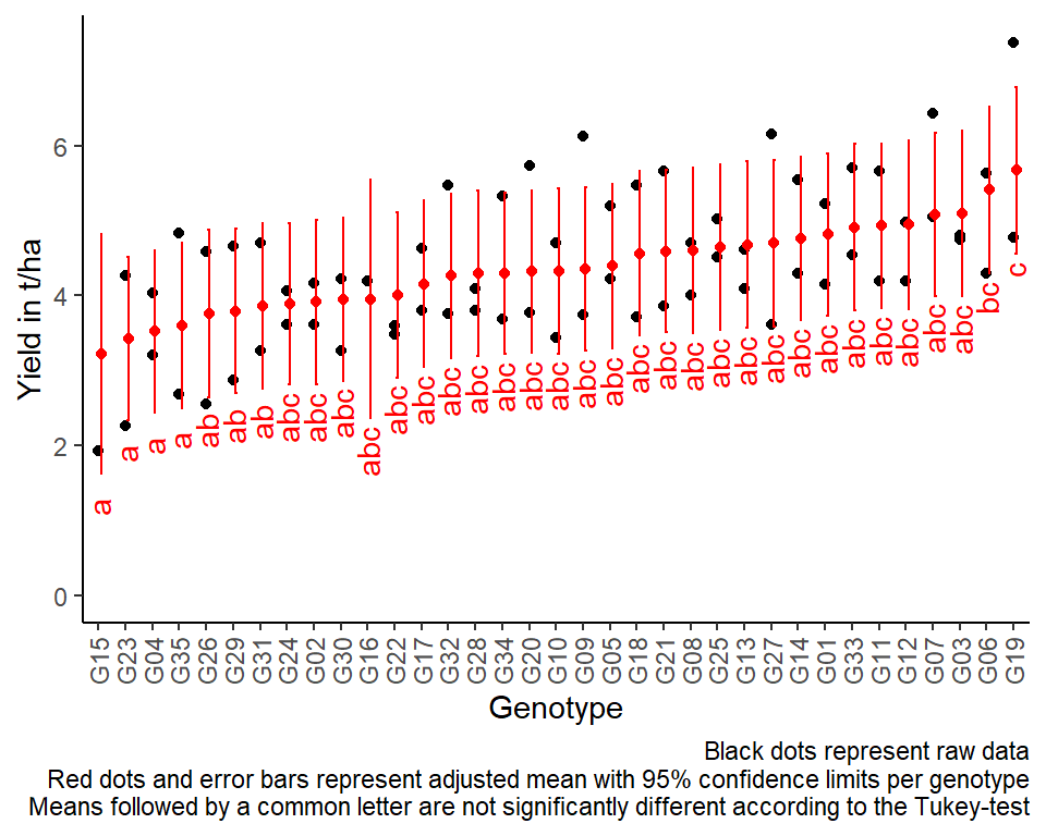
Exercises
Exercise 1
This example is taken from “Example 8” of the course material “Mixed models for metric data (3402-451)” by Prof. Dr. Hans-Peter Piepho. It considers data from a yield trial with oat. There were 64 genotypes laid out as a 8 x 8 lattice with 3 replicates.
- Explore
- Which genotypes have missing yield observations?
- Create a field trial layout using ´desplot()´ where the plots are
filled according to their yield. Try to see whether some areas have
lower/higher yields.
- Analyze
- Set up the model with random incomplete row and column effects.
- Extract the variance components.
- Compute an ANOVA
- Perform multiple (mean) comparisons using the LSD test/t-test.
# data (import via URL)
dataURL <- "https://raw.githubusercontent.com/SchmidtPaul/DSFAIR/master/data/RowColFromUtz.csv"
ex1dat <- read_csv(dataURL)
R-Code and exercise solutions
Please click here to find a folder with .R
files. Each file contains
- the entire R-code of each example combined, including
- solutions to the respective exercise(s).
Please feel free to contact me about any of this!
schmidtpaul1989@outlook.com