Completely randomized design
# packages
pacman::p_load(tidyverse, # data import and handling
               conflicted, # handling function conflicts
               emmeans, multcomp, multcompView, # adjusted mean comparisons
               ggplot2, desplot) # plots

# conflicts between functions with the same name
conflict_prefer("filter", "dplyr")
conflict_prefer("select", "dplyr")
Data
This example is taken from “Example 4.3” of the course
material “Quantitative Methods in Biosciences (3402-420)” by
Prof. Dr. Hans-Peter Piepho. It considers data
published in Mead et al. (1993, p.52) from a yield trial with
melons. The trial had 4 melon varieties (variety). Each
variety was tested on six field plots. The allocation of treatments
(varieties) to experimental units (plots) was completely at random.
Thus, the experiment was laid out as a completely randomized design
(CRD).
Import
# data (import via URL)
dataURL <- "https://raw.githubusercontent.com/SchmidtPaul/DSFAIR/master/data/Mead1993.csv"
dat <- read_csv(dataURL)

dat
## # A tibble: 24 × 4
## variety yield row col
## <chr> <dbl> <dbl> <dbl>
## 1 v1 25.1 4 2
## 2 v1 17.2 1 6
## 3 v1 26.4 4 1
## 4 v1 16.1 1 4
## 5 v1 22.2 1 2
## 6 v1 15.9 2 4
## 7 v2 40.2 4 4
## 8 v2 35.2 3 1
## 9 v2 32.0 4 6
## 10 v2 36.5 2 1
## # … with 14 more rowsFormatting
Before anything, the column variety should be encoded as
a factor, since R by default encoded it as a character variable.
dat <- dat %>%
  mutate_at(vars(variety), as.factor)
Exploring
In order to obtain a field layout of the trial, we can use the
desplot() function. Notice that for this we need two data
columns that identify the row and column of
each plot in the trial.
desplot(data = dat, flip = TRUE,
        form = variety ~ col + row,              # fill color per variety
        text = variety, cex = 1, shorten = "no", # show variety names per plot
        main = "Field layout", show.key = F)     # formatting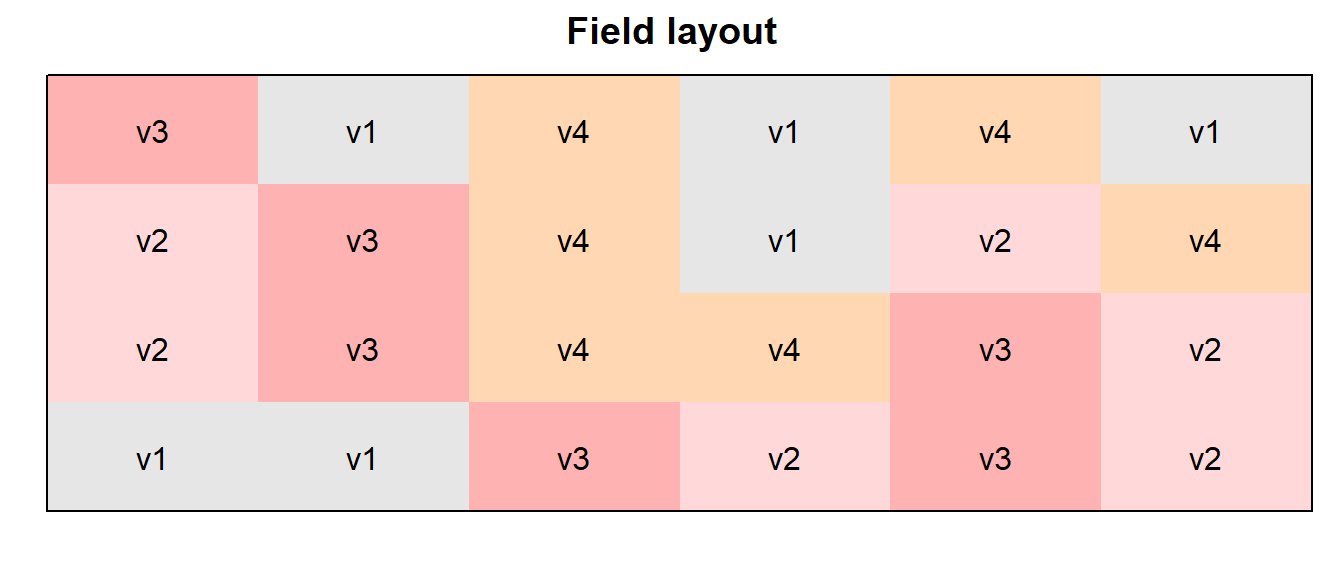
We could also have a look at the arithmetic means and standard
deviations per variety:
dat %>%
  group_by(variety) %>%
  summarize(mean    = mean(yield),
            std.dev = sd(yield))
## # A tibble: 4 × 3
## variety mean std.dev
## <fct> <dbl> <dbl>
## 1 v1 20.5 4.69
## 2 v2 37.4 3.95
## 3 v3 19.5 5.56
## 4 v4 29.9 2.23We can also create a plot to get a better feeling for the data.
ggplot(data = dat,
       aes(y = yield, x = variety)) +
  geom_point() +  # scatter plot
  ylim(0, NA) +   # force y-axis to start at 0
theme_classic() # clearer plot format 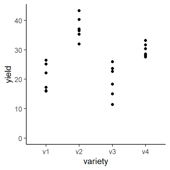
Modelling
Finally, we can decide to fit a linear model with yield
as the response variable and (fixed) variety effects.
mod <- lm(yield ~ variety, data = dat)ANOVA
Thus, we can conduct an ANOVA for this model. As can be seen, the
F-test of the ANOVA finds the variety effects to be
statistically significant (p<0.001).
mod %>% anova()## Analysis of Variance Table
##
## Response: yield
## Df Sum Sq Mean Sq F value Pr(>F)
## variety 3 1291.48 430.49 23.418 9.439e-07 ***
## Residuals 20 367.65 18.38
## ---
## Signif. codes: 0 '***' 0.001 '**' 0.01 '*' 0.05 '.' 0.1 ' ' 1Mean comparisons
Following a significant F-test, one will want to compare variety means.
mean_comparisons <- mod %>%
  emmeans(specs = "variety") %>% # get adjusted means for varieties
  cld(adjust="tukey", Letters=letters) # add compact letter display

mean_comparisons
## variety emmean SE df lower.CL upper.CL .group
## v3 19.5 1.75 20 14.7 24.3 a
## v1 20.5 1.75 20 15.7 25.3 a
## v4 29.9 1.75 20 25.1 34.7 b
## v2 37.4 1.75 20 32.6 42.2 c
##
## Confidence level used: 0.95
## Conf-level adjustment: sidak method for 4 estimates
## P value adjustment: tukey method for comparing a family of 4 estimates
## significance level used: alpha = 0.05
## NOTE: If two or more means share the same grouping symbol,
## then we cannot show them to be different.
## But we also did not show them to be the same.Note that if you would like to see the underyling individual
contrasts/differences between adjusted means, simply add
details = TRUE to the cld() statement. Also,
find more information on mean comparisons and the Compact Letter Display
in the separate Compact Letter
Display Chapter
Present results
Mean comparisons
For this example we can create a plot that displays both the raw data and the results, i.e. the comparisons of the adjusted means that are based on the linear model. If you would rather have e.g. a bar plot to show these results, check out the separate Compact Letter Display Chapter
ggplot() +
  # black dots representing the raw data
  geom_point(
    data = dat,
    aes(y = yield, x = variety)
  ) +
  # red dots representing the adjusted means
  geom_point(
    data = mean_comparisons,
    aes(y = emmean, x = variety),
    color = "red",
    position = position_nudge(x = 0.1)
  ) +
  # red error bars representing the confidence limits of the adjusted means
  geom_errorbar(
    data = mean_comparisons,
    aes(ymin = lower.CL, ymax = upper.CL, x = variety),
    color = "red",
    width = 0.1,
    position = position_nudge(x = 0.1)
  ) +
  # red letters
  geom_text(
    data = mean_comparisons,
    aes(y = emmean, x = variety, label = str_trim(.group)),
    color = "red",
    position = position_nudge(x = 0.2),
    hjust = 0
  ) +
  ylim(0, NA) + # force y-axis to start at 0
  ylab("Yield in t/ha") + # label y-axis
  xlab("Variety") +      # label x-axis
  labs(caption = "Black dots represent raw data
       Red dots and error bars represent adjusted mean with 95% confidence limits per variety
       Means followed by a common letter are not significantly different according to the Tukey-test") +
theme_classic() # clearer plot format 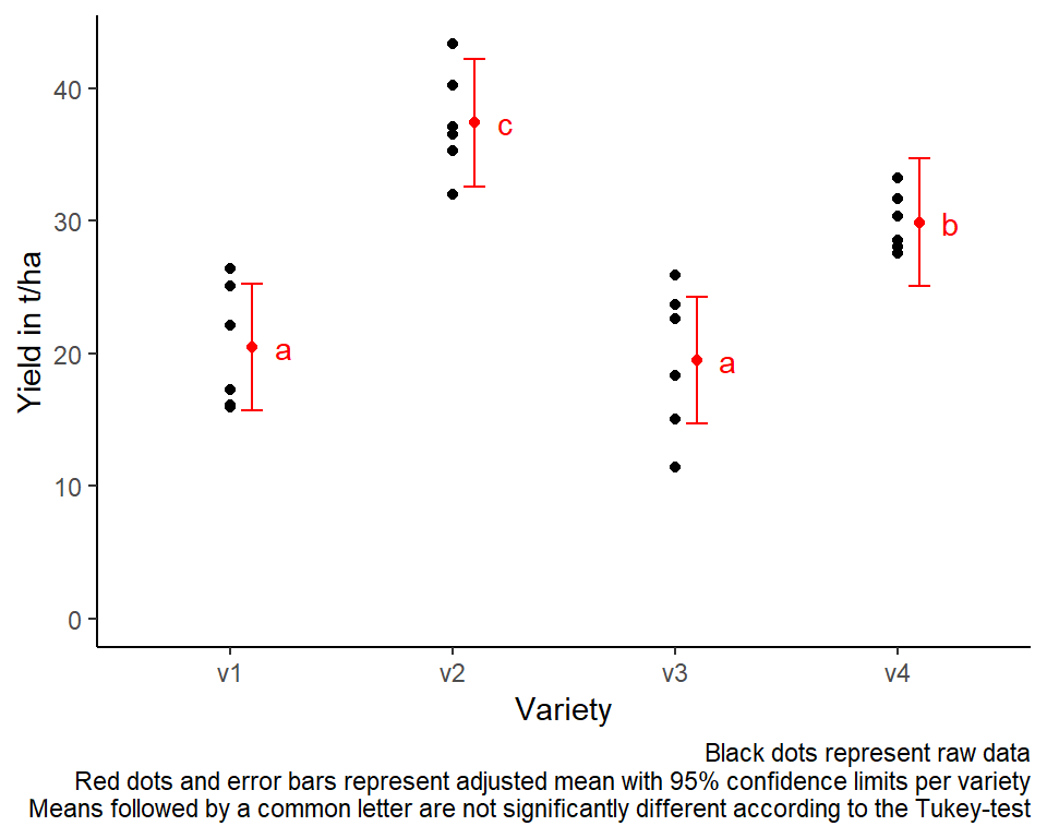
Exercises
Exercise 1
This example is taken from “Example 5.4” of the course
material “Quantitative Methods in Biosciences (3402-420)” by
Prof. Dr. Hans-Peter Piepho. It considers data
published in Mead et al. (1993, p.54). The percentage moisture
content is determined from multiple samples for each of four different
soils. Notice that for this dataset you have no information on any
specific field trial layout (i.e. row or
col column are not present in the dataset). Therefore you
should skip trying to create a field layout with desplot()
and instead focus on the following:
- Explore
- How many samples per soil were taken?
- Which soil has the highest value for moisture?
- Draw a plot with moisture values per soil
- Analyze
- Compute an ANOVA
- Perform multiple (mean) comparisons using the LSD test/t-test.
- Repeat the analysis, but this time remove all moisture values larger than 12 at the very beginning.
# data (import via URL)
dataURL <- "https://raw.githubusercontent.com/SchmidtPaul/DSFAIR/master/data/Mead1993b.csv"
ex1dat <- read_csv(dataURL)
R-Code and exercise solutions
Please click here to find a folder with .R
files. Each file contains
- the entire R-code of each example combined, including
- solutions to the respective exercise(s).
Please feel free to contact me about any of this!
schmidtpaul1989@outlook.com