Randomized complete block design
# packages
pacman::p_load(tidyverse, # data import and handling
               conflicted, # handling function conflicts
               emmeans, multcomp, multcompView, # adjusted mean comparisons
               ggplot2, desplot) # plots

# conflicts between functions with the same name
conflict_prefer("filter", "dplyr")
conflict_prefer("select", "dplyr")
Data
This example is taken from Chapter “2 Randomized complete block
design” of the course material “Mixed models for metric data (3402-451)” by Prof. Dr. Hans-Peter Piepho. It considers data
published in Clewer and Scarisbrick (2001) from a yield (t/ha)
trial laid out as a randomized complete block design (3
blocks) with cultivar (4 cultivars) being the only
treatment factor. Thus, we have a total of 12 plots.
Import
# data (import via URL)
dataURL <- "https://raw.githubusercontent.com/SchmidtPaul/DSFAIR/master/data/Clewer%26Scarisbrick2001.csv"
dat <- read_csv(dataURL)

dat
## # A tibble: 12 × 5
## block cultivar yield row col
## <chr> <chr> <dbl> <dbl> <dbl>
## 1 B1 C1 7.4 2 1
## 2 B1 C2 9.8 3 1
## 3 B1 C3 7.3 1 1
## 4 B1 C4 9.5 4 1
## 5 B2 C1 6.5 1 2
## 6 B2 C2 6.8 4 2
## 7 B2 C3 6.1 3 2
## 8 B2 C4 8 2 2
## 9 B3 C1 5.6 2 3
## 10 B3 C2 6.2 1 3
## 11 B3 C3 6.4 3 3
## 12 B3 C4 7.4 4 3Formatting
Before anything, the columns block and
cultivar should be encoded as factors, since R by default
encoded them as character.
dat <- dat %>%
  mutate_at(vars(block, cultivar), as.factor)
Exploring
In order to obtain a field layout of the trial, we can use the
desplot() function. Notice that for this we need two data
columns that identify the row and column of
each plot in the trial.
desplot(data = dat, flip = T,
  form = cultivar ~ col + row,        # fill color per cultivar
  out1 = block,                       # bold lines between blocks
  text = yield, cex = 1, shorten = F, # show yield for each plot
  main = "Field layout", show.key = F) # formatting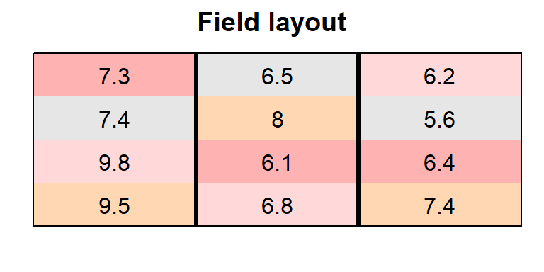
We could also have a look at the arithmetic means and standard
deviations for yield per cultivar or
block.
dat %>%
  group_by(cultivar) %>%
  summarize(mean    = mean(yield),
            std.dev = sd(yield))
## # A tibble: 4 × 3
## cultivar mean std.dev
## <fct> <dbl> <dbl>
## 1 C1 6.5 0.9
## 2 C2 7.6 1.93
## 3 C3 6.6 0.624
## 4 C4 8.3 1.08dat %>%
group_by(block) %>%
summarize(mean = mean(yield),
std.dev = sd(yield))## # A tibble: 3 × 3
## block mean std.dev
## <fct> <dbl> <dbl>
## 1 B1 8.5 1.33
## 2 B2 6.85 0.819
## 3 B3 6.4 0.748We can also create a plot to get a better feeling for the data.
ggplot(data = dat,
       aes(y = yield, x = cultivar, color = block)) +
  geom_point() +  # scatter plot
  ylim(0, NA) +   # force y-axis to start at 0
theme_classic() # clearer plot format 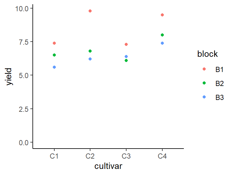
Modelling
Finally, we can decide to fit a linear model with yield
as the response variable and (fixed) cultivar and
block effects.
mod <- lm(yield ~ cultivar + block, data = dat)ANOVA
Thus, we can conduct an ANOVA for this model. As can be seen, the
F-test of the ANOVA finds the cultivar effects to be
statistically significant (p = 0.037 < 0.05).
mod %>% anova()## Analysis of Variance Table
##
## Response: yield
## Df Sum Sq Mean Sq F value Pr(>F)
## cultivar 3 6.63 2.21 5.525 0.036730 *
## block 2 9.78 4.89 12.225 0.007651 **
## Residuals 6 2.40 0.40
## ---
## Signif. codes: 0 '***' 0.001 '**' 0.01 '*' 0.05 '.' 0.1 ' ' 1Mean comparisons
Following a significant F-test, one will want to compare cultivar means.
mean_comparisons <- mod %>%
  emmeans(specs = ~ cultivar) %>% # get adjusted means for cultivars
  cld(adjust="tukey", Letters=letters) # add compact letter display

mean_comparisons
## cultivar emmean SE df lower.CL upper.CL .group
## C1 6.5 0.365 6 5.22 7.78 a
## C3 6.6 0.365 6 5.32 7.88 ab
## C2 7.6 0.365 6 6.32 8.88 ab
## C4 8.3 0.365 6 7.02 9.58 b
##
## Results are averaged over the levels of: block
## Confidence level used: 0.95
## Conf-level adjustment: sidak method for 4 estimates
## P value adjustment: tukey method for comparing a family of 4 estimates
## significance level used: alpha = 0.05
## NOTE: If two or more means share the same grouping symbol,
## then we cannot show them to be different.
## But we also did not show them to be the same.Note that if you would like to see the underyling individual
contrasts/differences between adjusted means, simply add
details = TRUE to the cld() statement. Also,
find more information on mean comparisons and the Compact Letter Display
in the separate Compact Letter
Display Chapter
Present results
Mean comparisons
For this example we can create a plot that displays both the raw data and the results, i.e. the comparisons of the adjusted means that are based on the linear model. If you would rather have e.g. a bar plot to show these results, check out the separate Compact Letter Display Chapter
ggplot() +
  # black dots representing the raw data
  geom_point(
    data = dat,
    aes(y = yield, x = cultivar)
  ) +
  # red dots representing the adjusted means
  geom_point(
    data = mean_comparisons,
    aes(y = emmean, x = cultivar),
    color = "red",
    position = position_nudge(x = 0.1)
  ) +
  # red error bars representing the confidence limits of the adjusted means
  geom_errorbar(
    data = mean_comparisons,
    aes(ymin = lower.CL, ymax = upper.CL, x = cultivar),
    color = "red",
    width = 0.1,
    position = position_nudge(x = 0.1)
  ) +
  # red letters
  geom_text(
    data = mean_comparisons,
    aes(y = emmean, x = cultivar, label = str_trim(.group)),
    color = "red",
    position = position_nudge(x = 0.2),
    hjust = 0
  ) +
  ylim(0, NA) + # force y-axis to start at 0
  ylab("Yield in t/ha") + # label y-axis
  xlab("Cultivar") +      # label x-axis
  labs(caption = "Black dots represent raw data
       Red dots and error bars represent adjusted mean with 95% confidence limits per cultivar
       Means followed by a common letter are not significantly different according to the Tukey-test") +
theme_classic() # clearer plot format 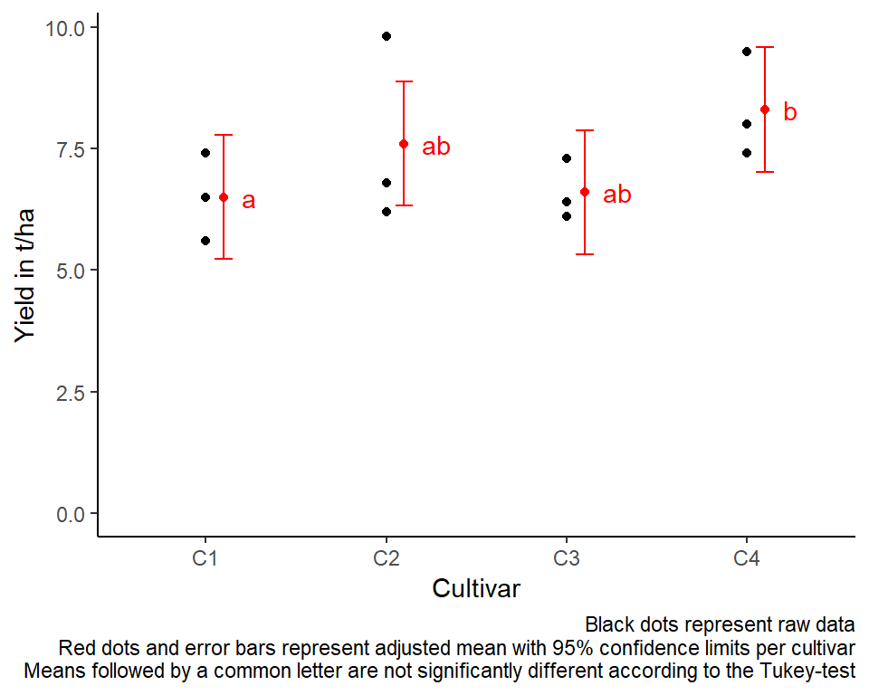
Exercises
Exercise 1
This example is taken from “Example 5.11” of the course material “Quantitative Methods in Biosciences (3402-420)” by Prof. Dr. Hans-Peter Piepho. It considers data published in Gomez & Gomez (1984). A randomized complete block experiment was conducted to assess the yield (kg/ha) of rice cultivar IR8 at six different seeding densities (kg/ha).
Important: The treatment factor
(density) is actually quantitative variable, but for this
exercise you should define it as a factor variable with 6
levels anyway. (Notice, however, that in such a case a regression
analysis with density being a numeric variable is actually
more efficient that ANOVA followed by multiple comparison of means.)
- Explore
- Create a field layout with
desplot() - Draw a plot with yield values per density
- Create a field layout with
- Analyze
- Compute an ANOVA
- Perform multiple (mean) comparisons
# data (import via URL)
dataURL <- "https://raw.githubusercontent.com/SchmidtPaul/DSFAIR/master/data/Gomez%26Gomez1984b.csv"
ex1dat <- read_csv(dataURL)
R-Code and exercise solutions
Please click here to find a folder with .R
files. Each file contains
- the entire R-code of each example combined, including
- solutions to the respective exercise(s).
Please feel free to contact me about any of this!
schmidtpaul1989@outlook.com